20

Using the proper Angular Material directive, how do I change the direction to vertical?

Starting with vertical tabs:

vertical-tabs screenshot

Then want to drop to content below mat-select dropdown:

mat-select screenshot

EDIT: Will be working on adapting https://stackoverflow.com/a/43389018 into my answer, if someone doesn't beat me to it :)

A T
  • 13,008
  • 21
  • 97
  • 158
  • Can't you use other option like Bootstrap tabs? – The Hungry Dictator Apr 13 '18 at 05:37
  • as of now, it seems that the feature is not yet implemented, see this issue : [Allow tabs to show vertical labels #3223](https://github.com/angular/material2/issues/3223) , i would suggest using [PrimeNG](https://www.primefaces.org/primeng/#/tabview) but you'll have to style it to look like material – Taki Apr 13 '18 at 06:07

5 Answers5

6

Wrote angular-vertical-tabs. This simply wraps @angular/material's mat-selection-list, and uses @angular/flex-layout to reorient for different screens sizes.

Usage

<vertical-tabs>
  <vertical-tab tabTitle="Tab 0">
    Lorem ipsum dolor sit amet, consectetur adipiscing elit.
    Mauris tincidunt mattis neque lacinia dignissim.
    Morbi ex orci, bibendum et varius vel, porttitor et magna.
  </vertical-tab>

  <vertical-tab tabTitle="Tab b">
    Curabitur efficitur eleifend nulla, eget porta diam sodales in.
    Lorem ipsum dolor sit amet, consectetur adipiscing elit.
    Maecenas vestibulum libero lacus, et porta ex tincidunt quis.
  </vertical-tab>

  <vertical-tab tabTitle="Tab 2">
    Sed dictum, diam et vehicula sollicitudin, eros orci viverra diam, et pretium
    risus nisl eget ex. Integer lacinia commodo ipsum, sit amet consectetur magna
    hendrerit eu.
  </vertical-tab>
</vertical-tabs>

Output

Full width

large

Smaller screen

small

Samuel Marks
  • 1,611
  • 1
  • 20
  • 25
6

So this is not perfect in my opinion but its very little code, does the trick and seems to work well with the other features of mat-tabs.

.mat-tab-group {
    flex-direction: row !important;
}

.mat-tab-labels {
    flex-direction: column !important;
}

.mat-tab-label-active {
    border-right: 2px solid $primary-color !important;
}

.mat-ink-bar {
    display: none;
}

Since the relevant classes are rendered outside the scope of the component, you will have to set encapsulation to ViewEncapsulation.None, note: this might meddle with the component styles.

This obviously does not solve the lack of animation but for me it was enough that the active strips gets highlighted which I achieved by simply hiding the original ink-bar and adding a border which mimics it

qubits
  • 1,227
  • 3
  • 20
  • 50
5

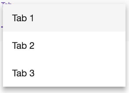
I am very new to Angular and tried to create vertical tabs using tabs, Sidenav and mat-action-list. I had to create separate component for tabs with hidden headers (because of ViewEncapsulation.None usage)

I don't know how to create stackblitz content yet. Here is very basic implementation. Hope it helps someone.

app.component.html

     <mat-sidenav-container class="side-nav-container">
      <mat-sidenav mode="side" opened class="sidenav">
          <mat-action-list>
              <button mat-list-item (click)="index = 0"> tab 1 </button>
              <button mat-list-item (click)="index = 1"> tab 2 </button>
            </mat-action-list>
      </mat-sidenav>
      <mat-sidenav-content>
          <app-tab-content [(index)]=index></app-tab-content>
      </mat-sidenav-content>
    </mat-sidenav-container>

app.component.css

    .side-nav-container {
      position: absolute;
      top: 0;
      bottom: 0;
      left: 0;
      right: 0;
      background: #eee;
    }


    .sidenav {
      width: 200px;
      background: rgb(15,62,9);
    }

    mat-action-list .mat-list-item {
      color : white;
    }

app.component.ts

    import { Component } from '@angular/core';

    @Component({
      selector: 'my-app',
      templateUrl: './app.component.html',
      styleUrls: ['./app.component.css']
    })
    export class AppComponent {
      index: number;
    }

tab-content.component.html

       <mat-tab-group [(selectedIndex)]="index" class="header-less-tabs" animationDuration="0ms">
        <mat-tab> Content 1 </mat-tab>
        <mat-tab> Content 2 </mat-tab>
      </mat-tab-group>

tab-content.component.css

    .header-less-tabs.mat-tab-group .mat-tab-header {
      display: none;
    }

tab-content.component.ts

    import { Component, OnInit, ViewEncapsulation, Input } from '@angular/core';

    @Component({
      selector: 'app-tab-content',
      templateUrl: './tab-content.component.html',
      styleUrls: ['./tab-content.component.css'],
      encapsulation: ViewEncapsulation.None
    })
    export class TabContentComponent {

      @Input() index: number = 1;

    }
Atul Kumbhar
  • 1,073
  • 16
  • 26
3

Use the below code for the vertical tab using angular material.

HTML

<div class="container">
  <div id="content">
    <div id="main-content">
      <mat-tab-group>
        <mat-tab label="Tab One">
          Tab One Content
        </mat-tab>
        <mat-tab label="Tab Two">
          Tab Two Content
        </mat-tab>
      </mat-tab-group>
    </div>
  </div>
</div>

SCSS

:host {
    >.container {
        max-width: 1264px;
        width: 100%;
        margin: 0 auto;
        display: flex;
        justify-content: space-between;
        background: none;
    }
    /deep/ {
        .mat-tab-group {
            flex-direction: row;
        }
        .mat-tab-header {
          border-bottom: none;
        }
        .mat-tab-header-pagination {
            display: none !important;
        }
        .mat-tab-labels {
            flex-direction: column;
        }
        .mat-ink-bar {
            height: 100%;
            left: 98% !important;
        }
        .mat-tab-body-wrapper {
            flex: 1 1 auto;
        }
    }
}

.container {
    position: relative;
    width: 100%;
    flex: 1 0 auto;
    margin: 0 auto;
    text-align: left;
}

#content {
    box-sizing: content-box;
    margin: 0 auto;
    padding: 15px;
    width: 1264px;
    background-color: #ffffff;
}

#content {
    max-width: 1100px;
    width: 100%;
    background-color: #ffffff;
    padding: 24px;
    box-sizing: border-box;
}

#content,
#main-content {
    &::before,
    &::after {
        content: "";
        display: table;
    }
    &::after {
        clear: both;
    }
}

Stackblitz Demo here

Sathiamoorthy
  • 8,831
  • 9
  • 65
  • 77
2

I have created a vertical tab, I feel this is a better one.

app.component.html

<mat-tab-group [@.disabled]="true" >
    <mat-tab>
        <ng-template mat-tab-label>
            <mat-icon>home</mat-icon>Home
        </ng-template>
        <div>Content 1</div>
    </mat-tab>
    <mat-tab>
        <ng-template mat-tab-label>
            <mat-icon>login</mat-icon>Login
        </ng-template>
        Content 2
    </mat-tab>
    <mat-tab>
        <ng-template mat-tab-label>
            <mat-icon>code</mat-icon>Code 
        </ng-template>
        Content 3
    </mat-tab>
</mat-tab-group>

app.component.css

:host {
  display: flex;
  flex-direction: column;
  overflow: hidden;
}

:host ::ng-deep .mat-tab-labels {
  flex-direction: column;
}

mat-tab-group {
  flex-grow: 1;
  display: flex;
  flex-direction: row;
}

:host ::ng-deep .mat-tab-body-wrapper {
  flex-grow: 1;
  display: flex;
  flex-direction: column;
}

mat-tab-body {
  flex-grow: 1;
  display: flex;
  flex-direction: column;
}

:host ::ng-deep mat-ink-bar {
  display: none;
}

/* Styles for the active tab label */
:host ::ng-deep.mat-tab-label.mat-tab-label-active {
    background-color: transparent;
    color: red;
    background-color: yellow;
    border-right: 2px solid red;
}
/* Styles for the active tab label */
:host ::ng-deep.mat-tab-label {
    background-color: transparent;
    /* background-color: lightgray; */
}

Screenshot:

enter image description here

Stackblitz Demo: https://stackblitz.com/edit/angular-verticall-tabs

Sathiamoorthy
  • 8,831
  • 9
  • 65
  • 77