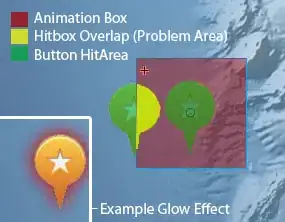
I created a map of some large ports. With 'x' and 'y' latitude and longitude and 'text' the port names.
x,y = map(lonA, latA)
map.scatter(x, y, s=Size, c=color, marker='o', label = 'Ports',alpha=0.65, zorder=2)
for i in range (0,n):
  plt.annotate(text[i],xy=(x[i],y[i]),ha='right')
The dots I plotted (bigger dots for bigger ports) overlap with the labels. How do I plot them a little further away to increase readability?

