Is there a way to control the size of the radio button in CSS ?
Asked
Active
Viewed 4.3e+01k times
15 Answers
82
This css seems to do the trick:
input[type=radio] {
    border: 0px;
    width: 100%;
    height: 2em;
}
Setting the border to 0 seems to allow the user to change the size of the button and have the browser render it in that size for eg. the above height: 2em will render the button at twice the line height. This also works for checkboxes (input[type=checkbox]). Some browsers render better than others.
From a windows box it works in IE8+, FF21+, Chrome29+.
KyleMit
- 30,350
- 66
- 462
- 664
user2745744
- 853
- 6
- 2
-
Made the tiny for me in Chromium. – Pocketsand May 09 '17 at 21:38
69
Old question but now there is a simple solution, compatible with most browsers, which is to use CSS3. I tested in IE, Firefox and Chrome and it works.
input[type="radio"] {
  -ms-transform: scale(1.5); /* IE 9 */
  -webkit-transform: scale(1.5); /* Chrome, Safari, Opera */
  transform: scale(1.5);
}
Change the value 1.5, in this case an increment of 50% in size, according to your needs. If the ratio is very high, it can blur the radio button. The next image shows a ratio of 1.5.
João Pimentel Ferreira
- 14,289
- 10
- 80
- 109
-
9This solution, although works, makes radio buttons blurry. Do not use this. – Vadim Sep 14 '17 at 14:58
-
2It will depend on the amount of scale. At a ratio of 1.5 it is OK. – João Pimentel Ferreira Sep 15 '17 at 22:44
-
You cannot control the amount of scale. A user may decide to zoom in (be on desktop or a mobile device), in which case the radio buttons would look terrible. – Vadim Oct 02 '17 at 21:13
-
1@Vadim I tested now in Chrome, ratio of 1.5 and zoom 300% and it is perfectly OK. – João Pimentel Ferreira Oct 23 '17 at 16:54
-
4On my relatively low resolution monitor (1920 x 1080), the radio button is quite blurry even at the zoom level of 100%. On retina displays, it will be even more blurry. These days even certain cell phones have a higher resolution that my monitor. Like I said earlier, you cannot control the scaling of an image. It may look okay on some screens. It may look okay on yours, but the solution is not universal. – Vadim Oct 23 '17 at 18:08
-
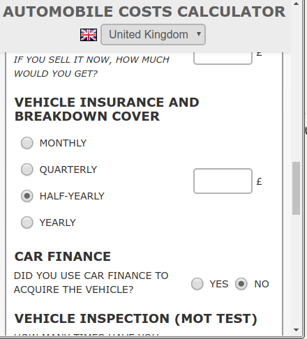
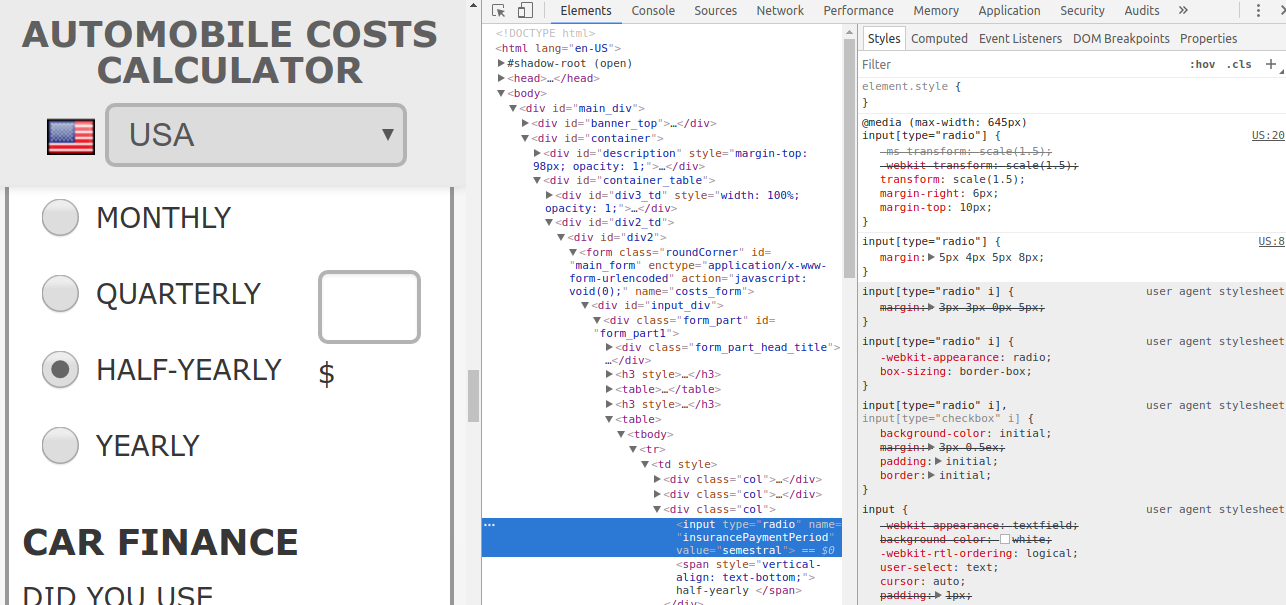
Which browser are you using? I really don't get what you say. Check my site (https://autocosts.info/US) with ratio of 1.5 on radio buttons. Reduce the width of the browser's window (mobile version) to check the enlarged radio buttons. – João Pimentel Ferreira Oct 24 '17 at 20:51
-
Check out this link: https://drive.google.com/file/d/0B07QroQQmlXWbHdOU21jZW9nbXc/view?usp=sharing. Even with zoom at 100%, the radio buttons on your website are already super blurry. Safari also has a slightly different problem with this solution. On some devices the buttons do look okay, by the way. As I've been saying all along, your solution works on some devices and in some browsers, but not always. – Vadim Nov 02 '17 at 15:03
-
@Vadim, strange, on my side it renders perfectly with any zoom! Check my new attachment on the post – João Pimentel Ferreira Nov 02 '17 at 18:46
-
1This solution works well for me with the added bonus to maintained the content of the label vertically centered – user1620090 Jan 06 '21 at 11:22
-
1
-
1Chrome uses vector radio buttons, so this solution works perfectly for it. The radio button of any size will be perfectly sharp. Firefox uses raster radio buttons, so this solution doesn't really suitable for it, since the radio button will be blurry. – user90726 Apr 07 '21 at 15:16
-
Combine it with `accent-color:` to customise the colour of the checked button. However, his only works on new browsers (according to caniuse.com). – MDickten Jan 27 '23 at 11:46
19
You can control radio button's size with css style:
style="height:35px; width:35px;"
This directly controls the radio button size.
<input type="radio" name="radio" value="value" style="height:35px; width:35px; vertical-align: middle;">
Tarik
- 4,270
- 38
- 35
-
2
-
@Rohit Gupta You may change the style="height:35px; width:35px;" to control the size of the radio button. – Tarik Dec 21 '15 at 10:03
-
I tried this and am quite surprised that it worked fine on IE, Edge and Chrome. Firefox, not so much. – zippy72 Jun 07 '19 at 10:06
-
12
A solution which works quite well is described right here: https://developer.mozilla.org/fr/docs/Web/HTML/Element/Input/radio
The idea is to use the appearance property, which when set to none allows to change the width and height of the radio button. The radio buttons are not blurry, and you can add other effects like transitions and stuff.
Here's an example :
input {
  -webkit-appearance: none;
  -moz-appearance: none;
  appearance: none;

  border-radius: 50%;
  width: 16px;
  height: 16px;

  border: 2px solid #999;
  transition: 0.2s all linear;
  margin-right: 5px;

  position: relative;
  top: 4px;
}

input:checked {
  border: 6px solid black;
  outline: unset !important /* I added this one for Edge (chromium) support */
}
The only drawback is that it is not supported yet on IE.
Here's a GIF below to give an idea of what can be achieved. The result will look nicer on an actual browser.
And the plunker : https://plnkr.co/plunk/1W3QXWPi7hdxZJuT
Aurelien FLURA
- 141
- 1
- 4
-
I loved this answer, but unfortunately it broke unexpectedly and no longer functions properly in Chrome. I found a solution at this site that worked beautifully, though: https://moderncss.dev/pure-css-custom-styled-radio-buttons/ – rockusbacchus Sep 20 '22 at 12:11
6
Not directly. In fact, form elements in general are either problematic or impossible to style using CSS alone. the best approach is to:
- hide the radio button using javascript.
- Use javascript to add/display HTML that can be styled how you like e.g.
- Define css rules for a selected state, which is triggered by adding a class "selected" to yuor span.
- Finally, write javascript to make the radio button's state react to clicks on the span, and, vice versa, to get the span to react to changes in the radio button's state (for when users use the keyboard to access the form). the second part of this can be tricky to get to work across all browsers. I use something like the following (which also uses jQuery. I avoid adding extra spans too by styling and applying the "selected" class directly to the input labels).
javascript
var labels = $("ul.radioButtons).delegate("input", "keyup", function () { //keyboard use
        if (this.checked) {
            select($(this).parent());
        }
    }).find("label").bind("click", function (event) { //mouse use
        select($(this));
    });

function select(el) {
    labels.removeClass("selected");
    el.addClass("selected");
}
html
<ul class="radioButtons">
    <li>
        <label for="employee1">
            employee1
            <input type="radio" id="employee1" name="employee" />
        </label>
    </li>
    <li>
        <label for="employee2">
            employee1
            <input type="radio" id="employee2" name="employee" />
        </label>
    </li>
</ul>
DreadPirateShawn
- 8,164
- 4
- 49
- 71
wheresrhys
- 22,558
- 19
- 94
- 162
3
Here's one approach. By default the radio buttons were about twice as large as labels.
(See CSS and HTML code at end of answer)
Safari: 10.0.3

Chrome: 56.0.2924.87

Firefox: 50.1.0

Internet Explorer: 9 (Fuzziness not IE's fault, hosted test on netrenderer.com)

CSS:
.sortOptions > label {
    font-size:          8px;
}

.sortOptions > input[type=radio] {
    width:              10px;
    height:             10px;
}
HTML:
<div class="rightColumn">Answers
    <span class="sortOptions">
        <input type="radio" name="answerSortList" value="credate"/>
        <label for="credate">Creation</label>

        <input type="radio" name="answerSortList" value="lastact"/>
        <label for="lastact">Activity</label>

        <input type="radio" name="answerSortList" value="score"/>
        <label for="score">Score</label>

        <input type="radio" name="answerSortList" value="upvotes"/>
        <label for="upvotes">Up votes</label>

        <input type="radio" name="answerSortList" value="downvotes"/>
        <label for="downvotes">Down Votes</label>

        <input type="radio" name="answerSortList" value="accepted"/>
        <label for="downvotes">Accepted</label>

    </span>
</div>
clearlight
- 12,255
- 11
- 57
- 75
3
<!DOCTYPE html>
<html lang="en">
<head>
  <title>Bootstrap Example</title>
  <meta charset="utf-8">
  <meta name="viewport" content="width=device-width, initial-scale=1">
  <link rel="stylesheet" href="https://maxcdn.bootstrapcdn.com/bootstrap/3.3.7/css/bootstrap.min.css">
  <script src="https://ajax.googleapis.com/ajax/libs/jquery/3.2.1/jquery.min.js"></script>
  <script src="https://maxcdn.bootstrapcdn.com/bootstrap/3.3.7/js/bootstrap.min.js"></script>
  <style>
input[type="radio"] {
    -ms-transform: scale(1.5); /* IE 9 */
    -webkit-transform: scale(1.5); /* Chrome, Safari, Opera */
    transform: scale(1.5);
}
  </style>
</head>
<body>

<div class="container">
  <h2>Form control: inline radio buttons</h2>
  <p>The form below contains three inline radio buttons:</p>
  <form>
    <label class="radio-inline">
      <input type="radio" name="optradio">Option 1
    </label>
    <label class="radio-inline">
      <input type="radio" name="optradio">Option 2
    </label>
    <label class="radio-inline">
      <input type="radio" name="optradio">Option 3
    </label>
  </form>
</div>

</body>
</html>
Waruna Manjula
- 3,067
- 1
- 34
- 33
-
1Thanks for providing an answer, some explanation would be nice :) – Tha'er AlAjlouni ثائر العجلوني Feb 04 '18 at 07:11
3
Resizing the default widget doesn’t work in all browsers, but you can make custom radio buttons with JavaScript. One of the ways is to create hidden radio buttons and then place your own images on your page. Clicking on these images changes the images (replaces the clicked image with an image with a radio button in a selected state and replaces the other images with radio buttons in an unselected state) and selects the new radio button.
Anyway, there is documentation on this subject. For example, read this: Styling Checkboxes and Radio Buttons with CSS and JavaScript.
Arseny
- 5,159
- 4
- 21
- 24
3
Well, I am from the future as compared to the posted year of this question, but I believe my answer will benefit all the new visitors: So if you want to increase the size of the "radio" button with CSS you can simply do it by putting the following styling rules in CSS and it will help you,
input[radio] {
  height: 20px;
  width: 20px;
  vertical-align: middle;
}
2
This works fine for me in all browsers:
(inline style for simplicity...)
<label style="font-size:16px;">
    <input style="height:1em; width:1em;" type="radio">
    <span>Button One</span>
</label>
The size of both the radio button and text will change with the label's font-size.
Ron Richardson
- 111
- 1
- 6
1
Directly you can not do this. [As per my knowledge].
You should use images to supplant the radio buttons. You can make them function in the same manner as the radio buttons inmost cases, and you can make them any size you want.
Harry Joy
- 58,650
- 30
- 162
- 207
-
1This answer is extremely ill-informed - of course you can do it directly. And no you shouldn't try to use images in the first instance - it would cause extra unnecessary bloat on your page – Jasdeep Khalsa Jun 21 '18 at 14:47
-
Using image placeholders for radio buttons doesnt seem like a good idea to me – A5H1Q Jun 23 '21 at 06:46
0
You can also use the transform property, with required value in scale:
input[type=radio]{transform:scale(2);}
Abhishek Kumawat
- 780
- 1
- 10
- 25
0
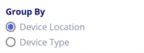
(Vue3) HTML:
<h2>Group By</h2>
<div class="radioButtons">
   <label><input type="radio" id="groupByDevice"
      v-model="data.groupBy" value="device" />
      <span>Device Location</span>
   </label>
   <label><input type="radio" id="groupByLocation"
      v-model="data.groupBy" value="location" />
      <span>Device Type</span></label>
   </div>
</div>
SASS:
$vw-viewport: 2400px;
@function toVw($vw-viewport, $value) {
   @return ($value / $vw-viewport) * 100vw;
}

label {
  font-size: toVw($vw-viewport, 16px);
  line-height: toVw($vw-viewport, 18px);
}

.radioButtons {
  > label {
    white-space: no-wrap;
    display: inline-block;
    height: toVw($vw-viewport, 22px);
    margin: 0 toVw($vw-viewport, 10px) toVw($vw-viewport, 5px) 0;

    > input[type=radio] {
      -webkit-appearance: none;
      -moz-appearance: none;
      appearance: none;
      display: inline-block;
      border-radius: 50%;
      width: toVw($vw-viewport, 18px);
      height:toVw($vw-viewport, 18px);
      border: toVw($vw-viewport,2px) solid #747474;
      margin: 0;
      position: relative;
      top: toVw($vw-viewport, 2px);
      background: white;

      &::after {
        content: '';
        position: absolute;
        top: 12.5%;
        left: 12.5%;
        right: 12.5%;
        bottom: 12.5%;
        width: auto;
        height: auto;
        background: rgb(80, 95, 226);
        opacity: 0;
        border-radius: 50%;
        transition: 0.2s opacity linear;
      }

      &:checked {
        &::after {
          opacity: 1 !important;
          background: rgb(80, 95, 226) !important;
        }
      }
    }

    &:hover {
      cursor: pointer;
      > input[type=radio]::after {
        opacity: 1;
        background: #cfd1e2;
      }
    }

    > span {
      display: inline-block;
      position: relative;
      top: toVw($vw-viewport, -1px);
      padding-left: toVw($vw-viewport, 7px);
    }
  }
}
The result is like this. On hover, a gray dot appears as well. The labels will wrap horizontally when there is room, there was not enough room here so they stack. This scales with the page. If you don't need that, remove the SASS function and use the pixels directly. This is a case where !important is being used correctly IMHO, in this case to override hover when the radio is checked.
GeeWhizBang
- 699
- 4
- 27
-2
try this code... it may be the ans what you exactly looking for
body, html{
  height: 100%;
  background: #222222;
}

.container{
  display: block;
  position: relative;
  margin: 40px auto;
  height: auto;
  width: 500px;
  padding: 20px;
}

h2 {
 color: #AAAAAA;
}

.container ul{
  list-style: none;
  margin: 0;
  padding: 0;
 overflow: auto;
}

ul li{
  color: #AAAAAA;
  display: block;
  position: relative;
  float: left;
  width: 100%;
  height: 100px;
 border-bottom: 1px solid #333;
}

ul li input[type=radio]{
  position: absolute;
  visibility: hidden;
}

ul li label{
  display: block;
  position: relative;
  font-weight: 300;
  font-size: 1.35em;
  padding: 25px 25px 25px 80px;
  margin: 10px auto;
  height: 30px;
  z-index: 9;
  cursor: pointer;
  -webkit-transition: all 0.25s linear;
}

ul li:hover label{
 color: #FFFFFF;
}

ul li .check{
  display: block;
  position: absolute;
  border: 5px solid #AAAAAA;
  border-radius: 100%;
  height: 25px;
  width: 25px;
  top: 30px;
  left: 20px;
 z-index: 5;
 transition: border .25s linear;
 -webkit-transition: border .25s linear;
}

ul li:hover .check {
  border: 5px solid #FFFFFF;
}

ul li .check::before {
  display: block;
  position: absolute;
 content: '';
  border-radius: 100%;
  height: 15px;
  width: 15px;
  top: 5px;
 left: 5px;
  margin: auto;
 transition: background 0.25s linear;
 -webkit-transition: background 0.25s linear;
}

input[type=radio]:checked ~ .check {
  border: 5px solid #0DFF92;
}

input[type=radio]:checked ~ .check::before{
  background: #0DFF92;
}
<ul>
<li>
<input type="radio" id="f-option" name="selector">
<label for="f-option">Male</label>
<div class="check"></div>
</li>
<li>
<input type="radio" id="s-option" name="selector">
<label for="s-option">Female</label>
<div class="check"><div class="inside"></div></div>
</li>
<li>
<input type="radio" id="t-option" name="selector">
<label for="t-option">Transgender</label>
<div class="check"><div class="inside"></div></div>
</li>
</ul>
Mausumi
- 45
- 5
-
2While this code may answer the question, providing additional context regarding how and/or why it solves the problem would improve the answer's long-term value. Please read this [how-to-answer](http://stackoverflow.com/help/how-to-answer) for providing quality answer. – thewaywewere Jun 07 '17 at 06:47
-
thank you for your comment and guidance .i m new bie of stack overflow.this ans was find out by myself by the help of google so i though it may save others times. so i post it here... – Mausumi Jun 07 '17 at 07:18
-
@Mausumi Yes, but some additional explanation as to _how_ and _why_ is works would make it a much better stack overflow answer :-) – starbeamrainbowlabs Aug 26 '19 at 15:13
-3
<html>
<head>
</head>
<body>
<style>
.redradio {border:5px black solid;border-radius:25px;width:25px;height:25px;background:red;float:left;}
.greenradio {border:5px black solid;border-radius:25px;width:29px;height:29px;background:green;float:left;}
.radiobuttons{float:left;clear:both;margin-bottom:10px;}
</style>
<script type="text/javascript">
<!--
function switchON(groupelement,groupvalue,buttonelement,buttonvalue) {
var groupelements = document.getElementById(groupelement);
var buttons = groupelements.getElementsByTagName("button");
for (i=0;i<buttons.length;i++) {
if (buttons[i].id.indexOf("_on") != -1) {
buttons[i].style.display="none";
} else {
buttons[i].style.display="block";
}
}
var buttonON = buttonelement + "_button_on";
var buttonOFF = buttonelement + "_button_off";
document.getElementById(buttonON).style.display="block";
document.getElementById(buttonOFF).style.display="none";
document.getElementById(groupvalue).value=buttonvalue;
}
// -->
</script>
<form>
<h1>farbige Radiobutton</h1>
<div id="button_group">
<input type="hidden" name="button_value" id="button_value" value=""/>
<span class="radiobuttons">
<button type="button" value="OFF1" name="button1_button_off" id="button1_button_off" onclick="switchON('button_group','button_value','button1',this.value)" class="redradio"></button>
<button type="button" value="ON1" name="button1_button_on" id="button1_button_on" style="display:none;" class="greenradio"></button>
<label for="button1_button_on"> Ich will eins</label>
</span><br/>
<span class="radiobuttons">
<button type="button" value="OFF2" name="button2_button_off" id="button2_button_off" onclick="switchON('button_group','button_value','button2',this.value)" class="redradio"></button>
<button type="button" value="ON2" name="button2_button_on" id="button2_button_on" style="display:none;" class="greenradio"></button>
<label for="button2_button_on"> Ich will zwei</label>
</span><br/>
<span class="radiobuttons">
<button type="button" value="OFF3" name="button3_button_off" id="button3_button_off" onclick="switchON('button_group','button_value','button3',this.value)" class="redradio"></button>
<button type="button" value="ON3" name="button3_button_on" id="button3_button_on" style="display:none;" class="greenradio"></button>
<label for="button3_button_on"> Ich will drei</label>
</span><br/>
<span class="radiobuttons">
<button type="button" value="OFF4" name="button4_button_off" id="button4_button_off" onclick="switchON('button_group','button_value','button4',this.value)" class="redradio"></button>
<button type="button" value="ON4" name="button4_button_on" id="button4_button_on" style="display:none;" class="greenradio"></button>
<label for="button4_button_on"> Ich will vier</label>
</span>
</div>
</form>
</body>
</html>
Matthias Erker
- 3
- 1
-
1It would have been useful to have comments or description on how this works. – James A Mohler Sep 24 '13 at 20:34
-
3And it would have been useful to not have structural errors right at the start of your source. – Mr Lister Dec 12 '13 at 14:00