1

What I want is quite simple, or so I thought. I have many spectograms to compute and display which is time consuming to compute, so I want to save them in variables to display them without redoing the computation. The problem is that I can't find a way to plot them like they appear if I directly use the function spectogram().

Example :

sampling_rate = 100;
spectrogram(data,100,20,[],sampling_rate,'yaxis');
caxis([-20 60])

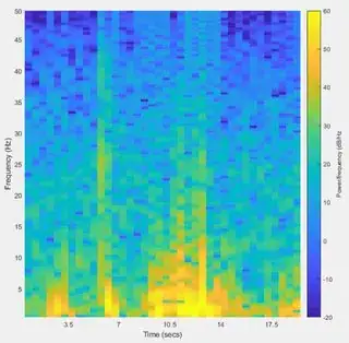
This displays a spectogram exactly as I want it :

Spectrogram

I read the doc and I understand that I can save the results by doing something like this :

[S,F,T] = spectrogram(data,100,20,[],sampling_rate);

Also, I know that the function spectogram internally calls surf().

I found this post that seems to give a solution to my problem by doing this :

[S,F,T] = spectrogram(data,100,20,[],sampling_rate);
surf(T,F,abs(S),'EdgeColor','none');
axis tight; view(0,90);

But I get this plot, which is far from what I expected:

Empty spectrogram

The axis labels and colorbar are gone, and the colors are completely not scaled. If I do this manually by adding colorbar; caxis([-20 60]); as previously, I get this thing:

Bad spectrogram

Isn't there a simple solution to save a spectogram and display it on command ?

Like S = spectogram(...) then plot(S)?

ArnoBen
  • 115
  • 3
  • 12

2 Answers2

3

I found a beginning of solution.

If I write :

[S,F,T,P] = spectrogram(data(1:3000),100,20,[],sampling_rate);

P saves the spectral power density in a matrix, which is quite convenient to plot without forgetting to add 10*log10(P):

h = pcolor(10*log10(P));
colorbar;
caxis([-20 60]);
set(h,'EdgeColor','none')

And I get this which is much better:

enter image description here

But I'm still missing the time and frequency axis, because it currently displays the dimension of the matrix P.

Edit:

I finally found some sort of solution which would be dealing with the axis manually. The display of the time is still terrible and I'm certain there is a better way but here we go:

[S,F,T,P] = spectrogram(data(1001:3000),100,50,[],sampling_rate);
h = pcolor(10*log10(P));
cb = colorbar;
caxis([-20 60]);
ylabel(cb, 'Power/frequency (dB/Hz')
set(h,'EdgeColor','none')

xticks(0:round(size(P,2)/6):size(P,2)) 
xt = xticks;
xticklabels([T(xt(2)) T(xt(2:end))]);
xlabel('Time (secs)');

yticks([0:13:size(P,1) size(P,1)])
yt = yticks;
yticklabels(0:5:50);
ylabel('Frequency (Hz)')

enter image description here

The time is saved in the vector T which is decently convenient in order to apply it on the x label. The frequency is stored F but in my case it'll always be between 0-50Hz so I wrote it manually.

I hope it'll help some people, and if you know how to properly set the time axis with automatic labelisation (sec, min, hours set automatically depending on the duration), by all means I would love to know.

ArnoBen
  • 115
  • 3
  • 12
3

If the OP's answer works more or less as expected, then the following shorter code should do the same:

[S,F,T,P] = spectrogram(data(1:3000),100,20,[],sampling_rate);
h = imagesc(T,F,10*log10(P),[-20,60]);
xlabel('Time (secs)')
ylabel('Frequency (Hz)')
colorbar;

(I don't have the data to test it with.) Note that here the x and y ticks are set automatically. If you want to select seconds, minutes, hours depending on the scale of T, you could do:

lab = 'Time (secs)';
if T(end) > 60*60*3
   T = T/(60*60);
   lab = 'Time (hours)';
elseif T(end) > 60*3
   T = T/60;
   lab = 'Time (mins)'
end
h = imagesc(T,F,10*log10(P),[-20,60]);
xlabel(lab)
ylabel('Frequency (Hz)')
colorbar;
Cris Luengo
  • 55,762
  • 10
  • 62
  • 120