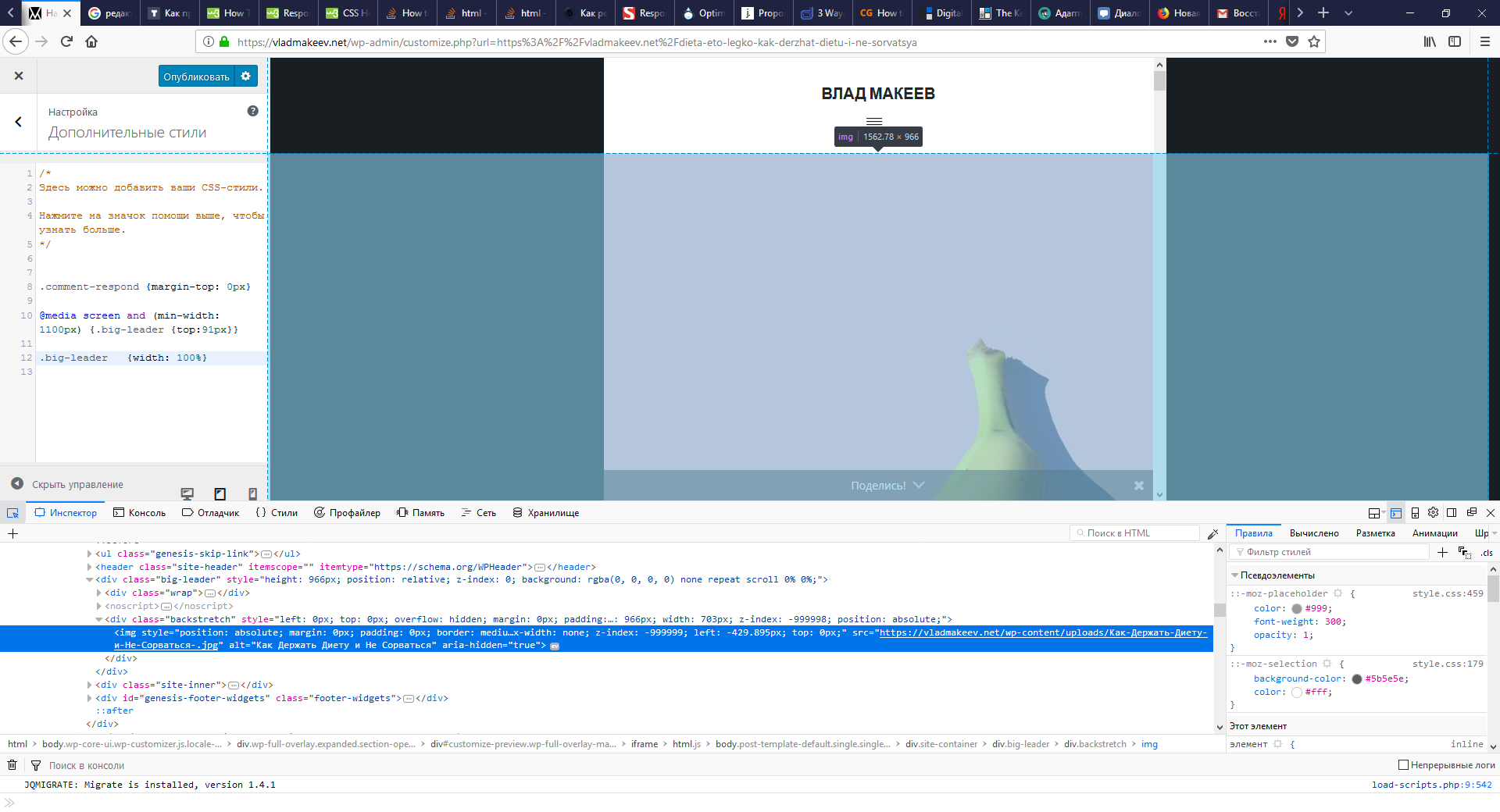
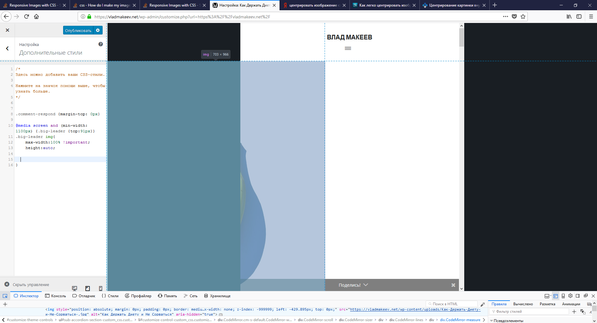
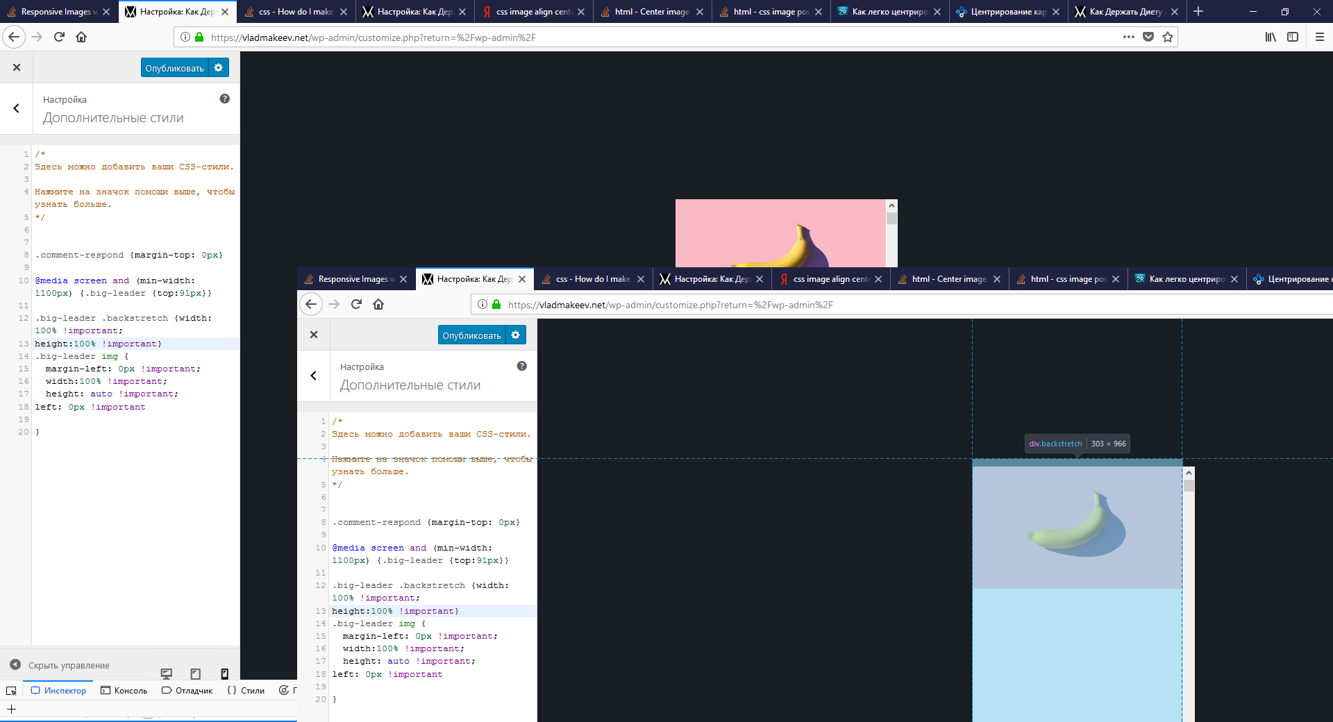
 I can't make my featured images responsive despite internet advice about max-width:100% or auto.
My site is vladmakeev.net
Tablets and phones are shown cropped image. I want full image, what to do?
I made changes that I saw in answer, and my image became proper sized, but it is center on the outside and I can't place in in the middle. After changes