I want to add navigation bar in cart icon with badge count. I have added cart icon in navigation bar using toolbar item. and also created badge count circle view using plugin. if i am giving margin to set that badge icon to toolbar item it is hide behind tabbed page.
It is not displaying on cart icon.
Please help me out this.
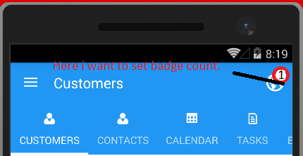
As per above image i want to set badge count with tabbed page.
Below is my XAML Code.
<?xml version="1.0" encoding="utf-8" ?>
<TabbedPage  xmlns="http://xamarin.com/schemas/2014/forms"
         xmlns:x="http://schemas.microsoft.com/winfx/2009/xaml"
          xmlns:lang="clr-namespace:Conekto"
         xmlns:controls="clr-namespace:Conekto.Controls;"
         x:Class="ProjectName.Pages.SalePage">
<TabbedPage.Children>
    <ContentPage Title="{lang:Translate PRODUCTLIST}">
        <Grid Margin="10,10,10,0" BackgroundColor="White">
            <Grid>
                <Grid.RowDefinitions>
                    <RowDefinition Height="50" />
                    <RowDefinition Height="Auto" />
                    <RowDefinition Height="*" />
                </Grid.RowDefinitions>
                <Grid.ColumnDefinitions>
                    <ColumnDefinition Width="*" />
                </Grid.ColumnDefinitions>
                <Button Grid.Row="0" Grid.Column="0" Text="charge 15,123" Style="{StaticResource primaryButton}" />
                <SearchBar x:Name="txtSearch" Grid.Row="1" Grid.Column="0" TextChanged="MySearchBarOnTextChanged" Placeholder="{lang:Translate Search}" SearchCommand="{Binding SearchCommand, Mode=TwoWay}" CancelButtonColor="Blue" Text="{Binding SearchText, Mode=TwoWay}" Style="{StaticResource labelgreycolour}" WidthRequest="50" HorizontalOptions="FillAndExpand"
                    VerticalOptions="FillAndExpand" />
                <StackLayout Grid.Row="2" Grid.Column="0"  VerticalOptions="StartAndExpand" HorizontalOptions="FillAndExpand">
                    <ListView x:Name="listView" ItemsSource="{Binding ProductList}" HasUnevenRows="True" IsPullToRefreshEnabled="true" RefreshCommand="{Binding RefreshCommand}" IsRefreshing="{Binding IsRefreshing}" ItemAppearing="listView_ItemAppearing" ItemSelected="listView_ItemSelected" SelectedItem="{Binding listView_ItemSelected, Mode=TwoWay}" BackgroundColor="White" HorizontalOptions="FillAndExpand">
                        <ListView.ItemTemplate>
                            <DataTemplate>
                                <ViewCell>
                                    <Grid Margin="0,5,0,5">
                                        <Grid.RowDefinitions>
                                            <RowDefinition Height="Auto" />
                                            <RowDefinition Height="Auto" />
                                        </Grid.RowDefinitions>
                                        <Grid.ColumnDefinitions>
                                            <ColumnDefinition Width="10*" />
                                            <ColumnDefinition Width="50*" />
                                            <ColumnDefinition Width="40*" />
                                        </Grid.ColumnDefinitions>
                                        <Image Source="add" Grid.Row="0" Grid.Column="0" Grid.RowSpan="2" Aspect="AspectFit" HeightRequest="30" WidthRequest="30" VerticalOptions="CenterAndExpand"  HorizontalOptions="CenterAndExpand">
                                            <Image.GestureRecognizers>
                                                <TapGestureRecognizer Command="{Binding BindingContext.AddProductCommand, Source={x:Reference listView}}" CommandParameter="{Binding .}" NumberOfTapsRequired="1" />
                                            </Image.GestureRecognizers>
                                        </Image>
                                        <Label Grid.Row="0" Grid.Column="1" VerticalOptions="CenterAndExpand" VerticalTextAlignment="End"  Text="{Binding ProductName,Mode=TwoWay}" Style="{StaticResource entrylogin}" />
                                        <Label Grid.Row="1" Grid.Column="1" VerticalOptions="CenterAndExpand" VerticalTextAlignment="End" Text="{Binding Cost,Mode=TwoWay,StringFormat='XOF {0}'}" Style="{StaticResource listViewsublabel}" />
                                    </Grid>
                                </ViewCell>
                            </DataTemplate>
                        </ListView.ItemTemplate>
                    </ListView>
                </StackLayout>
            </Grid>
            <controls:FloatingActionButton Margin="0,0,20,20"  Grid.Row="0" x:Name="FABCart" HorizontalOptions="End" VerticalOptions="End" WidthRequest="60" HeightRequest="60"  Image="cart" ButtonColor="#09999A" Clicked="FabCart_Clicked" />
            <controls:BadgeView Margin="0,0,32,52"  Grid.Row="0" Text="{Binding TotalCartItem, Mode=TwoWay}" BadgeColor="White" HorizontalOptions="End" VerticalOptions="End" />
        </Grid>
    </ContentPage>
    <ContentPage Title="{lang:Translate KEYPAD}">
        <ContentPage.BackgroundColor>
            <OnPlatform x:TypeArguments="Color">
                <OnPlatform.Platforms>
                    <On Platform="iOS" Value="Black" />
                    <On Platform="Android" Value="#eee" />
                </OnPlatform.Platforms>
            </OnPlatform>
        </ContentPage.BackgroundColor>
        <Grid x:Name="controlGrid" Margin="0,0,0,0" Padding="0,0,0,0" VerticalOptions="FillAndExpand" HorizontalOptions="FillAndExpand">
            <Grid.ColumnSpacing>
                <OnPlatform x:TypeArguments="x:Double">
                    <OnPlatform.Platforms>
                        <On Platform="iOS" Value="1" />
                        <On Platform="Android" Value="0" />
                    </OnPlatform.Platforms>
                </OnPlatform>
            </Grid.ColumnSpacing>
            <Grid.RowSpacing>
                <OnPlatform x:TypeArguments="x:Double">
                    <OnPlatform.Platforms>
                        <On Platform="iOS" Value="1" />
                        <On Platform="Android" Value="0" />
                    </OnPlatform.Platforms>
                </OnPlatform>
            </Grid.RowSpacing>
            <Grid.RowDefinitions>
                <RowDefinition Height="74" />
                <RowDefinition Height="80" />
                <RowDefinition Height="*" />
                <RowDefinition Height="*" />
                <RowDefinition Height="*" />
                <RowDefinition Height="*" />
            </Grid.RowDefinitions>
            <Grid.ColumnDefinitions>
                <ColumnDefinition Width="*" />
                <ColumnDefinition Width="*" />
                <ColumnDefinition Width="*" />
            </Grid.ColumnDefinitions>
            <Button Text="charge 15,123" Margin="12,12,12,12" Grid.Row="0" Grid.Column="0" Grid.ColumnSpan="3" Style="{StaticResource primaryButton}" />
            <Label Text="Add note" FontSize="10" Grid.Column="0" Grid.Row="1" HorizontalTextAlignment="Center" VerticalTextAlignment="End" TextColor="Black" />
            <Label x:Name="lblVal" Margin="0,0,16,0" Grid.Row="1" Grid.Column="1" HorizontalTextAlignment="End" VerticalTextAlignment="Center" TextColor="Black" FontSize="30" Grid.ColumnSpan="2" VerticalOptions="End" />
            <Button Clicked="Button_Clicked" Text ="7" Grid.Row="2" Grid.Column="0" Style="{StaticResource plainButton}" />
            <Button Clicked="Button_Clicked" Text = "8" Grid.Row="2" Grid.Column="1" Style="{StaticResource plainButton}" />
            <Button Clicked="Button_Clicked" Text = "9" Grid.Row="2" Grid.Column="2" Style="{StaticResource plainButton}" />
            <Button Clicked="Button_Clicked" Text = "4" Grid.Row="3" Grid.Column="0" Style="{StaticResource plainButton}" />
            <Button Clicked="Button_Clicked" Text = "5" Grid.Row="3" Grid.Column="1" Style="{StaticResource plainButton}" />
            <Button Clicked="Button_Clicked" Text = "6" Grid.Row="3" Grid.Column="2" Style="{StaticResource plainButton}" />
            <Button Clicked="Button_Clicked" Text = "1" Grid.Row="4" Grid.Column="0" Style="{StaticResource plainButton}" />
            <Button Clicked="Button_Clicked" Text = "2" Grid.Row="4" Grid.Column="1" Style="{StaticResource plainButton}" />
            <Button Clicked="Button_Clicked" Text = "3" Grid.Row="4" Grid.Column="2" Style="{StaticResource plainButton}" />
            <Button Clicked="ButtonClear_Clicked" Text = "C" Grid.Row="5" Grid.Column="0" Style="{StaticResource plainButton}" />
            <Button Clicked="Button_Clicked" Text = "0" Grid.Row="5" Grid.Column="1" Style="{StaticResource plainButton}" />
            <Button Clicked="Button_Clicked" Text = "+" Grid.Row="5" Grid.Column="2" Style="{StaticResource plainButton}" />
        </Grid>
    </ContentPage>
    <ContentPage Title="{lang:Translate SCAN}">
    </ContentPage>
</TabbedPage.Children>
And in .cs Page code i am adding cart icon in toolbar item.
  ToolbarItems.Add(new ToolbarItem("Add Product", "floating", async () =>
            {
                //var page = new ContentPage();
                //var result = await page.DisplayAlert("Title", "Message", "Accept", "Cancel");
                await Navigation.PushAsync(new CreateProductPage() { Title = Helper.GetResxNameByValue("CreateProduct") });

                //Debug.WriteLine("success: {0}", result);
            }));
As per design i have added cart button as floating button. Please do not consider that.