I'm using AntD, thought it would be an easy and quick set up for a common and standard Responsive NavBar, but it turned out it's not responsive by default:
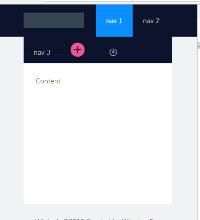
As you can see, it's squashed.
Here is the code:
<Menu
                        theme="dark"
                        mode="horizontal"
                        defaultSelectedKeys={["1"]}
                        style={{ lineHeight: '64px' }}
                        breakpoint="lg"
                        collapsedWidth="0"
                    >
                                <Menu.Item key="1">nav 1</Menu.Item>
                                <Menu.Item key="2">nav 2</Menu.Item>
                                <Menu.Item key="3">nav 3</Menu.Item>
                                <Menu.Item key="4"><Icon spin={true} type="plus-circle" className="publish-btn" /></Menu.Item>
                                <Menu.Item key="5"><Icon spin={true} type="login" className="loggin-btn" /></Menu.Item>
                    </Menu>
So I read the document again and thought I would have to use Grid inside the Menu to make it responsive. However, it threw me errors:
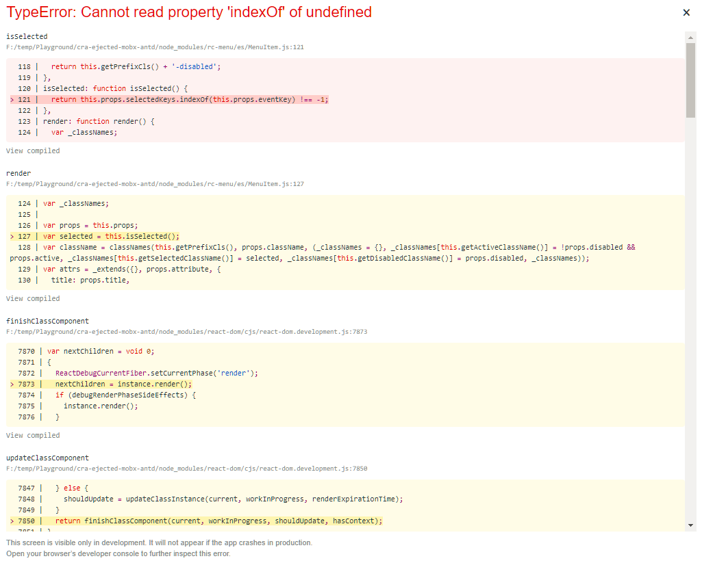
Here is the code:
<Menu
                        theme="dark"
                        mode="horizontal"
                        defaultSelectedKeys={["1"]}
                        style={{ lineHeight: '64px' }}
                        breakpoint="lg"
                        collapsedWidth="0"
                    >

                        <Row key="1" gutter={16}>
                            <Col span={3} key="1">
                                <Menu.Item key="1">nav 1</Menu.Item>
                            </Col>
                            <Col span={3} key="2">
                                <Menu.Item key="2">nav 2</Menu.Item>
                            </Col>
                            <Col span={3} key="3">
                                <Menu.Item key="3">nav 3</Menu.Item>
                            </Col>
                            <Col span={3} offset={9} key="4">
                                <Menu.Item key="4"><Icon spin={true} type="plus-circle" className="publish-btn" /></Menu.Item>
                            </Col>
                            <Col span={3} key="5">
                                <Menu.Item key="5"><Icon type="login" className="loggin-btn" /></Menu.Item>
                            </Col>
                        </Row>
                    </Menu>
Update
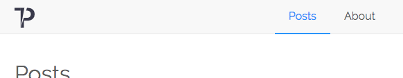
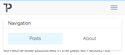
Let me clarify myself. I do not want a Sidebar(as in my case it's a small website, not many pages). All I want is to have a top NavBar when re-sizing the Menu.Items can collapse and become to a hamburger icon. Also, I need 2 menu.items on the right side.