We are working on an android app, and we have encountered an issue where devices in the same density bucket, i.e. "xxhdpi" do not all look the same, i.e. the Pixel and Pixel 2. We have a very image heavy UI and are using a Constraint view to organize the placement of several overlaid images. The Navigation drawer at the top of some of these screens further exacerbates the issue, as the margin is thicker with different densities on the same screen size and the rest of the app in squeezed into a smaller frame.
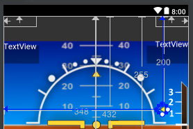
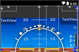
Heres an example of how different the Pixel and Pixel 2 are rendered: Pixel 2 vs. Pixel
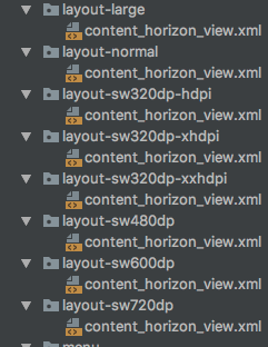
We have tried making more specific layouts to match more specific ranges of DPI but the simulator groups the same devices together no matter what we try. These are the layout categories we've tried, where sw320dp for example refers to a minimum screen width.
Is there a way to combat this issue with constraint view features such as a constraint anchor or percentage constraints? Alternatively can we more narrowly define our layout categories or do something about the dp scale not being the same for similar devices? We have already consulted this page as well as numerous stack overflow posts: Android's Guide on Supporting Multiple Screen Sizes.
Any suggestions, comments, or specific questions welcome, thanks in advance to anyone who takes the time to read this.