I need help on implementing a circular progress bar like this:
How should I implement the Circle to fill by increasing Value property?
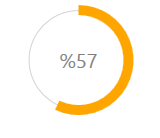
I need help on implementing a circular progress bar like this:
How should I implement the Circle to fill by increasing Value property?
You have a couple of options - the first is to template the ProgressBar control. This turns out to be a little tricky. I wrote a blog post which describes how to use an attached ViewModel to achieve the required effect.
The other alternative is to create your own control from scratch. You could do the following:
I know this is an old issue, but anyways here is my solution:
FOR WINFORMS:
using System;
using System.ComponentModel;
using System.Drawing;
using System.Drawing.Drawing2D;
using System.Windows.Forms;

public class CircularProgressBar : Control
{
    #region Enums

    public enum _ProgressShape
    {
        Round,
        Flat
    }

    public enum _TextMode
    {
        None,
        Value,
        Percentage,
        Custom
    }

    #endregion

    #region Private Variables

    private long _Value;
    private long _Maximum = 100;
    private int _LineWitdh = 1;
    private float _BarWidth = 14f;

    private Color _ProgressColor1 = Color.Orange;
    private Color _ProgressColor2 = Color.Orange;
    private Color _LineColor = Color.Silver;
    private LinearGradientMode _GradientMode = LinearGradientMode.ForwardDiagonal;
    private _ProgressShape ProgressShapeVal;
    private _TextMode ProgressTextMode;

    #endregion

    #region Contructor

    public CircularProgressBar()
    {
        SetStyle(ControlStyles.SupportsTransparentBackColor, true);
        SetStyle(ControlStyles.Opaque, true);
        this.BackColor = SystemColors.Control;
        this.ForeColor = Color.DimGray;

        this.Size = new Size(130, 130);
        this.Font = new Font("Segoe UI", 15);
        this.MinimumSize = new Size(100, 100);
        this.DoubleBuffered = true;

        this.LineWidth = 1;
        this.LineColor = Color.DimGray;

        Value = 57;
        ProgressShape = _ProgressShape.Flat;
        TextMode = _TextMode.Percentage;
    }

    #endregion

    #region Public Custom Properties

    /// <summary>Determina el Valor del Progreso</summary>
    [Description("Valor Entero que determina la posision de la Barra de Progreso."), Category("Behavior")]
    public long Value
    {
        get { return _Value; }
        set
        {
            if (value > _Maximum)
                value = _Maximum;
            _Value = value;
            Invalidate();
        }
    }

    [Description("Obtiene o Establece el Valor Maximo de la barra de Progreso."), Category("Behavior")]
    public long Maximum
    {
        get { return _Maximum; }
        set
        {
            if (value < 1)
                value = 1;
            _Maximum = value;
            Invalidate();
        }
    }

    [Description("Color Inicial de la Barra de Progreso"), Category("Appearance")]
    public Color BarColor1
    {
        get { return _ProgressColor1; }
        set
        {
            _ProgressColor1 = value;
            Invalidate();
        }
    }

    [Description("Color Final de la Barra de Progreso"), Category("Appearance")]
    public Color BarColor2
    {
        get { return _ProgressColor2; }
        set
        {
            _ProgressColor2 = value;
            Invalidate();
        }
    }

    [Description("Ancho de la Barra de Progreso"), Category("Appearance")]
    public float BarWidth
    {
        get { return _BarWidth; }
        set
        {
            _BarWidth = value;
            Invalidate();
        }
    }

    [Description("Modo del Gradiente de Color"), Category("Appearance")]
    public LinearGradientMode GradientMode
    {
        get { return _GradientMode; }
        set
        {
            _GradientMode = value;
            Invalidate();
        }
    }

    [Description("Color de la Linea Intermedia"), Category("Appearance")]
    public Color LineColor
    {
        get { return _LineColor; }
        set
        {
            _LineColor = value;
            Invalidate();
        }
    }

    [Description("Ancho de la Linea Intermedia"), Category("Appearance")]
    public int LineWidth
    {
        get { return _LineWitdh; }
        set
        {
            _LineWitdh = value;
            Invalidate();
        }
    }

    [Description("Obtiene o Establece la Forma de los terminales de la barra de progreso."), Category("Appearance")]
    public _ProgressShape ProgressShape
    {
        get { return ProgressShapeVal; }
        set
        {
            ProgressShapeVal = value;
            Invalidate();
        }
    }

    [Description("Obtiene o Establece el Modo como se muestra el Texto dentro de la barra de Progreso."), Category("Behavior")]
    public _TextMode TextMode
    {
        get { return ProgressTextMode; }
        set
        {
            ProgressTextMode = value;
            Invalidate();
        }
    }

    [Description("Obtiene el Texto que se muestra dentro del Control"), Category("Behavior")]
    public override string Text { get; set; }

    #endregion

    #region EventArgs

    protected override void OnResize(EventArgs e)
    {
        base.OnResize(e);
        SetStandardSize();
    }

    protected override void OnSizeChanged(EventArgs e)
    {
        base.OnSizeChanged(e);
        SetStandardSize();
    }

    protected override void OnPaintBackground(PaintEventArgs p)
    {
        base.OnPaintBackground(p);
    }

    #endregion

    #region Methods

    private void SetStandardSize()
    {
        int _Size = Math.Max(Width, Height);
        Size = new Size(_Size, _Size);
    }

    public void Increment(int Val)
    {
        this._Value += Val;
        Invalidate();
    }

    public void Decrement(int Val)
    {
        this._Value -= Val;
        Invalidate();
    }
    #endregion

    #region Events

    protected override void OnPaint(PaintEventArgs e)
    {
        base.OnPaint(e);
        using (Bitmap bitmap = new Bitmap(this.Width, this.Height))
        {
            using (Graphics graphics = Graphics.FromImage(bitmap))
            {
                graphics.InterpolationMode = System.Drawing.Drawing2D.InterpolationMode.HighQualityBilinear;
                graphics.CompositingQuality = System.Drawing.Drawing2D.CompositingQuality.HighQuality;
                graphics.PixelOffsetMode = System.Drawing.Drawing2D.PixelOffsetMode.HighQuality;
                graphics.SmoothingMode = System.Drawing.Drawing2D.SmoothingMode.AntiAlias;

                //graphics.Clear(Color.Transparent); //<-- this.BackColor, SystemColors.Control, Color.Transparent

                PaintTransparentBackground(this, e);

                //Dibuja el circulo blanco interior:
                using (Brush mBackColor = new SolidBrush(this.BackColor))
                {
                    graphics.FillEllipse(mBackColor,
                            18, 18,
                            (this.Width - 0x30) + 12,
                            (this.Height - 0x30) + 12);
                }
                // Dibuja la delgada Linea gris del medio:
                using (Pen pen2 = new Pen(LineColor, this.LineWidth))
                {
                    graphics.DrawEllipse(pen2,
                        18, 18,
                      (this.Width - 0x30) + 12,
                      (this.Height - 0x30) + 12);
                }

                //Dibuja la Barra de Progreso
                using (LinearGradientBrush brush = new LinearGradientBrush(this.ClientRectangle,
                    this._ProgressColor1, this._ProgressColor2, this.GradientMode))
                {
                    using (Pen pen = new Pen(brush, this.BarWidth))
                    {
                        switch (this.ProgressShapeVal)
                        {
                            case _ProgressShape.Round:
                                pen.StartCap = LineCap.Round;
                                pen.EndCap = LineCap.Round;
                                break;

                            case _ProgressShape.Flat:
                                pen.StartCap = LineCap.Flat;
                                pen.EndCap = LineCap.Flat;
                                break;
                        }

                        //Aqui se dibuja realmente la Barra de Progreso
                        graphics.DrawArc(pen,
                            0x12, 0x12,
                            (this.Width - 0x23) - 2,
                            (this.Height - 0x23) - 2,
                            -90,
                            (int)Math.Round((double)((360.0 / ((double)this._Maximum)) * this._Value)));
                    }
                }

                #region Dibuja el Texto de Progreso

                switch (this.TextMode)
                {
                    case _TextMode.None:
                        this.Text = string.Empty;
                        break;

                    case _TextMode.Value:
                        this.Text = _Value.ToString();
                        break;

                    case _TextMode.Percentage:
                        this.Text = Convert.ToString(Convert.ToInt32((100 / _Maximum) * _Value));
                        break;

                    default:
                        break;
                }

                if (this.Text != string.Empty)
                {
                    using (Brush FontColor = new SolidBrush(this.ForeColor))
                    {
                        int ShadowOffset = 2;
                        SizeF MS = graphics.MeasureString(this.Text, this.Font);
                        SolidBrush shadowBrush = new SolidBrush(Color.FromArgb(100, this.ForeColor));

                        //Sombra del Texto:
                        graphics.DrawString(this.Text, this.Font, shadowBrush,
                            Convert.ToInt32(Width / 2 - MS.Width / 2) + ShadowOffset,
                            Convert.ToInt32(Height / 2 - MS.Height / 2) + ShadowOffset
                        );

                        //Texto del Control:
                        graphics.DrawString(this.Text, this.Font, FontColor,
                            Convert.ToInt32(Width / 2 - MS.Width / 2),
                            Convert.ToInt32(Height / 2 - MS.Height / 2));
                    }
                }

                #endregion

                //Aqui se Dibuja todo el Control:
                e.Graphics.DrawImage(bitmap, 0, 0);
                graphics.Dispose();
                bitmap.Dispose();
            }
        }
    }

    private static void PaintTransparentBackground(Control c, PaintEventArgs e)
    {
        if (c.Parent == null || !Application.RenderWithVisualStyles)
            return;

        ButtonRenderer.DrawParentBackground(e.Graphics, c.ClientRectangle, c);
    }

    /// <summary>Dibuja un Circulo Relleno de Color con los Bordes perfectos.</summary>
    /// <param name="g">'Canvas' del Objeto donde se va a dibujar</param>
    /// <param name="brush">Color y estilo del relleno</param>
    /// <param name="centerX">Centro del Circulo, en el eje X</param>
    /// <param name="centerY">Centro del Circulo, en el eje Y</param>
    /// <param name="radius">Radio del Circulo</param>
    private void FillCircle(Graphics g, Brush brush, float centerX, float centerY, float radius)
    {
        g.InterpolationMode = System.Drawing.Drawing2D.InterpolationMode.HighQualityBilinear;
        g.CompositingQuality = System.Drawing.Drawing2D.CompositingQuality.HighQuality;
        g.PixelOffsetMode = System.Drawing.Drawing2D.PixelOffsetMode.HighQuality;
        g.SmoothingMode = System.Drawing.Drawing2D.SmoothingMode.AntiAlias;

        using (System.Drawing.Drawing2D.GraphicsPath gp = new System.Drawing.Drawing2D.GraphicsPath())
        {
            g.FillEllipse(brush, centerX - radius, centerY - radius,
                      radius + radius, radius + radius);
        }
    }

    #endregion
}
IMPLEMENTATION:
Control Looks like this:
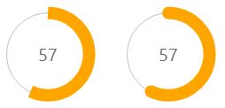
Enjoy.
It's a bit tricky but not impossible. Here is the my implementation using smooth animations to guide. Value converters should be used to create a CircularProgressBar.
CircularProgressBar.cs
 public partial class CircularProgressBar : ProgressBar
{
    public CircularProgressBar()
    {
        this.ValueChanged += CircularProgressBar_ValueChanged;
    }

    void CircularProgressBar_ValueChanged(object sender, RoutedPropertyChangedEventArgs<double> e)
    {
        CircularProgressBar bar = sender as CircularProgressBar;
        double currentAngle = bar.Angle;
        double targetAngle = e.NewValue / bar.Maximum * 359.999;

        DoubleAnimation anim = new DoubleAnimation(currentAngle, targetAngle, TimeSpan.FromMilliseconds(500));
        bar.BeginAnimation(CircularProgressBar.AngleProperty, anim, HandoffBehavior.SnapshotAndReplace);
    }

    public double Angle
    {
        get { return (double)GetValue(AngleProperty); }
        set { SetValue(AngleProperty, value); }
    }

    // Using a DependencyProperty as the backing store for Angle.  This enables animation, styling, binding, etc...
    public static readonly DependencyProperty AngleProperty =
        DependencyProperty.Register("Angle", typeof(double), typeof(CircularProgressBar), new PropertyMetadata(0.0));

    public double StrokeThickness
    {
        get { return (double)GetValue(StrokeThicknessProperty); }
        set { SetValue(StrokeThicknessProperty, value); }
    }

    // Using a DependencyProperty as the backing store for StrokeThickness.  This enables animation, styling, binding, etc...
    public static readonly DependencyProperty StrokeThicknessProperty =
        DependencyProperty.Register("StrokeThickness", typeof(double), typeof(CircularProgressBar), new PropertyMetadata(10.0));
}
AngleToPointConverter.cs
class AngleToPointConverter : IValueConverter
{

    public object Convert(object value, Type targetType, object parameter, System.Globalization.CultureInfo culture)
    {
        double angle = (double)value;
        double radius = 50;
        double piang = angle * Math.PI / 180;

        double px = Math.Sin(piang) * radius + radius;
        double py = -Math.Cos(piang) * radius + radius;

        return new Point(px, py);
    }

    public object ConvertBack(object value, Type targetType, object parameter, System.Globalization.CultureInfo culture)
    {
        throw new NotImplementedException();
    }
}
AngleToIsLargeConverter.cs
class AngleToIsLargeConverter : IValueConverter
{

    public object Convert(object value, Type targetType, object parameter, System.Globalization.CultureInfo culture)
    {
        double angle = (double)value;

        return angle > 180;
    }

    public object ConvertBack(object value, Type targetTypes, object parameter, System.Globalization.CultureInfo culture)
    {
        throw new NotImplementedException();
    }
}
App.xaml
<Application x:Class="WpfApplication1.App"
         xmlns="http://schemas.microsoft.com/winfx/2006/xaml/presentation"
         xmlns:x="http://schemas.microsoft.com/winfx/2006/xaml"
         StartupUri="MainWindow.xaml"
         xmlns:my="clr-namespace:WpfApplication1">
<Application.Resources>
    <my:AngleToPointConverter x:Key="prConverter"/>
    <my:AngleToIsLargeConverter x:Key="isLargeConverter"/>

    <Style x:Key="circularProgressBar" TargetType="my:CircularProgressBar">
        <Setter Property="Value" Value="10"/>
        <Setter Property="Maximum" Value="100"/>
        <Setter Property="StrokeThickness" Value="10"/>
        <Setter Property="Template">
            <Setter.Value>
                <ControlTemplate TargetType="my:CircularProgressBar">
                        <Canvas Width="100" Height="100">
                        <Ellipse Width="100" Height="100" Stroke="LightGray"
                                     StrokeThickness="1"/>

                        <Path Stroke="{TemplateBinding Background}"
                                  StrokeThickness="{TemplateBinding StrokeThickness}">
                                <Path.Data>
                                    <PathGeometry>
                                        <PathFigure x:Name="fig" StartPoint="50,0">
                                            <ArcSegment RotationAngle="0" SweepDirection="Clockwise"
                                                        Size="50,50"
                                                        Point="{Binding Path=Angle, Converter={StaticResource prConverter}, RelativeSource={RelativeSource FindAncestor, AncestorType=ProgressBar}}"
                                                        IsLargeArc="{Binding Path=Angle, Converter={StaticResource isLargeConverter}, RelativeSource={RelativeSource FindAncestor, AncestorType=ProgressBar}}"
                                                        >
                                            </ArcSegment>
                                        </PathFigure>
                                    </PathGeometry>
                                </Path.Data>
                            </Path>
                            <Border Width="100" Height="100">
                                <TextBlock Foreground="Gray" HorizontalAlignment="Center" VerticalAlignment="Center"
                                       Text="{Binding Path=Value, StringFormat={}%{0},
                                RelativeSource={RelativeSource TemplatedParent}}"
                                           FontSize="{TemplateBinding FontSize}"/>
                            </Border>
                        </Canvas>

                </ControlTemplate>
            </Setter.Value>
        </Setter>
    </Style>
</Application.Resources>
It can be more customized by adding a few more properties such as InnerRadius, Radius etc.
Have you looked at ValueConverters? You can bind to the Value property in the template using TemplateBinding and use an appropriate value converter to change the value to whats is useful for a Circular progress bar.
EDIT:
In the template:
Add a circle fill with yellow.
Add another circle on top with color orange.
Use a value converter(or multi value converter) to return a clipping geometry (using arc segment possibly) for the circle added in 2.
Clip the circle in 2. with geometry returned in 3.
Downvoter gives me my repz back.