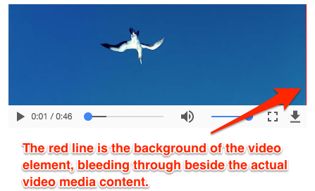
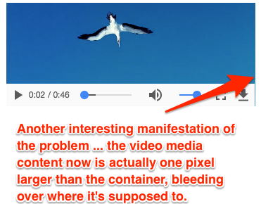
It appears that some browsers, when rendering image or video media that is positioned and sized on the page using percentages, occasionally round the size of the media content (image or video) differently than they round the actual DOM element that contains them. We're not sure how to fix this. There are two variants: HTML5 video element, and div with a background image (set to "contain").
My testing is on Chrome 64.0 on macOS Sierra, but we've had the same issue reported on Chrome on Windows. I've not yet tested other browsers.
Video Element
Here's an example of a very minimal test case that shows the issue. Resize the width of your browser until you see a red line beside the video, or the video overflowing its element (as shown in the screenshots below).
video {
  background-color: red;
  width: 32%;
  margin: 0 auto;
  display: block;
}
<video controls src="http://vjs.zencdn.net/v/oceans.mp4">
</video>Or, as a codepen: https://codepen.io/jthomerson/pen/mXrpZr
Here are two variations of the error:
Is there a way to fix this? JW Player appears to be working around this with some complex JS that's watching for all resize events and then adding dynamic transforms and positioning directly to the video element. Is there a simpler way? Or if that's the only way, is there a library out there where this has been standardized? (We are using VideoJS, but this isn't a problem specific to VideoJS).
Background Image
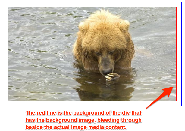
The same thing can happen with a div that is sized to be the exact same aspect ratio as your background image, and the background image uses no-repeat and contain.
.container {
  width: 60%;
  border: 1px solid blue;
  margin: 0 auto;
  padding: 1em;
}
.someBox {
  background-color: red;
  background-image: url('https://placebear.com/640/360');
  background-repeat: no-repeat;
  background-size: contain;
  margin: 0 auto;
  display: block;
  padding-top: 56.25%;
}
<div class="container">
<div class="someBox">
</div>
</div>Or, as a codepen: https://codepen.io/jthomerson/pen/xYEYZK
Here is an example of the error:
Of course, in this situation you might say "just change contain to cover, that's what it's made for". That's true, but in our actual usecase we are using a div with a background image as the poster image for a video when the video is not playing. However, we don't know the actual aspect ratio of the image. The video player itself is always sized to be 16:9, but in some cases our clients upload a poster image that is 1:1 (example: music video album art), or 4:3 or 2:1 (for legacy content where they don't have 16:9 content). So, we couldn't change contain to cover unless we were programmatically loading the image, detecting its size, and then if it's actually 16:9, use cover, otherwise use contain.