-1

I am trying to get this code to behave more responsively but I have not been able to find a good solution.

As the browser window shrinks towards mobile sizes, the list becomes really narrow, and the picture/video items on the right become really small and aesthetically unpleasing. I think this is partially due to the fact that I am unable to get the picture/video items on the right move below the central column, the one with all of the bullet points to allow the to expand out more to the right.

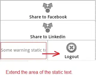
I'd like all elements to take up full width (with the default padding of course) of the screen as the site becomes smaller. Essentially this means that the right-most column containing the video player and the cartoon would move below the entry to its left. Something like this: Want it to look like this on mobile instead of what it currently looking like what the above code currently looks like in mobile: current code: ugly in mobileand ugly in mobile (2). While preserving this look in desktop: Ideal aesthetic in desktop but not in mobile
<section id="about">
     <div class="container">
       <h3 class="font-weight-bold text-center">Discovering The Future.                        </h3>
         <div class="row mt-4">

         </div>
         <div class="row">
             <div class="col">
                <div class="row">                
                    <div class="col-auto">       
                        <img src="https://picsum.photos/140/65" alt="" class="img-fluid testphoto">
                    </div>
                    <div class="col pt-3">
                        <h2>The Cao Lab</h2>
                        <h3 class="font-weight-bold pt-1 pb-3">April 2016 - Present</h3>
                        <ul>
                            <li class="pb-3">Employ alkene metathesis to produce porous molecules valuable for encapsulation and adsorption applications</li>
                            <li class="pb-3">Prepare analytical samples, preform characterization analysis, and interpret results for molecules of interest</li>
                            <li class="pb-3">Communicate research to others by attending conferences and poster presentations</li>
                            <li class="pb-5">Devised a cost-effective method to quantify hydrogen production during evolution experiments</li>
                        </ul>
                    </div>
                    <div class="col-sm-3 ">

                            <div class="embed-responsive embed-responsive-5by3 teensie">
                              <iframe class="embed-responsive-item youtube" src="https://www.youtube.com/embed/KPZ8HHRR1A0"></iframe></div>    
                     </div>
                </div>            
             </div>

         </div>
         <div class="row">
             <div class="col">
                 <div class="row">
                     <div class="col-auto">
                         <img src="https://picsum.photos/140/65" alt="" class="img-fluid testphoto">
                     </div>
                     <div class="col pt-3">
                         <h2>Institut Parisien de Chimie Moléculaire
                            </h2>
                         <p class="text-primary">National Science Foundation Internation REU Program.</p>
                         <h3 class="font-weight-bold pb-3">May 2017 - August 2017</h3>
                         <ul>
                             <li class="pb-3">Conduct study on the selective deprotection of perbenzylated a-cyclodextrin to access novel functionalization</li>
                             <li class="pb-3">Synthesize molecules suitable as ligands in metal-catalysis and for improving chiral HPLC discrimination ability</li>
                             <li class="pb-3">Prepare analytical samples, preform characterization analysis, and interpret data of cyclodextrin derivatives</li>
                             <li>Submitted abstract to present at the Chemical Education Division of the 255th ACS National Meeting</li>
                         </ul>                           
                     </div>
                     <div class="col-sm-3 ">
                            <img src="https://vignette.wikia.nocookie.net/rayman/images/c/cf/Teensy.png" alt="" class="img-fluid teensie2 ">
                            </div>
                     </div>

                 </div>

             </div>

         </div>

 </section>

CSS:

        .shift{
        margin-left:20px;
    }

    .barbie{
      list-style: none;
        margin: 0;
        padding: 0;
    }

    .barbieitem{
      //text-align: right;
      font-size: 1.3em;
    }
    .testphoto { 
      display: inline-block; 
      vertical-align:middle;
   }

    .joblist{
      display: inline-block;
    }

    .labname{
      display: inline-block; 
      vertical-align:middle;
      border:solid black 1px; 
    }

    .youtube {
      max-width: 300px;
      max-height: 300px;
      position: relative !important;
      float: right;

    }

    .teensie{
      top: 50%;
      left:50%;
      transform: translate(-50%,-50%);
    }

    .teensie2{
      position: relative;
      top: 50%;
      left:50%;
      transform: translate(-50%,-50%);
    }
Johannes
  • 64,305
  • 18
  • 73
  • 130
Joseph Romo
  • 153
  • 3
  • 13
  • What have you tried to achieve better responsiveness? Your code doesn't suggest you've employed or tried to employ any additional breakpoints. I'm also unclear why so many of your columns are part of grids embedded in grids? – Robert Jan 29 '18 at 17:18
  • Well actually, this a modified solution of a scaffold provided as an answer to one of my previous questions, which I was directed to ask as a separate question :/ instead. Relevant OP: https://stackoverflow.com/questions/48491026/vertically-centering-images-to-text-in-a-multi-column-container-bootstrap-4/48491213?noredirect=1#comment83989290_48491213 – Joseph Romo Jan 29 '18 at 17:20
  • That this is related to a previous question actually makes this question *less appropriate*, especially given as your provided code does not suggest any attempt has been made at finding a solution. – Robert Jan 29 '18 at 19:16
  • I did try several solutions, this is what works "best". I tried avoiding making a new question, then I got called out for not making a new question. Now I make a new question, and you call me out for making a new question and no one provides a useful answer so.... sorry, but hypocrisy much? – Joseph Romo Jan 29 '18 at 19:18
  • 2
    You call it hypocrisy... but really all anyone wants is a clear question. Your provided HTML isn't a minimum example, you refuse to answer why it also doesn't attempt any of the things you show you want it to do... instead deflecting by referencing previously-asked questions. I will submit a potential solution for your structure shortly but I would encourage you to consider how to better ask questions and respond to criticism in the future. – Robert Jan 29 '18 at 19:53
  • Hi Robert, sorry for the confusion, and thanks for working on a solution, I did not understand that you were asking for clarification for the question. Is there something that is particularly confusing above? I will definitely consider these details more carefully in the future. – Joseph Romo Jan 29 '18 at 19:55

1 Answers1

0

As I understand the question you would like to have the each set of image | content | image/video collapse in a more responsive-friendly fashion so that as you view the contents on a smaller device everything remains easy-to-read.

The solution resides almost entirely in how you implement your Bootstrap Grid and may potentially simplify your layout. Reviewing your provided structure it looks like you aren't using container-fluid despite indicating that you want to take up the full width, and you're also using nested grids in a scenario where they may not be necessary.

Since each section is made up of 3 columns that collapse into full-width on smaller screens, we can treat this as a scenario where each row is a wrapper for your content. In the below code snippet I've setup the following structure:

  1. All 3 columns as 12-wide by default.
  2. Column #1 shrinks to 3-wide at the medium breakpoint (and greater)
  3. Column #2 shrinks to 5-wide at the medium breakpoint (and greater)
  4. Column #3 shrinks to 4-wide at the medium breakpoint (and greater)

At this point your base structure is laid out... on small screens everything is full width and at larger you'll start seeing all 3 content elements in a single line. From here it's merely a matter of adding some additional BS utility classes to help everything render properly:

  • Adding align-items-center mb-4 causes the items to align vertically centered with one another as well as increases the bottom margin between each row.
  • Adding mb-3 mb-md-0 to the first column ensures that there will be padding below each image on smaller screens.
  • Adding pb-2 to your <ul> and changing the last pb-5 to pb-3 allows you to achieve the same padding while making it easier to populate those list items programatically.

<link rel="stylesheet" href="https://maxcdn.bootstrapcdn.com/bootstrap/4.0.0/css/bootstrap.min.css" integrity="sha384-Gn5384xqQ1aoWXA+058RXPxPg6fy4IWvTNh0E263XmFcJlSAwiGgFAW/dAiS6JXm" crossorigin="anonymous">
<script src="https://code.jquery.com/jquery-3.2.1.slim.min.js" integrity="sha384-KJ3o2DKtIkvYIK3UENzmM7KCkRr/rE9/Qpg6aAZGJwFDMVNA/GpGFF93hXpG5KkN" crossorigin="anonymous"></script>
<script src="https://cdnjs.cloudflare.com/ajax/libs/popper.js/1.12.9/umd/popper.min.js" integrity="sha384-ApNbgh9B+Y1QKtv3Rn7W3mgPxhU9K/ScQsAP7hUibX39j7fakFPskvXusvfa0b4Q" crossorigin="anonymous"></script>
<script src="https://maxcdn.bootstrapcdn.com/bootstrap/4.0.0/js/bootstrap.min.js" integrity="sha384-JZR6Spejh4U02d8jOt6vLEHfe/JQGiRRSQQxSfFWpi1MquVdAyjUar5+76PVCmYl" crossorigin="anonymous"></script>

<div class="container-fluid">
  <div class="row">
    <div class="col-12">
      <h3 class="text-center">Page Title</h3>
    </div>
  </div>
  
  <!-- This is where each content group starts -->
  <div class="row align-items-center mb-4">
    <div class="col-12 col-md-3 mb-3 mb-md-0 text-center">
      <img src="http://placehold.it/300x300" class="img-fluid" />
    </div>
    
    <div class="col-12 col-md-5">
        <h2>Section Title</h2>
        <h3 class="pt-1 pb-3">Date</h3>

        <ul class="pb-2">
        <li class="pb-3">List Item #1</li>
        <li class="pb-3">List Item #2</li>
        <li class="pb-3">List Item #3</li>
        <li class="pb-3">List Item #4</li>
        </ul>
    </div>
        
    <div class="col-12 col-md-4">
      <div class="embed-responsive embed-responsive-16by9">
        <iframe class="embed-responsive-item" src="https://www.youtube.com/embed/zpOULjyy-n8?rel=0" allowfullscreen></iframe>
      </div>
    </div>
  </div>
  <!-- This is where each content group ends -->
</div>

Note: You will need to expand the snippet to view its responsive nature, and SO may not allow the embedded <iframe> to process. Copying and pasting the snippet into a local HTML file should let you view everything.

Robert
  • 6,881
  • 1
  • 21
  • 26