0

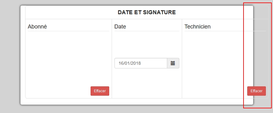
I'm trying to manage my wrapper/canvas on responsive view to fit in the div. The problem is that it overflows the div's frame (look at screenshot)

I tried to play with min-width and max-width but nothing works correctly.

My Fiddle code

.wrapper {
    margin-left: auto;
    margin-right: auto;
    margin-bottom: 8px;
    position: relative;
    width: 262px;
    height: 150px;
    -moz-user-select: none;
    -webkit-user-select: none;
    -ms-user-select: none;
    user-select: none;
}

.signature_client,
.signature_tech {
    position: absolute;
    left: 0;
    top: 0;
    width: 280px;
    height: 150px;
}

enter image description here

Peacefull
  • 546
  • 6
  • 24

1 Answers1

1

Hi if you remove the padding it fixes the problem

.table>tbody>tr>td {
      padding:8px 0px;
  }
Arian Al Lami
  • 867
  • 7
  • 9
  • Well, i tried your css code but that doesn't solve the problem, look @ https://jsfiddle.net/2w1Labxn/1/ Thanks for helping me. – Peacefull Jan 16 '18 at 16:29
  • @Peacefull make the wrapper{ width: 100%;} .signature_client, .signature_tech {width:100% } instead of width: 262px; – Arian Al Lami Jan 16 '18 at 16:41