I'm trying to use the auto-fit feature of the CSS grid to wrap grid items neatly for different screen sizes. This works well when all items I put into the auto-fitted grid container are of equal size; however if I make the items different sized, for small screen sizes, I am getting undesirable sizing when the items wrap.
This code snippet illustrates the issue I am having (if you resize the browser window you can see the issue clearly):
.wrapper {
  display: grid;
  padding: 10px;
  width: 90%;
  grid-gap:10px;
  grid-template-columns:
    repeat(auto-fit, minmax(300px, 1fr));

    box-sizing: border-box;
  border: 1.5px solid darkblue;
}

.first{
  grid-column: span 1;
  box-sizing: border-box;
  border: 1.5px solid darkgrey;
}

.second{
  grid-column: span 2;
  box-sizing: border-box;
  border: 1.5px solid darkgrey;
}
<div class='wrapper'>
<div class='first'>
First
</div>
<div class='second'>
Second
<div>
</div>This screenshot of different behaviours shows what's happening:
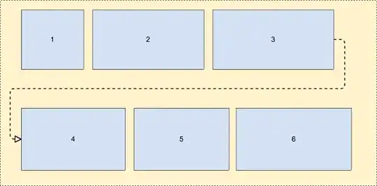
Picture 1 is what's displayed when the items are of equal size at full screen - this wraps to Picture 2.
Picture 3 is what's displayed when the items are of different size - this wraps first to Picture 4 (expected), but then wraps to Picture 5 - this is not the same as Picture 2. (which would be the ideal behaviour) - the two items are of different size.
I suspect this is due to grid items collapsing in accordance with auto-fit at smaller screen sizes, but not collapsing the gaps between the collapsed grid items. Debugging in Chrome shows this but I don't know how to overcome it!
Am I on the right track? Is there any way to get the desired behaviour in Picture 2 when the items I'm placing into the container are of different size?