I am new to front end programming. I have made the back-end of an application as an R Shiny app and I am trying to make a layout for this information which requires presentation of tabular data, in HTML and CSS.
I am using the Tachyons CSS library as I hoped it would make designing the layout much easier.
I am using their code template example 'Three Columns - Collapse to Single' at the bottom of this page of their documentation: here . This works wonderfully BUT when I put a table in the div suddenly the div elements overlap upon page re-size.
To explain this better I have the following screenshots and a link to two codepens with the code.
Please not that for some reason the visual output on codepen looks different than on my browser (see below) so might need to be run locally, but HTML and CSS code is there to help identify the problem).
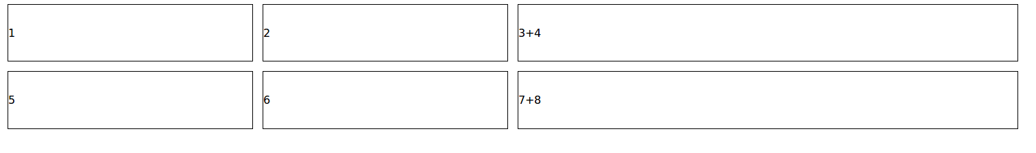
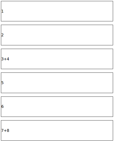
Screenshots of when the divs only contain a number (not a table): codepen
<body>
  <!-- first row of blocks -->
<div class="mw9 center ph3-ns">
  <div class="cf ph2-ns">
    <div class="fl w-100 w-25-ns pa2">
      <div class="outline bg-white pv4">1</div>
    </div>
    <div class="fl w-100 w-25-ns pa2">
      <div class="outline bg-white pv4">2</div>
    </div>
    <div class="fl w-100 w-50-ns pa2">
      <div class="outline bg-white pv4">3+4</div>
    </div>
  </div>
</div>

  <!-- second row of blocks -->
 <div class="mw9 center ph3-ns">
  <div class="cf ph2-ns">
    <div class="fl w-100 w-25-ns pa2">
      <div class="outline bg-white pv4">5</div>
    </div>
    <div class="fl w-100 w-25-ns pa2">
      <div class="outline bg-white pv4">6</div>
    </div>
    <div class="fl w-100 w-50-ns pa2">
      <div class="outline bg-white pv4">7+8</div>
    </div>
  </div>
</div>
 </div>
 </body>
just contains text - browser window is wide enough that they are full size
Just contains text - browser window made narrower so that the boxes squash together
boxes collapse into a single column when browser window gets very narrow

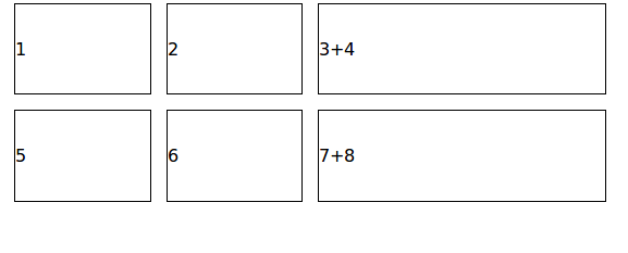
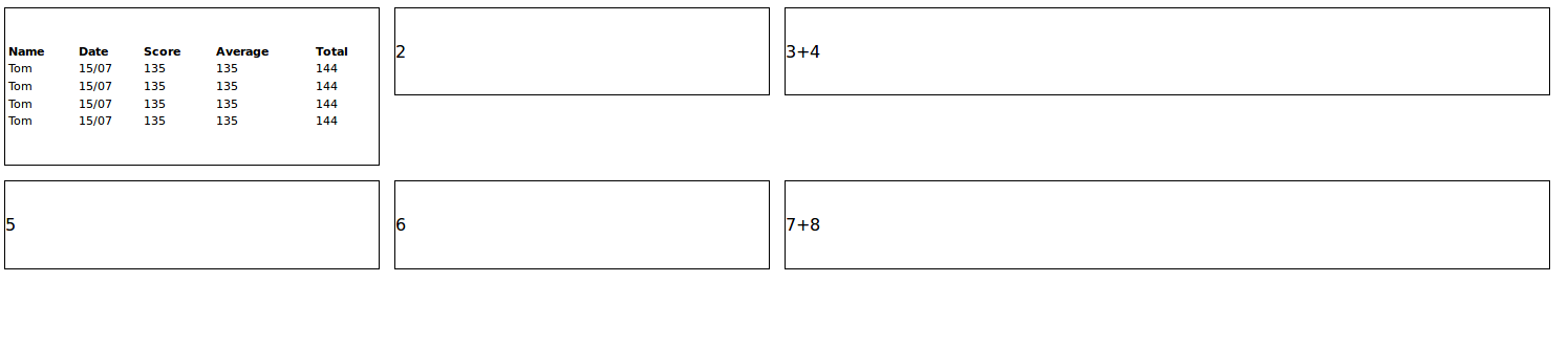
Screenshots of when there is a table in the div: codepen
  <body>
  <!-- first row of blocks -->
<div class="mw9 center ph3-ns">
  <div class="cf ph2-ns">
    <div class="fl w-100 w-25-ns pa2">
      <div class="outline bg-white pv4">
         <table class="table-custom" style="width:100%">
            <tr>
              <th>Name</th>
              <th>Date</th>
              <th>Score</th>
              <th>Average</th>
              <th>Total</th>
            </tr>
            <tr>
              <td>Tom</td>
              <td>15/07</td>
              <td>135</td>
              <td>135</td>
              <td>144</td>
            </tr>
            <tr>
              <td>Tom</td>
              <td>15/07</td>
              <td>135</td>
              <td>135</td>
              <td>144</td>
            </tr>
            <tr>
              <td>Tom</td>
              <td>15/07</td>
              <td>135</td>
              <td>135</td>
              <td>144</td>
            </tr>
              <td>Tom</td>
              <td>15/07</td>
              <td>135</td>
              <td>135</td>
              <td>144</td>
            </tr>
        </table>
      </div>
    </div>
    <div class="fl w-100 w-25-ns pa2">
      <div class="outline bg-white pv4">2</div>
    </div>
    <div class="fl w-100 w-50-ns pa2">
      <div class="outline bg-white pv4">3+4</div>
    </div>
  </div>
</div>

  <!-- second row of blocks -->
 <div class="mw9 center ph3-ns">
  <div class="cf ph2-ns">
    <div class="fl w-100 w-25-ns pa2">
      <div class="outline bg-white pv4">5</div>
    </div>
    <div class="fl w-100 w-25-ns pa2">
      <div class="outline bg-white pv4">6</div>
    </div>
    <div class="fl w-100 w-50-ns pa2">
      <div class="outline bg-white pv4">7+8</div>
    </div>
  </div>
</div>
 </div>
 </body>
When there is a table in the first div when the browser window is large (which works fine)

However when the window size is made smaller there is now an overlap between the boxes
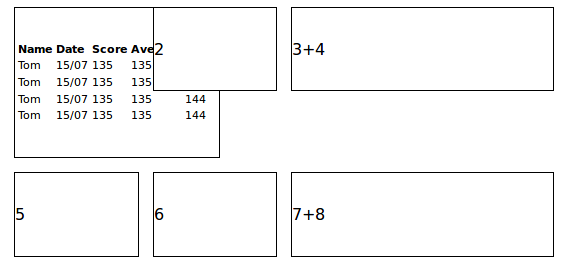
How can I prevent this overlap from happening? I am using firefox 57.0 (64 bit) when generating the screenshots.
I have been wrestling with this problem over the past 2 days and any help would be much appreciated.
Thanks