There is a pure CSS (no JavaScript) dropdown menu activated on hover, and the menu stays open if you click it.
It's here: Making Animated Dropdown Menu by Using Pure CSS Like Bootstrap does
Here's the code:
html, body {
    margin:0;
}
.acn-menu {
    text-align: center;
    background-color: rgba(0, 0, 0, 0.9);
    border-bottom-left-radius: 5px;
    border-bottom-right-radius: 5px;
    min-height: 74px;
    width: 100%;
}
.label_openclose {
    display: none;
}
.menu-tabs {
    height: 100%;
}
.menu-tabs .elem {
    box-sizing: border-box;
    padding: 0 20px;
    float: left;
    height: 100%;
    line-height: 70px;
    background-color: rgb(30, 30, 30);
    color: white;
}
@-webkit-keyframes spin {
    0% {
        transform: rotate(-180deg);
    }
    50% {
        transform: rotate(180deg);
    }
    100% {
        transform: rotate(-180deg);
    }
}
@keyframes spin {
    0% {
        transform: rotate(-180deg);
    }
    50% {
        transform: rotate(180deg);
    }
    100% {
        transform: rotate(-180deg);
    }
}
.menu-check:checked ~ .label_openclose {
    -webkit-animation-play-state: paused;
    animation-play-state: paused;
}
.menu-check {
    display: none;
}
.menu-tabs .elem:hover {
    background-color: rgba(255, 255, 255, 0.2);
}
/*@media screen and (max-width:55%)*/
 @media screen and (max-width:768px) {
    .label_openclose {
        -webkit-animation: spin 2s;
        animation: spin 2s;
        display: inline-block;
        transform: rotate(-180deg);
        transition-duration: 1s;
        margin: 10px;
        width: 30px;
        height: 30px;
        border-radius: 50%;
        border-top: 10px solid rgb(50, 50, 50);
        border-right: 10px solid rgb(100, 100, 100);
        border-bottom: 10px solid rgb(150, 150, 150);
        border-left: 10px solid rgb(200, 200, 200);
        background-color: transparent;
        cursor: pointer;
    }
    .label_openclose:hover {
        transform: rotate(180deg);
    }
    .menu-tabs .elem {
        transition: border 1s linear, height 1s;
        line-height: initial;
        float: initial;
        height: 0px;
        cursor: pointer;
        border-top: 0px solid #000;
        overflow: hidden;
    }
    .menu-tabs:hover .elem {
        height: 25px;
    }
    .menu-check:checked ~ .menu-tabs .elem {
        height: 25px;
        color: white;
        border-top: 2px solid rgba(255, 255, 255, 0.2);
    }
    .label_openclose:hover ~ .menu-tabs .elem {
        border-top: 2px solid rgba(255, 255, 255, 0.2);
        height: 25px;
    }
}
<div class="acn-menu">
<input type="checkbox" id="openclose" class="menu-check" />
<label class="label_openclose" for="openclose"></label>
<div class="menu-tabs">
<div class="elem">test</div>
<div class="elem">nav</div>
<div class="elem">bar</div>
<div class="elem">with</div>
<div class="elem">transitions</div>
</div>
</div>
<main>
test content of main page</br>The navbar menu stays open when you click on the circle</br>and it even opens on hover, not just on click.
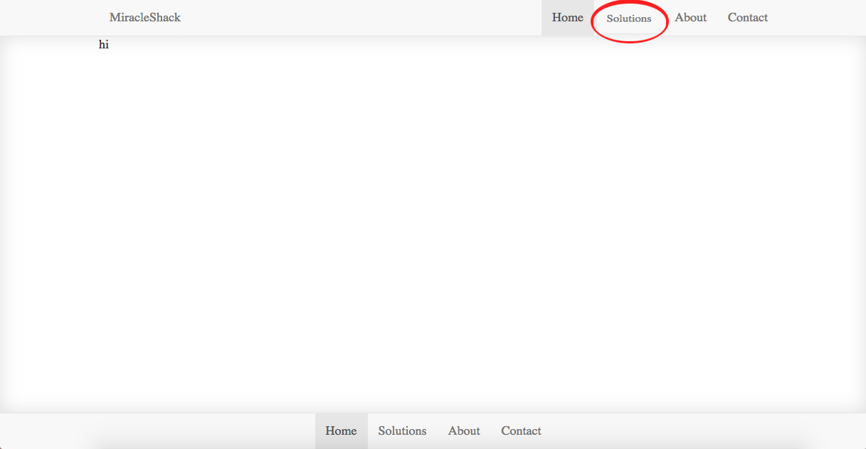
</main>I would put the drop down where it says "Solutions" in the navbar:
How could I make this work with the default bootstrap 3 navbar menu?