54

I have 2 boxes and a vertical div line in one unique container div (code and fiddle below).

I'm using CSS grids to position my elements inside the container

What I'd like to accomplish is to use the vertical line to resize horizontally the two boxes based on the position of the vertical line.

I apologize if the question is noobish, I am new to web development, only used Python before, already tried to google and stackoverflow search but all solutions seem overly complicated and generally require additional libraries, I was looking for something simpler and JS only.

HTML:

<div class="wrapper">
  <div class="box a">A</div>
  <div class="handler"></div>
  <div class="box b">B</div>
</div>

CSS:

body {
  margin: 40px;
}

.wrapper {
  display: grid;
  grid-template-columns: 200px 8px 200px;
  grid-gap: 10px;
  background-color: #fff;
  color: #444;
}

.box {
  background-color: #444;
  color: #fff;
  border-radius: 5px;
  padding: 20px;
  font-size: 150%;
  resize: both;
}

.handler{
    width: 3px;
    height: 100%;
    padding: 0px 0;
    top: 0;
    background: red;
    draggable: true;
}

https://jsfiddle.net/gv8Lwckh/6/

Aquazi
  • 617
  • 1
  • 6
  • 8
  • I don't quite get the behavior you are looking for: right now boxes A and B have identical sizes, so what should happen when I drag the handle to the left? I guess box A should shrink, but what about box B? The same goes if the handle is dragged to the right: should box A grow? What happens to box B? – Terry Oct 25 '17 at 11:25
  • Yes, exactly. I thought that by just giving the resize: both attritube to my box divs, and the draggable: true one to the handler I could accomplish exactly this. – Aquazi Oct 25 '17 at 11:41
  • Unfortunately, HTML is not smart like this ;) the `resize` attribute mostly works for ` – Terry Oct 25 '17 at 11:46
  • I'd gladly do that, could you point me in some direction on how to dynamically change css with Javascript? – Aquazi Oct 25 '17 at 11:55

4 Answers4

110

What you intend to do can be done using CSS flexbox—there is no need to use CSS grid. The bad news is that HTML + CSS is not so smart that declaring resize and draggable will make the layout flexible and adjustable by user interaction. For that, you will have to use JS. The good news is that this is actually not too complicated.

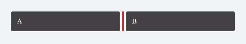
Here is a quick screen grab of output the code below:

However, for you to understand the code I will post below, you will have to familiarize yourself with:

  • Event binding using .addEventListener. In this case, we will use a combination of mousedown, mouseup and mousemove to determine whether the user is in the middle of dragging the element
  • CSS flexbox layout

Description of the solution

Initial layout using CSS

Firstly, you will want to layout your boxes using CSS flexbox. We simply declare display: flex on the parent, and then use flex: 1 1 auto (which translates to "let the element grow, let the element shrink, and have equal widths). This layout is only valid at the initial rendering of the page:

.wrapper {
  /* Use flexbox */
  display: flex;
}

.box {
  /* Use box-sizing so that element's outerwidth will match width property */
  box-sizing: border-box;

  /* Allow box to grow and shrink, and ensure they are all equally sized */
  flex: 1 1 auto;
}

Listen to drag interaction

You want to listen to mouse events that might have originated from your .handler element, and you want a global flag that remembers whether the user is dragging or not:

var handler = document.querySelector('.handler');
var isHandlerDragging = false;

Then you can use the following logic to check if the user is dragging or not:

document.addEventListener('mousedown', function(e) {
  // If mousedown event is fired from .handler, toggle flag to true
  if (e.target === handler) {
    isHandlerDragging = true;
  }
});

document.addEventListener('mousemove', function(e) {
  // Don't do anything if dragging flag is false
  if (!isHandlerDragging) {
    return false;
  }

  // Set boxA width properly
  // [...more logic here...]
});

document.addEventListener('mouseup', function(e) {
  // Turn off dragging flag when user mouse is up
  isHandlerDragging = false;
});

Computing the width of box A

All you are left with now is to compute the width of box A (to be inserted in the [...more logic here...] placeholder in the code above), so that it matches that of the movement of the mouse. Flexbox will ensure that box B will fill up the remaining space:

// Get offset
var containerOffsetLeft = wrapper.offsetLeft;

// Get x-coordinate of pointer relative to container
var pointerRelativeXpos = e.clientX - containerOffsetLeft;

// Resize box A
// * 8px is the left/right spacing between .handler and its inner pseudo-element
// * Set flex-grow to 0 to prevent it from growing
boxA.style.width = (pointerRelativeXpos - 8) + 'px';
boxA.style.flexGrow = 0;

Working example

var handler = document.querySelector('.handler');
var wrapper = handler.closest('.wrapper');
var boxA = wrapper.querySelector('.box');
var isHandlerDragging = false;

document.addEventListener('mousedown', function(e) {
  // If mousedown event is fired from .handler, toggle flag to true
  if (e.target === handler) {
    isHandlerDragging = true;
  }
});

document.addEventListener('mousemove', function(e) {
  // Don't do anything if dragging flag is false
  if (!isHandlerDragging) {
    return false;
  }

  // Get offset
  var containerOffsetLeft = wrapper.offsetLeft;

  // Get x-coordinate of pointer relative to container
  var pointerRelativeXpos = e.clientX - containerOffsetLeft;
  
  // Arbitrary minimum width set on box A, otherwise its inner content will collapse to width of 0
  var boxAminWidth = 60;

  // Resize box A
  // * 8px is the left/right spacing between .handler and its inner pseudo-element
  // * Set flex-grow to 0 to prevent it from growing
  boxA.style.width = (Math.max(boxAminWidth, pointerRelativeXpos - 8)) + 'px';
  boxA.style.flexGrow = 0;
});

document.addEventListener('mouseup', function(e) {
  // Turn off dragging flag when user mouse is up
  isHandlerDragging = false;
});
body {
  margin: 40px;
}

.wrapper {
  background-color: #fff;
  color: #444;
  /* Use flexbox */
  display: flex;
}

.box {
  background-color: #444;
  color: #fff;
  border-radius: 5px;
  padding: 20px;
  font-size: 150%;
  
  /* Use box-sizing so that element's outerwidth will match width property */
  box-sizing: border-box;
  
  /* Allow box to grow and shrink, and ensure they are all equally sized */
  flex: 1 1 auto;
}

.handler {
  width: 20px;
  padding: 0;
  cursor: ew-resize;
  flex: 0 0 auto;
}

.handler::before {
  content: '';
  display: block;
  width: 4px;
  height: 100%;
  background: red;
  margin: 0 auto;
}
<div class="wrapper">
  <div class="box">A</div>
  <div class="handler"></div>
  <div class="box">B</div>
</div>
Terry
  • 63,248
  • 15
  • 96
  • 118
  • 19
    It would be a perfect answer if only you sticked with grid and not switched to using flex. The OP said he is using CSS grids. – Jacques Sep 11 '18 at 02:17
  • simply amazing! – Systems Rebooter Oct 19 '18 at 17:12
  • You included jquery, but it's not in use! – NVRM Nov 08 '18 at 10:31
  • 1
    @Cryptopat thanks, it was probably added by accident. Removed it now. – Terry Nov 08 '18 at 12:10
  • 2
    is it possible to set the initial width of box A? – James Fremen Dec 13 '18 at 02:49
  • This is very good, thank you! I second @james-freman question and add one of my own. Would it be fairly easy to add a third re-sizable box? TIA – D4A60N Jan 02 '19 at 23:46
  • Better yet, do this utilizing Bootstrap's latest flex-box system. – D4A60N Jan 03 '19 at 01:35
  • 3
    I like this answer better, because it uses flexbox and not CSS grid (much better support), even though the question title refers to CSS grid first – Jorge Lazo Mar 15 '19 at 19:46
  • 1
    Thanks for the solution. What happens if you want to add more than one box to this? So far you can still only resize the first box. – paralaxbison May 17 '19 at 15:15
  • Hi. I tried your solution for vertical dragBar. But I am facing an issue when I am dragging the handler to the top as it is taking the whole width of BoxA and reaches to the top tip. Actually I have used the minimum height instead of maximum height as previously handler was coming at the bottom tip when moved downwards. I am posting the jsFiddle of vertical slider. Please can any one tell me what am I doing wrong? JsFiddle : https://jsfiddle.net/kn507gtw/2/ – Deeksha Mulgaonkar Aug 24 '19 at 18:52
  • awesome answer. how would the code change so that the divider is horizontal... aka the A and B are on top of each other, not next to each other? – Jose Martinez Sep 28 '19 at 13:42
  • 1
    @Terry, I had some issues with `wrapper.offsetLeft` as the wrapper element is inside other divs, anyway using `wrapper.getBoundingClientRect().left` works – Luca Faggianelli Oct 08 '19 at 14:34
  • How does boxA ever grow again if you set it to flex 0 after you've clicked and dragged? – blomster Feb 26 '20 at 17:05
  • I made the same implementation before visiting this question except I did not put in boxA.style.flexGrow = 0; - does not work without without it. – Adam May 15 '20 at 07:14
  • I found this answer useful but in my case, I have a doubt. Consider A and B as header data and corresponding to the header data I have some item data like 1 David so on.. Here when I drag A or B box I need the content of 1 and David below also need to be dragged can I know how to achieve that – R Subha Feb 08 '21 at 11:15
  • Place the script in the body after all classes and divs or use document.onreadystatechange. It took me hours to run this example on my own. The document should be ready to access its elements. I am sure there are other ways as well. I am new to JS – Amadeus Sep 01 '21 at 13:58
31

Here's an example of the drag event handling, but using CSS Grids

The trick is to set the grid-template-columns (or rows) on the grid container rather than than the size of the grid items

let isLeftDragging = false;
let isRightDragging = false;

function ResetColumnSizes() {
  // when page resizes return to default col sizes
  let page = document.getElementById("pageFrame");
  page.style.gridTemplateColumns = "2fr 6px 6fr 6px 2fr";
}

function SetCursor(cursor) {
  let page = document.getElementById("page");
  page.style.cursor = cursor;
}

function StartLeftDrag() {
  // console.log("mouse down");
  isLeftDragging = true;

  SetCursor("ew-resize");
}

function StartRightDrag() {
  // console.log("mouse down");
  isRightDragging = true;

  SetCursor("ew-resize");
}

function EndDrag() {
  // console.log("mouse up");
  isLeftDragging = false;
  isRightDragging = false;

  SetCursor("auto");
}

function OnDrag(event) {
  if (isLeftDragging || isRightDragging) {
    // console.log("Dragging");
    //console.log(event);

    let page = document.getElementById("page");
    let leftcol = document.getElementById("leftcol");
    let rightcol = document.getElementById("rightcol");

    let leftColWidth = isLeftDragging ? event.clientX : leftcol.clientWidth;
    let rightColWidth = isRightDragging ? page.clientWidth - event.clientX : rightcol.clientWidth;

    let dragbarWidth = 6;

    let cols = [
      leftColWidth,
      dragbarWidth,
      page.clientWidth - (2 * dragbarWidth) - leftColWidth - rightColWidth,
      dragbarWidth,
      rightColWidth
    ];

    let newColDefn = cols.map(c => c.toString() + "px").join(" ");

    // console.log(newColDefn);
    page.style.gridTemplateColumns = newColDefn;

    event.preventDefault()
  }
}
#page {
  height: 100%;
  background-color: pink;
  display: grid;
  grid-template-areas: 'header header header header header' 'leftcol leftdragbar tabs tabs tabs' 'leftcol leftdragbar tabpages rightdragbar rightcol' 'leftcol leftdragbar footer footer footer';
  grid-template-rows: min-content 1fr 9fr 1fr;
  grid-template-columns: 2fr 6px 6fr 6px 2fr;
}


/*****************************/

#header {
  background-color: lightblue;
  overflow: auto;
  grid-area: header;
}

#leftcol {
  background-color: #aaaaaa;
  overflow: auto;
  grid-area: leftcol;
}

#leftdragbar {
  background-color: black;
  grid-area: leftdragbar;
  cursor: ew-resize;
}

#tabs {
  background-color: #cccccc;
  overflow: auto;
  grid-area: tabs;
}

#tabpages {
  background-color: #888888;
  overflow: auto;
  grid-area: tabpages;
}

#rightdragbar {
  background-color: black;
  grid-area: rightdragbar;
  cursor: ew-resize;
}

#rightcol {
  background-color: #aaaaaa;
  overflow: auto;
  grid-area: rightcol;
}

#footer {
  background-color: lightblue;
  overflow: auto;
  grid-area: footer;
}
<body onresize="ResetColumnSizes()">
  <div id="page" onmouseup="EndDrag()" onmousemove="OnDrag(event)">
    <div id="header">
      Header
    </div>
    <div id="leftcol">
      Left Col
    </div>
    <div id="leftdragbar" onmousedown="StartLeftDrag()"></div>
    <div id="tabs">
      Tabs
    </div>
    <div id="tabpages">
      Tab Pages
    </div>
    <div id="rightdragbar" onmousedown="StartRightDrag()"></div>
    <div id="rightcol">
      Rightcol
    </div>
    <div id="footer">
      Footer
    </div>
  </div>
</body>

https://codepen.io/lukerazor/pen/GVBMZK

Steven B.
  • 8,962
  • 3
  • 24
  • 45
lukerazor
  • 311
  • 3
  • 3
  • 2
    nice job! I took your code and expanded it to work for vertical splitters as well as horizontal ones. I did this by adding and removing the onmouseup and onmousemove event handlers dynamicaly from the grid containers: https://jsfiddle.net/zabh8jev/ – Jonathan Elkins Oct 02 '22 at 02:42
4

I changed, so you can add more Horizontal and Vertical slider. test1.html:

<!DOCTYPE html>
<html>
    <head>
        <link rel="stylesheet" href="test1.css">
        <script src=  "test1.js" > </script>
    </head>
    <body>
        <div id="page" onmouseup="EndDrag()" onmousemove="OnDrag(event)">
            <div id="header">
                Header asdlkj flkdfj sdflkksdjf sd;flsdjf sd;flkjsd;fljsd;flsdj;fjsd f;sdlfj;sdlfj
            </div>
            <div id="leftcol">
                Left Col
            </div>
            <div id="leftdragbar" onmousedown="StartHDrag(1)"></div>
            <div id="tabs">
                Tabs
            </div>
            <div id="topdragbar" onmousedown="StartVDrag(2)"></div>
            <div id="tabpages">
                Tab Pages
            </div>
            <div id="rightdragbar" onmousedown="StartHDrag(3)"></div>
            <div id="rightcol">
                Rightcol
            </div>
            <div id="botdragbar" onmousedown="StartVDrag(4)"></div>
            <div id="footer">
                Footer
            </div>
        </div>
        <div id= 'status'></div>
    </body>
</html>

test1.css

body {
}

#page {
    height: 100vh;
    background-color: pink;
    display: grid;
    grid-template-areas:
        'header header header header header'
        'leftcol leftdragbar tabs tabs tabs'
        'leftcol leftdragbar topdragbar topdragbar topdragbar'
        'leftcol leftdragbar tabpages rightdragbar rightcol'
        'botdragbar botdragbar botdragbar botdragbar botdragbar'
        'footer footer footer footer footer';
    grid-template-rows: min-content 1fr 6px 9fr 6px 1fr;
    grid-template-columns: 2fr 6px 6fr 6px 2fr; 
}

/*****************************/
#header {
    background-color: lightblue;
    overflow: auto;
    grid-area: header;
}

#leftcol {
    background-color: #aaaaaa;
    overflow: auto;
    grid-area: leftcol;
}

#leftdragbar {
    background-color: black;
    grid-area: leftdragbar;
    cursor: ew-resize;
}

#topdragbar {
    background-color: black;
    grid-area: topdragbar;
    cursor: ns-resize;
}

#botdragbar {
    background-color: black;
    grid-area: botdragbar;
    cursor: ns-resize;
}

#tabs {
    background-color: #cccccc;
    overflow: auto;
    grid-area: tabs;
}

#tabpages {
    background-color: #888888;
    overflow: auto;
    grid-area: tabpages;
}

#rightdragbar {
    background-color: black;
    grid-area: rightdragbar;
    cursor: ew-resize;
}


#rightcol {
    background-color: #aaaaaa;
    overflow: auto;
    grid-area: rightcol;
}

#footer {
    background-color: lightblue;
    overflow: auto;
    grid-area: footer;
}

test1.js

let isHDragging = false;
let isVDragging = false;

let cols = ['2fr','6px','6fr','6px','2fr'];  //grid-template-columns: 2fr 6px 6fr 6px 2fr;
let colns = ['leftcol','','tabpages','','rightcol'];
let Tcols = [];

let rows = ['min-content','1fr','6px','9fr','6px','1fr'];  //grid-template-rows: min-content 1fr 6px 9fr 1fr
let rowns = ['header','tabs','','tabpages','','footer'];
let Trows = []
let CLfactor ;
let CRfactor ;
let gWcol = -1;
let gWrow = -1;

function StartHDrag(pWcol) {
    isHDragging = true;
    SetCursor("ew-resize");
    CLfactor = parseFloat(cols[pWcol-1]) / document.getElementById(colns[pWcol-1]).clientWidth;
    CRfactor = parseFloat(cols[pWcol+1]) / document.getElementById(colns[pWcol+1]).clientWidth;
    Tcols = cols.map(parseFloat);
    gWcol = pWcol;
}

function StartVDrag(pRow) {
    isVDragging = true;
    SetCursor("ns-resize");
    CLfactor = parseFloat(rows[pRow-1]) / document.getElementById(rowns[pRow-1]).clientHeight;
    CRfactor = parseFloat(rows[pRow+1]) / document.getElementById(rowns[pRow+1]).clientHeight;
    Trows = rows.map(parseFloat);
    gWrow = pRow;
}

function SetCursor(cursor) {
    let page = document.getElementById("page");
    page.style.cursor = cursor;
}

function EndDrag() {
    isHDragging = false;
    isVDragging = false;
    SetCursor("auto");
}

function OnDrag(event) {
    if(isHDragging) {
        Tcols[gWcol-1] +=  (CLfactor * event.movementX);
        Tcols[gWcol+1] -=  (CLfactor * event.movementX);
        
        cols[gWcol-1]  = Math.max(Tcols[gWcol-1],0.01) + "fr";
        cols[gWcol+1]  = Math.max(Tcols[gWcol+1],0.01) + "fr";
        let newColDefn = cols.join(" ");
        page.style.gridTemplateColumns = newColDefn;
        
    } else if (isVDragging) {
        Trows[gWrow-1] +=  (CLfactor * event.movementY);
        Trows[gWrow+1] -=  (CLfactor * event.movementY);
        
        rows[gWrow-1]  = Math.max(Trows[gWrow-1],0.01) + "fr";
        rows[gWrow+1]  = Math.max(Trows[gWrow+1],0.01) + "fr";
        let newRowDefn = rows.join(" ");
        page.style.gridTemplateRows = newRowDefn;
        document.getElementById("footer").innerHTML = newRowDefn;
    }
    event.preventDefault()
}
Socrates
  • 41
  • 1
  • 1
2

To actually match the question! Making a dragbar to resize divs inside CSS grids.


Here is a possible way, the original OP layout is kept, as well as the CSS, using Grids.

The goal is to capture the original state of the Grid Template Columns, and convert it to floats.

The browser always compute in pixels, and the sum of those columns + the gap, represent the total width of the container element. That sum must always be the same, or the elements will jump!

NB: Calls to .getComputedStyle() are not very efficient, optimisation is likely possible here!

Notice, doing this way using grids and screenX avoid the common jumping bug on mouse down.

Comments are added, this will allow to apply the logic with any number of columns, or rows, good luck.

With the usage of pointer events, it does works from a touch device as well.

let target = document.querySelector("div") // Target container element
let md = false;     // Will be true at mouse down
let xorigin;        // Click origin X position
let gtcorigin = []; // Origin Grid Template Columns in pixels

const pointerdown = (e) => {
  if (e.target.classList[0] === "handler"){ // Filter to target the wanted element
    md = true;                              // Set mouse down
    xorigin = e.screenX;                    // Store the origin X position
    // Grid Template Columns, array of pixels as float
    gtcorigin = window.getComputedStyle(target)["grid-template-columns"].split(" ").map((a) => +(a.slice(0, -2)));
    document.body.style.cursor = "col-resize" // This makes things nice
    document.body.style.userSelect = "none"   // This makes things nice
  }
}
const pointerup = (e) => {
  md = false; // Reset bool at mouse up
  document.body.style.cursor = "pointer"
  document.body.style.userSelect = "unset"
}

const resizer = (e) => {
  if (md){ // Mouse is down hover the handler element
    let gtc = window.getComputedStyle(target)["grid-template-columns"].split(" ").map((a) => +(a.slice(0, -2)));       // Grid Template Columns, array of pixels as float
    let xdragdif = xorigin - e.screenX; // Move in pixels since the click
    gtc[0] = gtcorigin[0] - xdragdif    // First column, if negative, it will grow
    gtc[2] = gtcorigin[2] + xdragdif    // Third column
    gtc = gtc.map((a) => a+"px")        // Set back the values in string with "px"
    document.querySelector("console").textContent = gtc.join(" ") // !!! This is only for the demo
    target.style.gridTemplateColumns = gtc.join(" ") // Apply the new Grid Template Column as inline style. 
  }
}

// Attach all events on the largest container element. Here the body is used. 
document.body.addEventListener("pointerdown", pointerdown, false)
document.body.addEventListener("pointerup", pointerup, false)
document.body.addEventListener("pointermove", resizer, false)
body {
  margin: 40px;
  overflow-x: hidden
}

.wrapper {
  display: grid;
  grid-template-columns: 200px 8px 200px;
  grid-gap: 10px;
  background-color: #fff;
  color: #444;
}

.box {
  background-color: #444;
  color: #fff;
  border-radius: 5px;
  padding: 20px;
  font-size: 150%;
}

.handler{
  width: 3px;
  height: 100%;
  padding: 0px 0;
  top: 0;
  background: red;
  cursor: col-resize
}
<div class="wrapper">
  <div class="box">A</div>
  <div class="handler"></div>
  <div class="box">B</div>
</div>


<console></console>

No limits are applied here, this can be enhanced with CSS only, using min-width and other similar rules, and the float values can be retrieved to create range sliders and more, this way.

NVRM
  • 11,480
  • 1
  • 88
  • 87