1

page that needs filter

In the photo above where the gray container is set I want to add a high contrast black and white photo filter.

Iv tried scaling the opacity and using the filter css3 property but have had no success. The body is the background image and the child container is the gray box. I want to just have the child show the black and white.

body{
  background: url('../images/wtc.jpg') no-repeat center center fixed;
  -webkit-background-size: cover;
  -moz-background-size: cover;
  -o-background-size: cover;
  background-size: cover;
}
.profile-box{
  background-color: grey;
  width: 80%;
  height: 60%;
  margin-top: 180px;
  margin-bottom: 100px;
}
dutchkillsg
  • 333
  • 4
  • 21
  • Is your image the expected result or is it what you get and dislike ? – G-Cyrillus Oct 09 '17 at 19:06
  • You're going to have to give the gray box the same background image and scale it up to make sure that it matches the background. Then you can apply [CSS grayscale](https://www.w3schools.com/cssref/css3_pr_filter.asp) to the popover image. – Chase DeAnda Oct 09 '17 at 19:06

4 Answers4

3

Easiest solution, but least supported: backdrop-filter

The most straight-forward way, is to actually use the rather new backdrop-filter property. Unfortunately it is only supported in Safari (and Chrome Canary) so far.

body{
  background: url('https://i.imgur.com/uh5YLj5.jpg') no-repeat center center fixed;
  -webkit-background-size: cover;
  -moz-background-size: cover;
  -o-background-size: cover;
  background-size: cover;
  margin: 0;
  padding: 0;
}
.profile-box{
  width: 80%;
  height: 60%;
  
  /* Backdrop filter */
  -webkit-backdrop-filter: grayscale(100%);
  backdrop-filter: grayscale(100%);
  
  /* Additional styles for positioning */
  position: absolute;
  top: 50%;
  left: 50%;
  transform: translate(-50%, -50%);
}
<div class="profile-box"></div>

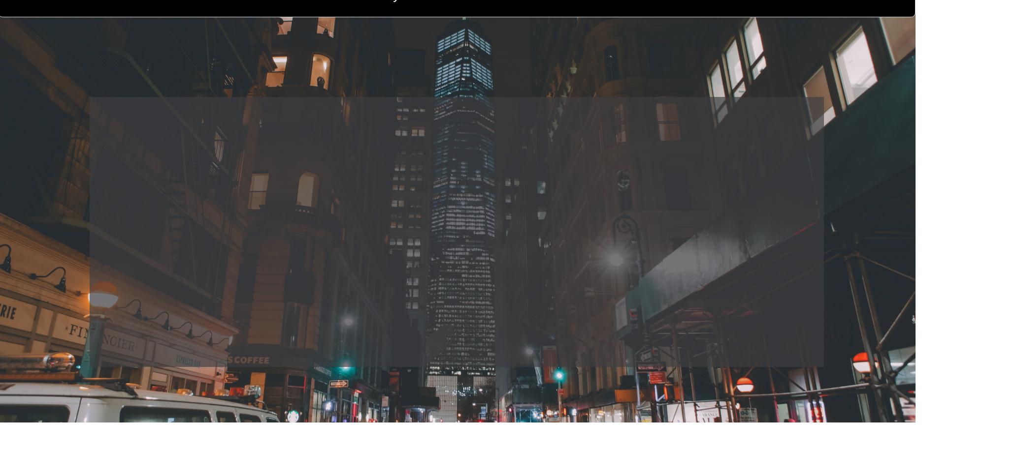
The code snippet above will render something similar to this on Safari:

Complicated solutions, but more cross-browser compatible

Using the deprecated clip:

An alternative solution that will see more support across browser is to use the clip: rect(...) property. This property has been, however, deprecated in favour of clip-path (see next section for the updated solution). Since you have specified on your code that you wanted a grayscale area that is 80% in width and 60% in height (relative to viewport, so that is equivalent to 80vw and 60vh), we can tune the arguments passed into clip: rect(...) as such:

clip: rect(30vh, 90vw, 70vh, 10vw);

The coordinates represent offset from the top/left corners of the page of the top, right, bottom, left edges of the clip rectangle. To center a 80vw horizontally, we need 10vw on left and right (adding up to 20vw). To center a 60vh vertically, we need 20vh on top and bottom (adding up to 40vh). This computes to:

  1. 20vh from the top (this is the TOP border measured from top)
  2. 90vw from the left (this is the RIGHT border measured from left)
  3. 80vh from the top (this is the BOTTOM border measured from top)
  4. 10vw from the left (this is the LEFT border measured from left)

The image below will help you explain the calculations more:

body{
  background: url('https://i.imgur.com/uh5YLj5.jpg') no-repeat center center fixed;
  background-size: cover;
  margin: 0;
  padding: 0;
}
.profile-box {
  background: url('https://i.imgur.com/uh5YLj5.jpg') no-repeat center center fixed;
  background-size: cover;
  position: absolute;
  top: 0;
  bottom: 0;
  left: 0;
  right: 0;
  filter: grayscale(100%);
  clip: rect(20vh, 90vw, 80vh, 10vw);
}
<div class="profile-box"></div>

Using the new property, clip-path:

Even though it is a more modern standard compared to clip, it still suffers from non-support in IE or Edge. The arguments of clip-path: inset(...) are not comma-separated, unlike that of clip: rect(...), and it is slightly more intuitive to use because each edge is measure relative to the corresponding edge of the browser. In that case, using the same calculation logic we have established above, the arguments will be:

  1. 20vh from the top
  2. 10vw from the right
  3. 20vh from the bottom
  4. 10vw from the left

In other words, something like this:

clip-path: inset(20vh 10vw 20vh 10vw);

body{
  background: url('https://i.imgur.com/uh5YLj5.jpg') no-repeat center center fixed;
  background-size: cover;
  margin: 0;
  padding: 0;
}
.profile-box {
  background: url('https://i.imgur.com/uh5YLj5.jpg') no-repeat center center fixed;
  background-size: cover;
  position: absolute;
  top: 0;
  bottom: 0;
  left: 0;
  right: 0;
  filter: grayscale(100%);
  clip-path: inset(20vh 10vw 20vh 10vw);
}
<div class="profile-box"></div>
Terry
  • 63,248
  • 15
  • 96
  • 118
  • @dutchkillsg Glad my answer helped :) I've updated it to explain the numbers/arguments I have used for the `clip-path` property (and created a figure to boot). – Terry Oct 09 '17 at 19:32
1

What you are trying to do is usually a pretty hard thing to achieve with css but it is possible. I think this answer will help you:

TAKEN FROM https://stackoverflow.com/a/19382357/8312881

written by edensource

If it has to be dynamic, you should have some trouble, but you can have somewhere to start with this :

HTML

<div class="background"></div>
<div class="mask">
    <div class="bluredBackground"></div>
</div>
<div class="content"></div>

CSS

.content {
    width: 70%;
    height: 70%;
    border:2px solid;
    border-radius:20px;
    position: fixed;
    top: 15%;
    left: 15%;
    z-index:10;
    background-color: rgba(168, 235, 255, 0.2);
}
.background {
    width:100%;
    height:100%;
    background-image:url('http://www.travel.com.hk/region/time_95.jpg');
    z-index:2;
    position:fixed;
}
.bluredBackground {
    width:100%;
    height:100%;
    display:block;
    background-image:url('http://www.travel.com.hk/region/time_95.jpg');
    z-index:1;
    position:absolute;
    top:-20%;
    left:-20%;
    padding-left:20%;
    padding-top:20%;
    -webkit-filter: blur(2px);
}
.mask {
    width: 70%;
    height: 70%;
    border:2px solid;
    border-radius:20px;
    position: fixed;
    top: 15%;
    left: 15%;
    z-index:10;
    overflow:hidden;
}

FIDDLE

http://jsfiddle.net/sE4Fv/

FIDDLE with greyscale filter

http://jsfiddle.net/sE4Fv/926/

User3434343443
  • 170
  • 3
  • 17
0

Your body is ok, just the .profile-box needs some fixes:

div.profile-box {
  background: url('https://s3-us-west-1.amazonaws.com/powr/defaults/image-slider2.jpg') no-repeat center center fixed;
  background-size: cover;
  filter: grayscale(100%);
  // width & height etc...
}

Attach your background in the box as well and add filter: grayscale(100%)

Demo

Thielicious
  • 4,122
  • 2
  • 25
  • 35
0

(you did not respond to my question in comments, so i still go with an average answer untill feedback shows ;) )

you can use an rgba() color if the matter is to darken your image.

A simple example with background or image to show the idea, a third example showing the use of the grayscale(X%) filter if the matter is turn blac & white the image:

.filter {
  position: relative;
  float: left;
  width: 50%;
}

.filter:before {
  content: '';
  position: absolute;
  top: 15%;
  right: 5%;
  bottom: 15%;
  left: 5%;
  background: rgba(0, 0, 0, 0.5);
}

.filter img {
  display: block;
  width: 100%;
}

.filter.bg {
  box-sizing: border-box;
  padding: 1.5% 2.5%;
  background: url(http://lorempixel.com/1200/250/city/5) center / 100% auto;
}

.bg:before {
  display: none;
}

.content {
  min-height: 7.45vw;
  height: 100%;
  background: rgba(0, 0, 0, 0.5)
}

.grayscale .content {
  background: url(http://lorempixel.com/1200/250/city/5) center / 50vw auto;
  filter: grayscale(100%);
}

body {
  margin: 0;
}
<div class="filter">
  <img src="http://lorempixel.com/1200/250/city/5" alt="my nice City" /></div>

<div class="filter bg ">
  <div class="content">Some content hover the bg </div>
</div>
<div class="filter bg grayscale ">
  <div class="content">Some content hover the bg </div>
</div>
G-Cyrillus
  • 101,410
  • 14
  • 105
  • 129