2

I know how to fade out a text on a plain colored background with a CSS transparent gradient. But how is it possible to fade out a text on an image background? Here is an example of what I'd like:

Fade out text on image

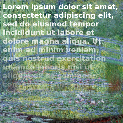
NB: I need a static effect just like the image (not a dynamic transition).

Patrick
  • 3,578
  • 5
  • 31
  • 53
  • @MasterYoda A static effect I need, not a transition. – Patrick Oct 02 '17 at 13:31
  • 1
    Perhaps you could use the same background image with a faded gradient sat on top of the text – Pete Oct 02 '17 at 13:31
  • @Patrick, okay i can see that you have edited your question to include this so ill retract the flag for you. However my next question is going to be, what have you tried so far? – Master Yoda Oct 02 '17 at 13:32
  • @Pete But how would you use an image as a gradient? – Patrick Oct 02 '17 at 13:38
  • @MasterYoda I tried blend modes and gradient with an image but without success. – Patrick Oct 02 '17 at 13:41
  • Have your non gradient image as the background and have your gradient image on top of the text to make it look like the text is fading out (may need to ask a designer how to do gradient images) or use the answer below! – Pete Oct 02 '17 at 13:41

2 Answers2

4

CSS mask-image is probably what you are looking for:

div {
  background: #333;
  padding: 1em;
}

p {
  color: white;
  font-weight: bold;
  -webkit-mask-image: linear-gradient(to bottom, white, transparent);
  mask-image: linear-gradient(to bottom, white, transparent);
}
<div>
  <p>
    Lorem ipsum dolor sit amet, consectetur adipiscing elit. Nullam eget eros quis purus laoreet lobortis sit amet sit amet diam. Maecenas imperdiet nunc sed erat placerat, id ullamcorper mauris rhoncus. Phasellus non fringilla urna, eget elementum nulla.
  </p>
</div>

Be sure to check browser compatibility (not so great, unfortunately)

helb
  • 3,154
  • 15
  • 21
  • Thanks! The browser compatibility seems better than with the other solution (background-clip + text-fill-color). Tested and working on Chrome 53.0. – Patrick Oct 02 '17 at 14:01
3

You can achieve it using background-clip: text; text-fill-color: transparent; test it on Chrome stable...

.image-background{
 background: url("https://www.noao.edu/image_gallery/images/d5/dumba.jpg");
 background-repeat: no-repeat;
 width:400px;
 height:400px;
 
}
.text-container{
color:white;
 font-size:20px;
 padding:20px;
 box-sizing:border-box;
 background:linear-gradient(rgba(255,255,255,1), rgba(255,255,255,0));
 background: -webkit-linear-gradient(rgba(255,255,255,1), rgba(255,255,255,0));
     -webkit-background-clip: text;
    -webkit-text-fill-color: transparent;
}
<div class="image-background">
<p class="text-container">
Lorem ipsum dolor sit amet, consectetur adipiscing elit. Vestibulum vel felis congue, eleifend libero quis, ullamcorper metus. Etiam porttitor lectus elit, vitae interdum urna convallis id. Mauris et libero nec mi ornare pretium. Sed quis malesuada nibh, et volutpat augue. Cras non gravida nunc. Donec efficitur metus non dui tincidunt ultricies. Aliquam ut elementum dui, vitae sagittis nisi. Vestibulum aliquam interdum dui. Quisque gravida at justo id bibendum. Donec eleifend tortor mi, a rhoncus sapien consequat id. Etiam finibus blandit hendrerit. Donec et porttitor urna. Praesent bibendum aliquet volutpat.
</p>
</div>
Renzo Calla
  • 7,486
  • 2
  • 22
  • 37