1

How can I float my Layout like this with Bootstrap 4 flex Grid? I enter image description here

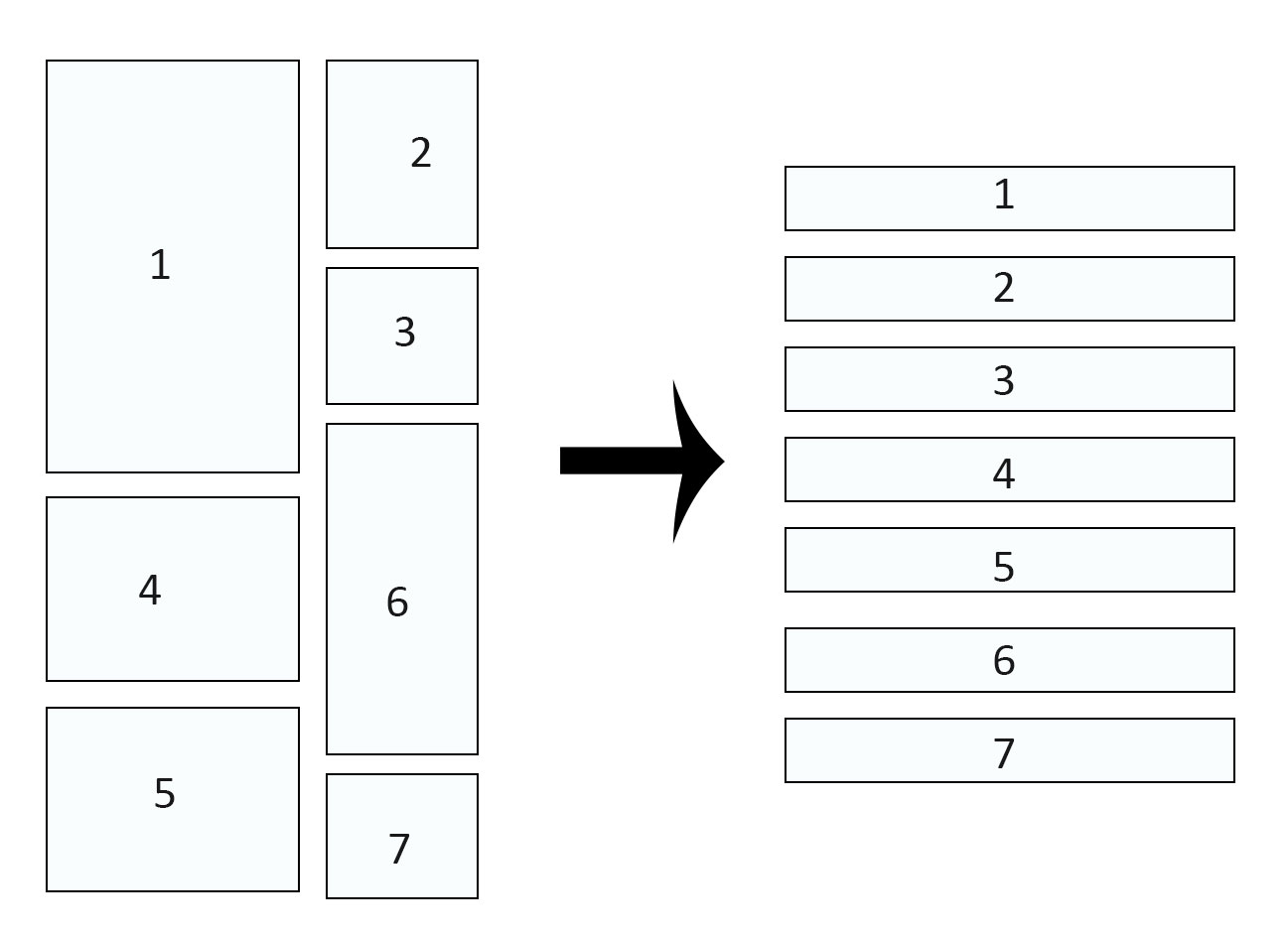
tried it with the flex order function but see my result and the problem

<div class="row align-items-start">

        <div class="col-sm-8 float-left" style="background: orange;order:1">
                <div class="white-container pt-5 pb-5">
                    # LEFT 1
                </div>
            </div>
            <div class="col-sm-4 float-right" style="background: pink;order:2">
                <div class="white-container pt-3 pb-3">
                    # RIGHT 1
                </div>
            </div>
            <div class="col-sm-4 float-right" style="background: grey;order:4">
                <div class="white-container pt-3 pb-3 ">
                    # RIGHT 2
                </div>
            </div>
            <div class="col-sm-8 float-left" style="background: yellow;order:3">
                <div class="white-container pt-5 pb-5">
                    # LEFT 2
                </div>
            </div>
            <div class="col-sm-8 float-left" style="background: yellow;order:5">
                <div class="white-container pt-5 pb-5">
                    LEFT 3
                </div>
            </div>
            <div class="col-sm-4 float-right" style="background: grey;order:6">
                <div class="white-container pt-3 pb-3">
                    RIGHT 3
                </div>
            </div>
        </div>

enter image description here

The Problem with my Solution are the Spaces between the right columns. I hope for any help before I give up and use javascript :)

Alper Aydingül
  • 251
  • 1
  • 9

2 Answers2

1

jQuery Solution:

var isMobileSorted = false;

$(window).resize(function() {
    if ($(window).width() < 768) {
        if(!isMobileSorted) {
            // sort mobile
            $("#widget").insertAfter($("#pictures"));
            $("#video").insertAfter($("#widget"));
            $("#reviews").insertAfter($("#contact"));
            isMobileSorted = true;
        }
    } else {
        if(isMobileSorted) {
            // resort desktop
            $("aside").prepend($("#widget"))
            $("#video").insertAfter($("#widget"));
            $("#reviews").insertAfter($("#video"));
            isMobileSorted = false;
        }
    }
}).resize();
Alper Aydingül
  • 251
  • 1
  • 9
0

This layout would be much easier to achieve with two side-by-side columns.

See https://codepen.io/caleyshemc/pen/mBWWRL for a working example.

<div class="container">
  <div class="row">
    <div class="col-sm-8">
      <div class="p-5" style="background: orange;">
        # LEFT 1
      </div>
      <div class="p-5" style="background: yellow;">
        # LEFT 2
      </div>
      <div class="p-5" style="background: lightgreen;">
        # LEFT 3
      </div>
    </div>

    <div class="col-sm-4">
      <div class="p-3" style="background: pink;">
        # RIGHT 1
      </div>
      <div class="p-3" style="background: grey;">
        # RIGHT 2
      </div>
      <div class="p-3" style="background: lightblue;">
        # RIGHT 3
      </div>
    </div>
  </div>
</div>

If you absolutely must preserve the order of the items, this layout is not possible with Flexbox. Look into a JavaScript grid layout library such as Masonry.

polyp
  • 78
  • 1
  • 9