1

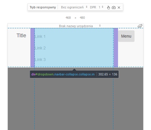
this is my problem: collapse problem

As You can see my navbar-collapse div enters navbar area. Could You please help me fix it?

<script src="https://ajax.googleapis.com/ajax/libs/jquery/2.1.1/jquery.min.js"></script>
<script src="https://maxcdn.bootstrapcdn.com/bootstrap/3.3.7/js/bootstrap.min.js"></script>
<link href="https://maxcdn.bootstrapcdn.com/bootstrap/3.3.7/css/bootstrap.min.css" rel="stylesheet"/>
<nav class="navbar navbar-default navbar-fixed-top">
    <div class="container">
        <a class="navbar-brand" href="#page-top">Title</a>
        <button class="navbar-toggle" data-toggle="collapse" data-target="#dropdown">
            Menu
        </button>
        <div class="collapse navbar-collapse" id="dropdown">
            <ul class="nav navbar-nav navbar-right">
                <li>
                    <a href="#">Link 1</a>
                </li>
                <li>
                    <a href="#">Link 2</a>
                </li>
                <li>
                    <a href="#">Link 3</a>
                </li>
            </ul>
        </div>
    </div>
</nav>
RaJesh RiJo
  • 4,302
  • 4
  • 25
  • 46
svyatogor92
  • 113
  • 1
  • 2
  • 7
  • I have tried your code in codepen.io, removed the `collapse` class from your `ul` container to show it and it was displayed directly under the Title, are you sure you do not have additional css messing up your styling ? – M0nst3R Sep 25 '17 at 10:24
  • Please take a look at the following codepen (https://codepen.io/glouhaichi/pen/WZoqxK) and let me know if that is the expected behavior. – M0nst3R Sep 25 '17 at 10:30
  • @GhassenLouhaichi actualy adding div.navbar-header above the navbar-brand solved the problem :) – svyatogor92 Sep 25 '17 at 10:47

2 Answers2

1

Issue is about you missed to add navbar-header container which helps to segregate header and submenus. Hope it helps

<script src="https://ajax.googleapis.com/ajax/libs/jquery/2.1.1/jquery.min.js"></script>
<script src="https://maxcdn.bootstrapcdn.com/bootstrap/3.3.7/js/bootstrap.min.js"></script>
<link href="https://maxcdn.bootstrapcdn.com/bootstrap/3.3.7/css/bootstrap.min.css" rel="stylesheet" />
<nav class="navbar navbar-default navbar-fixed-top">
  <div class="container">
    <div class="navbar-header">
      <a class="navbar-brand" href="#page-top">Title</a>
      <button class="navbar-toggle" data-toggle="collapse" data-target="#dropdown">
                Menu
            </button></div>
    <div class="collapse navbar-collapse" id="dropdown">
      <ul class="nav navbar-nav navbar-right">
        <li>
          <a href="#">Link 1</a>
        </li>
        <li>
          <a href="#">Link 2</a>
        </li>
        <li>
          <a href="#">Link 3</a>
        </li>
      </ul>
    </div>
  </div>
</nav>
RaJesh RiJo
  • 4,302
  • 4
  • 25
  • 46
0

add class .m-top-55 in div id="dropdown" which work on small layout

@media only screen and (min-width: 600px) {
    /* For tablets: */
    .m-top-55{
       margin-top:55px;
     }
}

This will solve Your problem.

  • No, it didn't solve the problem. I should mention, that I'm using Bootstrap3 if that's relevant. – svyatogor92 Sep 25 '17 at 10:23
  • Then you should not indicate `bootstrap-4` in your tags. – M0nst3R Sep 25 '17 at 10:28
  • If u want to use only bootstrap 3 you have to create two navigation one is display in desktop view and other in display in tablet and mobile view with collapsible navigation.The above answer is just a small customization. – Wasim Khan Sep 25 '17 at 10:33