5

(Heavily edited:)

In python matplotlib, I want to plot y against x with two xscales, the lower one with linear ticks and the upper one with logarithmic ticks.

The lower x values are an arbitrary function of the upper ones (in this case the mapping is func(x)=np.log10(1.0+x)). Corollary: The upper x tick positions are the same arbitrary function of the lower ones.

The positions of the data points and the tick positions for both axes must be decoupled.

I want the upper axis's logarithmic tick positions and labels to be as tidy as possible.

What is the best way to produce such a plot?

Related: http://matplotlib.1069221.n5.nabble.com/Two-y-axis-with-twinx-only-one-of-them-logscale-td18255.html

Similar (but unanswered) question?: Matplotlib: how to set ticks of twinned axis in log plot

Could be useful: https://stackoverflow.com/a/29592508/1021819
jtlz2
  • 7,700
  • 9
  • 64
  • 114
  • Have you tried [`twiny()`](https://matplotlib.org/api/_as_gen/matplotlib.axes.Axes.twiny.html)? – Marco Sep 20 '17 at 13:44
  • @BusyBeaver I have not (`twinx()`?) - are you able to give an answer? – jtlz2 Sep 20 '17 at 13:48
  • You want to share the `y-axis` between two `x-axis` (right?) so `twiny()` – Marco Sep 20 '17 at 13:53
  • Ah - yes - correct – jtlz2 Sep 20 '17 at 13:54
  • Possible duplicate of [Matplotlib: twinx() wrong values on second axis](https://stackoverflow.com/questions/45440474/matplotlib-twinx-wrong-values-on-second-axis)? Certainly closely related, but from content of the current question I am unsure what the desired outcome is. – saintsfan342000 Sep 20 '17 at 14:07
  • @saintsfan342000 Should I attempt some example code? I wanted to be clear and hopefully useful in words rather than supplying half-baked code. What is unclear? – jtlz2 Sep 20 '17 at 14:11
  • Edited - I am wondering whether this is a hard problem or whether my question is very unclear. If we can get to the bottom of it I think it would be a useful one. – jtlz2 Sep 20 '17 at 14:50
  • 3
    The problem is that you cannot show the same data at the same positions using two differently scaled axes, when the relationship between the scales is non-linear. That is mathematics. What you could do is use two similar scales but with different tick labeling. Now the problem is that in view of this, the desired outcome is indeed unclear, hence you did not receive any useful answer. – ImportanceOfBeingErnest Sep 20 '17 at 15:47

2 Answers2

3

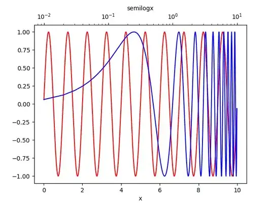
You may find Axes.twiny() and Axes.semilogx() useful.

import numpy as np
import matplotlib.pyplot as plt

fig, ax1 = plt.subplots()

x = np.arange(0.01, 10.0, 0.01) # x-axis range
y = np.sin(2*np.pi*x) # simulated signal to plot

ax1.plot(x, y, color="r") # regular plot (red)
ax1.set_xlabel('x')

ax2 = ax1.twiny() # ax1 and ax2 share y-axis
ax2.semilogx(x, y, color="b") # semilog plot (blue)
ax2.set_xlabel('semilogx')

plt.show()

jtlz2
  • 7,700
  • 9
  • 64
  • 114
Marco
  • 2,007
  • 17
  • 28
  • Thanks - useful start - I have added some of it into my edit – jtlz2 Sep 20 '17 at 14:38
  • I saw your edit... how come *The red crosses need to coincide with the black points* if you change the `x-axis` scale? – Marco Sep 20 '17 at 14:47
  • I want one set of data points (there is only one data series). I took your idea but it gave the above; I need to do something to the upper `x` axis to make it happen - I want to see how both `y` varies with both `z` and `log10(1+z)`. – jtlz2 Sep 20 '17 at 14:49
  • For example, in your plot, 10^0 at the top should align with 1.0 at the bottom? – jtlz2 Sep 20 '17 at 14:53
  • But that's not how semi-log plots work... If you align `10**0` with `1.0` then the blue plot will perfectly match the red one and you'll lose the semi-log representation, which is what you first asked; i.e., if *10^0 at the top should align with 1.0 at the bottom* then it'd be like re-plotting the same signal above the red one. – Marco Sep 20 '17 at 14:56
  • But the upper one is on a log scale? I want log ticks on the top and linear ticks on the bottom. – jtlz2 Sep 20 '17 at 15:07
  • Now you totally lost me :) You **don't want** the signal to be semi-log plotted (blue one) but you **just want** to plot the red one and display "more" ticks on the above `x-axis`? – Marco Sep 20 '17 at 15:15
  • Thanks! I have added an answer using your `ticky()` tip and based on our discussion - about to amend the question to make it better posed. – jtlz2 Sep 21 '17 at 07:49
0

Here is an attempt at an answer after speaking to a few people and with thanks to @BusyBeaver.

I agree the question was ill-posed and will amend it to clarify (help welcome!).

I do think this is a useful one to have written down on stackoverflow.

Code:

import numpy as np
import matplotlib.pyplot as plt
from matplotlib.ticker import AutoMinorLocator

# Necessary functions

def tick_function(x):
    """Specify tick format"""
    return ["%2.f" % i for i in x]

def func(x):
    """This can be anything you like"""
    funcx=np.log10(1.0+x)
    return funcx

z=np.linspace(0.0,4.0,20)

np.random.seed(seed=1234)
y=np.random.normal(10.0,1.0,len(z))

# Set up the plot
fig,ax1 = subplots()
ax1.xaxis.set_minor_locator(AutoMinorLocator())
ax1.yaxis.set_minor_locator(AutoMinorLocator())

# Set up the second axis
ax2 = ax1.twiny()

# The tick positions can be at arbitrary positions
zticks=np.arange(z[0],z[-1]+1)
ax2.set_xticks(func(zticks))
ax2.set_xticklabels(tick_function(zticks))
ax2.set_xlim(func(z[0]),func(z[-1]))
ax1.set_ylim(5.0,15.0)

ax1.set_xlabel(r'$\log_{10}\left(1+z\right)$')
ax2.set_xlabel(r'$z$')
ax1.set_ylabel('amplitude/arb. units')

plt.tick_params(axis='both',which = 'major', labelsize=8, width=2)
plt.tick_params(axis='both',which = 'minor', labelsize=8, width=1)

_=ax1.plot(func(z),y,'k.')

plt.savefig('lnopz2.png')

Plot generated from the above code

I am not sure how to control the upper ax2 minor ticks (e.g. every 0.5).

jtlz2
  • 7,700
  • 9
  • 64
  • 114