3

I am starting a new application and I am willing to use the Dashboard pattern.

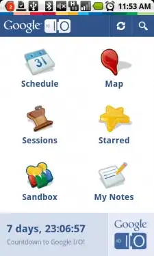
For example: The Google IO app uses it:

alt text

My issue is that the amount of buttons will be more than six. I'm not sure if I should use vertical or horizontal scrolling.

Vertical scrolling could be done with a ScrollView or a GridView but I am not sure which would be the easier way to implement the horizontal version.

I was thinking of using an HorizontalScrollView but it doesn't have pagination. It should feel similar to the tweetdeck app.

How would you implement it?

Macarse
  • 91,829
  • 44
  • 175
  • 230
  • I think you need to take a step back and determine what is more user friendly, rather than what is easier to implement. You are already getting in deep with more than six on a dashboard, but that is just my opinion. – user432209 Jan 07 '11 at 17:52
  • @user432209: I am not looking for the easiest. I just said if I decide to go for the horizontal scrolling I don't know which is the best way to implement. – Macarse Jan 07 '11 at 17:55

4 Answers4

4

My issue is that the amount of buttons will be more than six. I'm not sure if I should use vertical or horizontal scrolling.

IMHO, do neither. Reduce the number of buttons. Watch the 2010 Google I|O presentation on this design pattern -- the point behind the dashboard is to only surface a few items.

CommonsWare
  • 986,068
  • 189
  • 2,389
  • 2,491
  • would you use "sub dashboards"? – Macarse Jan 07 '11 at 18:16
  • @Macarse: Probably not, though I don't know enough about your app to say for certain. Put 1-2 icons in an action bar, ones you will typically have on lots of activities (e.g., search). Put 6 icons in the dashboard. Put the rest on the options menu, particularly things that are of little importance (e.g., About). If your app is more complicated than that, you may need to consider some form of hierarchy of tasks, or your users will be overwhelmed. – CommonsWare Jan 07 '11 at 18:26
  • Cool. I agree. I have three buttons that are almost the same. It's an application for an art event and I was going to have "Galleries", "Artists", "Paintings" since the user can browse them separately. Perhaps one button should cover all three and have a quick action to show the three possible options. – Macarse Jan 07 '11 at 18:49
3

I would go with a vertical scroll. It is way more natural to scroll down to view more content of the same view.

A horizontal scroll kind of feels like you switch to another part of the application.

Octavian Helm
  • 39,405
  • 19
  • 98
  • 102
1

I have an app that uses a gridview with vertical scrolling but I dynamically adjust the number of rows in the gridview based on the width of the actual screen so that it in landscape or in a bigger display it uses more columns and avoid scrolling alltogether in most cases.

However in my case it is more of a search results display of categories and not a dashboard. I believe the whole point of a dashboard is to have only a small number of button (e.g. max six or so).

What you could do is dynamically interrogate the screen real estate and if there is not enough room just show e.g. 6 buttons of which one is a more/utils or whatever button. Sort of like the options menu does it.. but on a bigger screen display them all.

Manfred Moser
  • 29,539
  • 13
  • 92
  • 123
0

It would be interesting to scroll based on the orientation of the device, so you would scroll horizontally or vertically if the device is oriented that way. This would let you maximize the screen real estate.

Eric Levine
  • 13,536
  • 5
  • 49
  • 49