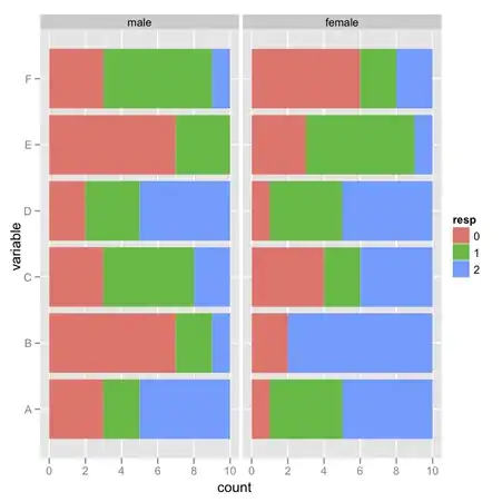
I am manipulating DataFrame using pandas, Python. My data is 10000(rows) X 20(columns) and I am visualizing it, like this.
df.hist(figsize=(150,150))
However, if I make figsize bigger, each of subplots' title, which is name of each columns, get really small or graphs overlap each other and it makes impossible to distinguish.
Is there any clever way to fix it?
Thank you!


