I am building a website on wix.com and I added a map with google maps. My code is as follow:
<iframe width="950" height="450" frameborder="0" style="border:0" src="https://www.google.com/maps/embed/v1/place?q=place_id:ChIJya9E14i2xUcRLWzbVXjmqMg&key=API_KEY&zoom=15" allowfullscreen></iframe>
On PC it looks good, but on mobile phones it looks like this:
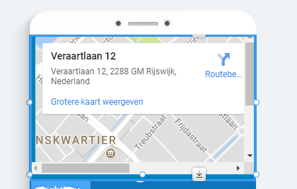
How do I make it so that it adjusts size on mobile phone so that people don't have to use scroll bars, but also so that they can click the route and save button?