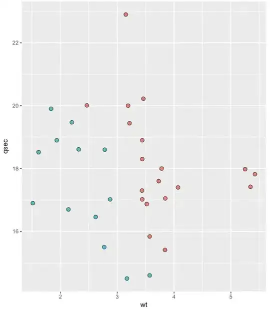
I am cross posting from another forum (https://www.biostars.org/p/268514/#268559) where I got useful comments but still am confused by output of ggplot2.
I am trying to get a simple black outline on circles but my code is now giving my random colours and seems to be ignoring my scale_colour_manual(values = cols) argument. When I run the following code:
# creating color palette

> cols <- c("red" = "red", "orange" = "orange", "nonsignificant" = "darkgrey", "Increased" = "#00B2FF", "Decreased" = "#00B2FF")

# Make a basic ggplot2 object

> vol <- ggplot(data, aes(x = lfc, y = pval, color = color, labels=gene))

# inserting mnaual colors as per color pallette  with term "scale_colour_manual(values = cols)" below

> vol +
  ggtitle(label = "Volcano Plot", subtitle = "Colored by fold-change direction") +
  geom_point(size = 2.5, alpha = 1, na.rm = T) +
  scale_colour_manual(values = cols) +
  theme_bw(base_size = 14) +
  theme(legend.position = "right") +
  xlab(expression(log[2]("VitD" / "Carrier"))) +
  ylab(expression(-log[10]("FDR"))) + # Change Y-Axis label
  geom_hline(yintercept = 1, colour="#990000", linetype="dashed") + geom_vline(xintercept = 0.586, colour="#990000", linetype="dashed") + geom_vline(xintercept = -0.586, colour="#990000", linetype="dashed") +
  scale_y_continuous(trans = "log1p")
I get a beautiful graph with my defined colour palette:

Next, I want to add a border to the points and so I only change 2 pieces of code. At the start I make the basic ggplot object with "fill = color" instead of "color = color"
> vol <- ggplot(data, aes(x = lfc, y = pval, fill = color, labels=gene))
And I add "shape = 21, colour = "black"" to the "geom_point" argument:
> vol +
  ggtitle(label = "Volcano Plot", subtitle = "Colored by fold-change direction") +
  geom_point(size = 2.5, alpha = 1, na.rm = T, shape = 21, colour = "black") +
  scale_colour_manual(values = cols) +
  theme_bw(base_size = 14) +
  theme(legend.position = "right") +
  xlab(expression(log[2]("VitD" / "Carrier"))) +
  ylab(expression(-log[10]("FDR"))) + l
  geom_hline(yintercept = 1, colour="#990000", linetype="dashed") + geom_vline(xintercept = 0.586, colour="#990000", linetype="dashed") + geom_vline(xintercept = -0.586, colour="#990000", linetype="dashed") +
  scale_y_continuous(trans = "log1p")
And suddenly I have the a plot with what seems to be a random selection of 5 colours; and if I print the colors:
print(cols)

red      orange         nonsignificant      Increased      Decreased
"red"    "orange"      "darkgrey"           "#00B2FF"      "#00B2FF"
The palette is still there.
