10

I'm trying to recreate this image in CSS.enter image description here

This is what I got from experimenting, so far. I used box-shadow to act as the second box. I'm not sure if there's a better way to do this?

h4 {
  font-family: sans-serif;
  text-transform: uppercase;
  text-align: center;
  border: solid 3px black;
  border-radius: 5px;
  text-decoration: none;
  font-weight: 600;
  color: black;
  letter-spacing: 2px;
  padding: 20px 15px;
  background: white;
  box-shadow: 10px 5px 0px 0px #ffffff, 11px 7px 0px 2px #000000;
}
<h4>3. Scouting for a location</h4>

enter image description here

Vadim Ovchinnikov
  • 13,327
  • 5
  • 62
  • 90
Solus
  • 123
  • 5

4 Answers4

10

You can achieve this via absolutely position pseudo element. Also avoid property duplication via CSS inheritance.

.border {
  text-align: center;
  border: solid 3px black;
  border-radius: 5px;
  text-decoration: none;
  font-weight: 600;
  color: black;
  letter-spacing: 2px;
  padding: 20px 15px;
  margin: 15px 15px;
  background: white;
  
  position: relative; /* new */
}

/* new */
.border:after {
  content: "";
  position: absolute;
  display: block;
  background: inherit;
  border-radius: inherit;
  border: inherit;
  left: 2px;
  top: 2px;
  width: 100%;
  height: 100%;
  z-index: -1;
}
<div class="border">3. Scouting for a location</div>
Vadim Ovchinnikov
  • 13,327
  • 5
  • 62
  • 90
6

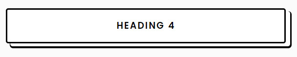
The concept behind using box-shadow is that two shadows, one white and one black, overlap to simulate a second black border. But the black shadow is only visible in the direction from which it is offset from the white shadow, so a gap is apparent between the original border and the black shadow (as shown in the OP's original post).

The "spread radius" of the black shadow could be utilized to eliminate this gap (cleverly demonstrated by Nirav Joshi), but then the curvature of the corners is amplified and the two borders look different.

To duplicate the original border, I'd use ::after to generate an absolutely-positioned pseudo-element and use z-index to place it behind the original element. To further ensure that the border is duplicated exactly, I like Vadim Ovchinnikov's idea of inheriting the border color and radius from the original element.

.border {
  position: relative;
  text-align: center;
  border: solid 3px black;
  border-radius: 5px;
  text-decoration: none;
  font-weight: 600;
  color: black;
  letter-spacing: 2px;
  padding: 20px 15px;
  margin: 15px 15px;
  background: white;
}

.border::after {
  content: "";
  position: absolute;
  width: 100%;
  height: 100%;
  top: 3px;
  left: 3px;
  border: solid 3px black;
  border-radius: 5px;
  z-index: -1;
}
<h4 class="border">3. SCOUTING FOR A LOCATION</h4>
showdev
  • 28,454
  • 37
  • 55
  • 73
  • 1
    It's alright, your answer is much more complete because it actually implements the suggestion using OP's code. – TylerH Jul 07 '17 at 20:44
5

Try this example

Hope it will help you.

.border {
text-align: center;
border: solid 3px black;
border-radius: 5px;
text-decoration: none;
font-weight: 600;
color: black;
letter-spacing: 2px;
padding: 20px 15px;
margin: 15px 15px;
background: white;
-webkit-box-shadow: 3px 3px 0px 0px #ffffff, 3px 3px 0px 3px #000000;
-moz-box-shadow: 3px 3px 0px 0px #ffffff, 3px 3px 0px 3px #000000;
box-shadow: 3px 3px 0px 0px #ffffff, 3px 3px 0px 3px #000000;
}
<div class="border">Title</div>

EDIT

Here now you can see that i made box-shadow to 3px and no longer right side corner.

Nirav Joshi
  • 2,924
  • 1
  • 23
  • 45
  • 3
    No need for vendor prefixed `box-shadow`. They are for very old versions of browsers. – Vadim Ovchinnikov Jul 07 '17 at 20:50
  • 1
    I like this solution, except that the "spread radius" part of the shadow seems to amplify the curvature of the corners relative to the original border. That's not entirely desirable to me, but it may not matter to others. – showdev Jul 07 '17 at 21:16
  • Try with boxshadow pixels increase or descrease as per you need.. like 8px to 7px or 9px.. – Nirav Joshi Jul 07 '17 at 21:21
  • Can you show an example? I meant the `spread` portion, the "3px" part. It makes the corners more round than the original border. No biggie though. – showdev Jul 07 '17 at 21:24
0

Use an absolute positioned ::after or ::before pseudo element and have its z-index lower than the element itself.

ebraley
  • 206
  • 1
  • 9