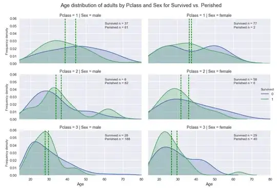
I am working with the Titanic passenger dataset (from Kaggle) as part of a Udacity course. I am using a Seaborn FacetGrid to look at passenger age distribution profiles by Travel class and Gender - with hue as 'Survived' (1/0).
The plot is working well, and I want to add vertical mean lines to each subplot - but in different colours (and with different annotation) for each of the two 'hues' in each subplot (1/0). The ' vertical_mean_line ' function in code below works great on plots without the multiple 'hue' data - but I can't find a way to plot different lines for each hue
Any ideas if it is possible to do this within Seaborn?
Current Seaborn FacetGrid plot output:
Code:
sns.set()
sns.set_context('talk')
sns.set_style('darkgrid')
grid = sns.FacetGrid(titanic_data.loc[titanic_data['is_child_def'] == False], col='Sex', row = 'Pclass', hue='Survived' ,size=3.2, aspect=2)
grid.map(sns.kdeplot, 'Age', shade=True)
grid.set(xlim=(14, titanic_data['Age'].max()), ylim=(0,0.06))
grid.add_legend()


# Add vertical lines for mean age on each plot
def vertical_mean_line_survived(x, **kwargs):
    plt.axvline(x.mean(), linestyle = '--', color = 'g')
    #plt.text(x.mean()+1, 0.052, 'mean = '+str('%.2f'%x.mean()), size=12)
    #plt.text(x.mean()+1, 0.0455, 'std = '+str('%.2f'%x.std()), size=12)

grid.map(vertical_mean_line_survived, 'Age')

# Add text to each plot for relevant popultion size
# NOTE - don't need to filter on ['Age'].isnull() for children, as 'is_child'=True only possible for children with 'Age' data
for row in range(grid.axes.shape[0]):
    grid.axes[row, 0].text(60.2, 0.052, 'Survived n = '+str(titanic_data.loc[titanic_data['Pclass']==row+1].loc[titanic_data['is_child_def']==False].loc[titanic_data['Age'].isnull()==False].loc[titanic_data['Survived']==1]['is_male'].sum()), size = 12)
    grid.axes[row, 1].text(60.2, 0.052, 'Survived n = '+str(titanic_data.loc[titanic_data['Pclass']==row+1].loc[titanic_data['is_child_def']==False].loc[titanic_data['Age'].isnull()==False].loc[titanic_data['Survived']==1]['is_female'].sum()), size = 12)
    grid.axes[row, 0].text(60.2, 0.047, 'Perished n = '+str(titanic_data.loc[titanic_data['Pclass']==row+1].loc[titanic_data['is_child_def']==False].loc[titanic_data['Age'].isnull()==False].loc[titanic_data['Survived']==0]['is_male'].sum()), size = 12)
    grid.axes[row, 1].text(60.2, 0.047, 'Perished n = '+str(titanic_data.loc[titanic_data['Pclass']==row+1].loc[titanic_data['is_child_def']==False].loc[titanic_data['Age'].isnull()==False].loc[titanic_data['Survived']==0]['is_female'].sum()), size = 12)


grid.set_ylabels('Frequency density', size=12)

# Squash down a little and add title to facetgrid
plt.subplots_adjust(top=0.9)
grid.fig.suptitle('Age distribution of adults by Pclass and Sex for Survived vs. Perished')
