I am really perplexed about this bootstrap grid issue. From the screenshot below (source: http://uforest.org/Species/C/Callerya_atropurpurea.php). The header "References" has gone out of its grid alignment at the size of md & sm.
As you can see from the code below, the grid layout for References and the below citations are all under col-lg-12. This is nested within a column of col-md-9. "References" has instead jumped into the other col-md-3 column.
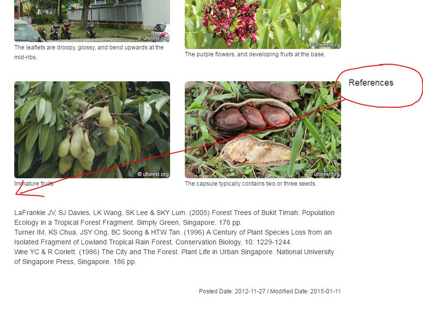
<!-- References -->
<div class="col-lg-12">
    <h4>References</h4>
        LaFrankie JV, SJ Davies, LK Wang, SK Lee & SKY Lum. (2005) Forest Trees of Bukit Timah: Population Ecology in a Tropical Forest Fragment. Simply Green, Singapore. 178 pp.......
        <br><br><br>
        <span style="float:right;"><small>Posted Date: 2012-11-27 / Modified Date: 2015-01-11</small></span>
 </div>
Does anyone know why? This layout worked for all my other 200 pages, and there are only 2 such instances.
Thanks!
[SOLVED] Thanks to @Prince sodhi for suggesting to add the class clearfix. I added it to one of div tags housing the photos and it solved the issue.
<!-- Photos -->
<div class="clearfix">
    <div class="col-sm-6 img-portfolio">
        <img class="img-responsive img-rounded" src="../../images/callerya_atropurpurea1.jpg" alt="">
        <p><small>The leaflets are droopy, glossy, and bend upwards at the mid-ribs.</small></p>
    </div>

    <div class="col-sm-6 img-portfolio">
        <img class="img-responsive img-rounded" src="../../images/callerya_atropurpurea2.jpg" alt="">
        <p><small>The Purple Milletia always have a dense crown of canopy.</small></p>
        </div>

    <div class="col-sm-6 img-portfolio">
        <img class="img-responsive img-rounded" src="../../images/callerya_atropurpurea3.jpg" alt="">
        <p><small>The purple flowers, and developing fruits at the base.</small></p>
    </div>
</div>