Using a framework (materialize-css) it suggests me to put the following inside '$( document ).ready(function(){})' to get the responsive collapsable menu working:
$(".button-collapse").sideNav();
How would i do this in angular? I know that ngAfterContentInit is similar to '$( document ).ready(function(){})':
ngAfterContentInit(): void {
    //What do I put here?
  }
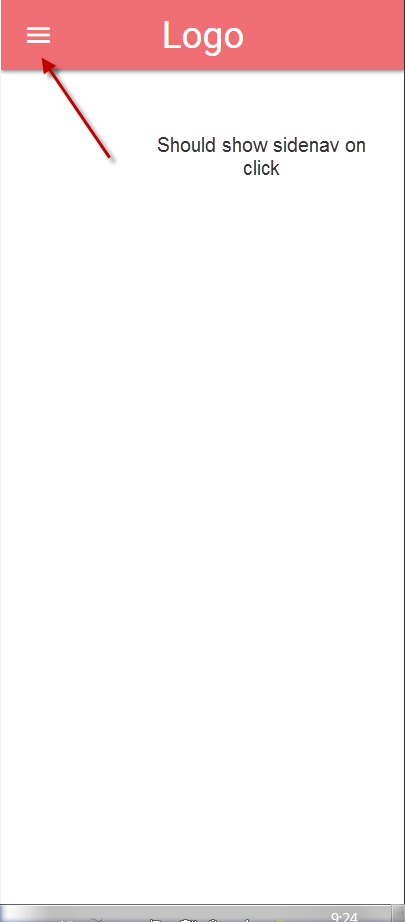
Below you can see a screenshot wich shows the hamburger icon (that becomes visible only on mobile screen sizes): Image of my menu
Here's my html (app.component.html):
<nav>
  <div class="nav-wrapper">
    <a href="#!" class="brand-logo">Logo</a>
    <a href="#" data-activates="mobile-demo" class="button-collapse"><i class="material-icons">menu</i></a>
    <ul class="right hide-on-med-and-down">
      <li><a href="sass.html">Sass</a></li>
      <li><a href="badges.html">Components</a></li>
      <li><a href="collapsible.html">Javascript</a></li>
      <li><a href="mobile.html">Mobile</a></li>
    </ul>
    <ul class="side-nav" id="mobile-demo">
      <li><a href="sass.html">Sass</a></li>
      <li><a href="badges.html">Components</a></li>
      <li><a href="collapsible.html">Javascript</a></li>
      <li><a href="mobile.html">Mobile</a></li>
    </ul>
  </div>
</nav>