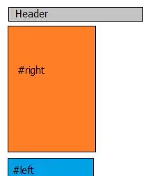
This is a tough question and I've struggled with it long enough - time to ask people who probably know more than I about CSS layouts and why my layout is such a nightmare.
The blue line represents the viewport. The layout is forced by the application to be horizontal / landscape. The user understands this, so not an issue.
The constraints... The column on the left can occupy no more than 30% of the available viewport space. That's easy enough. The tic-tac-toe grid to the right will occupy the remainder. Between the left column and the grid, there is about 12px space (margins, padding, whatever gets it done). The grid on the right, in this example, has 9 boxes, but can have less and needs to flow accordingly. The widths of the columns in the grid must be equal. The heights of the rows in the grid must be equal. The text in each box in the grid cannot force the size to become unbalanced (width or height), meaning overflow: hidden is acceptable or truncate and add ellipsis.
This can be displayed on a desktop computer, phone, tablet, etc. The layout should adapt, but that's not a huge issue. Maintaining the ratios/sizes is.
So, that's about it. Tricky. I intentionally haven't posted code because my code for this has become such a monstrosity as to become useless and likely to taint any ideas the enlightened folks here might have.
Thoughts? Help? Thank you so much in advance!
