I'm trying to figure out how to create a custom background effect for text.
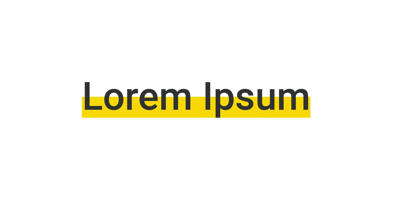
In other words, how can I make something like this:
Asked
Active
Viewed 1.7k times
5 Answers
20
Use the <mark> element and tweek the line-height
mark {
  display: inline-block;
  line-height: 0em;
  padding-bottom: 0.5em;
}
<h1><mark>Lorem ipsum</mark></h1>
caramba
- 21,963
- 19
- 86
- 127
-
1I only recently learned this element even existed. Now I know why :) – somethinghere Apr 28 '17 at 17:06
-
@somethinghere me to! I just had to go trough [this list](https://developer.mozilla.org/en-US/docs/Web/HTML/Element) a few days ago. The list ain't that big but good to know... – caramba Apr 28 '17 at 18:41
-
1I found out through htmlreference.io not so long ago as well. It sounds like a deprecated element, reminding me of `marquee`. Also, turns out I'm old enough to think that... – somethinghere Apr 28 '17 at 18:43
-
1Any idea how to get that working on multiline headlines? – AndreLung Aug 06 '19 at 13:55
8
A very good article explains a nice way to do that with gradients: https://thirtyeightvisuals.com/blog/low-highlight-heading-links-squarespace
.highlight {
  background: linear-gradient(180deg,rgba(255,255,255,0) 50%, #FFD0AE 50%);
}
Qortex
- 7,087
- 3
- 42
- 59
2
For these I usually use an SVG pixel (a 1x1 stretchable HTML-encoded SVG with a fill color) that we can manoeuvre anyway we want:
h1 {
  background: url("data:image/svg+xml;charset=utf8,%3Csvg version='1.1' xmlns='http://www.w3.org/2000/svg' x='0px' y='0px' width='1px' height='1px' viewBox='0 0 1 1' preserveAspectRatio='none'%3E%3Crect x='0' y='0' width='1' height='1' fill='red' /%3E%3C/svg%3E") no-repeat 100% 100%;
  background-size: 100% 50%;
}
<h1>My Text</h1>This also allows for animations to be easily added. This only works on single-line items, however. You can change the color inside the svg fill property. If encoded it works on IE9+, so it's pretty compatible! Just remember that the hash sign in front of hex colors needs to be encoded as well - its %23 (personally I use sass to encode it for me).
somethinghere
- 16,311
- 2
- 28
- 42
1
You can easily achieve this using a linear-gradient set to the background property.
CSS
.low-highlight {
  background:linear-gradient(180deg, transparent 60%, yellow 60%);
}
HTML
<p>You can easily <span class="low-highlight">do underline</span> me.</p>
p {
font-size:68px;
  font-weight:600;
  font-family:'Merriweather';
}


.low-highlight {
  background:linear-gradient(180deg, transparent 60%, yellow 60%);
}
<p>You can easily <span class="low-highlight">do underline</span> me.</p>
Muneeb Ejaz
- 696
- 6
- 11
-1
Try resizing the line size. Line-height. And then highlight the text.
-
Whats `line-size`? And how does `line-height` affect this? It does neither. – somethinghere Apr 28 '17 at 14:59