I've setup a horizontal scrolling nav using the Sly slider by darsain but have also combined it with some jQuery that sets the corresponding nav to active as the user scrolls through the page. However, on mobile, two nav items are showing the active CSS, though only one reflects the "active" class added.
The Issue:
- Sly is set to change the active state on click, since that's normal for navigation
- Because of the above setting, if someone is only scrolling through the page, they active state is changing because of my additional jQuery, but because Sly only recognizes active on click, the slider doesn't force center the active item when scrolled through.
- Due to that issue, the user will have to scroll the nav sideways to see what the other nav items are and this will add an active state to the item clicked but if they continue to scroll, the next section visible will also get the active CSS (because of my added jQuery).
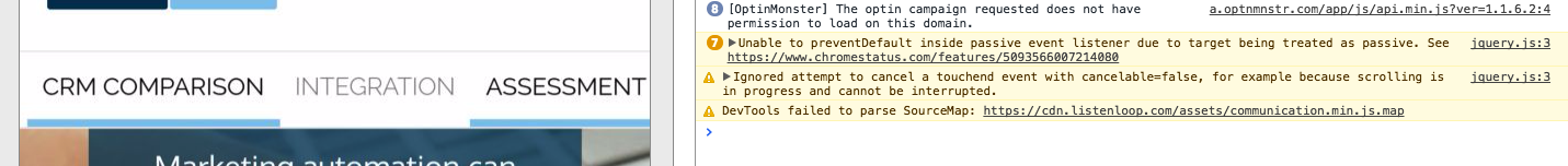
The Error: It's clearly a mobile only issue because of the touch scrolling but these are the two errors I found when debugging on my phone:
"Unable to preventDefault inside passive event listener due to target being treated as passive."
"Ignored attempt to cancel a touchend event with cancelable=false, for example because scrolling is in progress and cannot be interrupted."
See the error screenshot here and the two links showing the "active" CSS
What I'm trying to figure out is if there is a way to allow both the jQuery functions that are changing the active state based on a click or scroll but make sure that the active CSS is removed if a new scroll or click happens? Like it does seem that both are working, however, they just seem to overlap when someone scrolls after clicking.
Any ideas or direction would help to figure this out! I've included a basic JSFiddle here (if you want to actually see the issue, check the link from a mobile device). And here's the jQuery being used (including Sly):
jQuery(document).ready(function($) {

var stickyNavSpot = $('div.mb-menu').offset().top - 93;
    var topHeight = $('div.navbar').outerHeight();

    var stickyNav = function() {
        var scrollTop = $(window).scrollTop();

        if (scrollTop >= stickyNavSpot) {
            $('div.mb-menu').css ({
                'position': 'fixed',
                'top': topHeight+'px',
                'background-color': 'white'
            });
        } else if (scrollTop < stickyNavSpot){
            $('div.mb-menu').css ({
                'position': 'relative',
                'top': '0',
                'padding-top': '10px',
                'margin-left': '-20%'
            });
        }
    };
    stickyNav();
    $(window).scroll(function() {
        stickyNav();
    });
    $(window).resize(function() {
        stickyNav();
    });

var sections = jQuery('.anchor_space');
var nav = jQuery('div.mb-menu');
var nav_height = nav.outerHeight();

jQuery(window).on('scroll', function () {
    var cur_pos = jQuery(this).scrollTop();

        sections.each(function() {
            var top = jQuery(this).offset().top - 160,
                bottom = top + jQuery(this).outerHeight();

            if (cur_pos >= top && cur_pos <= bottom) {
                nav.find('li').removeClass('active');
                sections.removeClass('active');

                jQuery(this).addClass('active');

nav.find('li[title="#'+jQuery(this).attr('id')+'"]').addClass('active');
            }
        });

});

});


jQuery(function () {
 jQuery(".scroll").click(function(event) {
            event.preventDefault();
            jQuery('html, body').animate({
                scrollTop: jQuery(this.title).offset().top-205},
                500);
        });
});
jQuery(function($){
'use strict';
(function () {
var $frame = jQuery('#forcecentered');
    var $wrap  = $frame.parent();

    // Call Sly on frame
    $frame.sly({
        horizontal: 1,
        itemNav: 'basic',
        smart: 1,
        activateMiddle: false,
        activateOn: 'click',
        mouseDragging: 1,
        touchDragging: 1,
        releaseSwing: 1,
        startAt: 0,
        scrollBy: 0,
        speed: 300,
        elasticBounds: 1,
        easing: 'easeOutExpo',
        dragHandle: 1,
        dynamicHandle: 1,
        clickBar: 1
    });
}());
$(window).on('resize', function () { $frame.sly('reload'); });
});