0

I have an R dataframe (named frequency) like this:

word    author  proportion
a   Radicals    1.679437e-04
aa  Radicals    2.099297e-04
aaa Radicals    2.099297e-05
abbe    Radicals    NA
aboow   Radicals    NA
about   Radicals    NA
abraos  Radicals    NA
ytterst Conservatives   5.581042e-06
yttersta    Conservatives   5.581042e-06
yttra   Conservatives   2.232417e-05
yttrandefrihet  Conservatives   5.581042e-06
yttrar  Conservatives   2.232417e-05

I want to plot document differences using ggplot2. Something like this

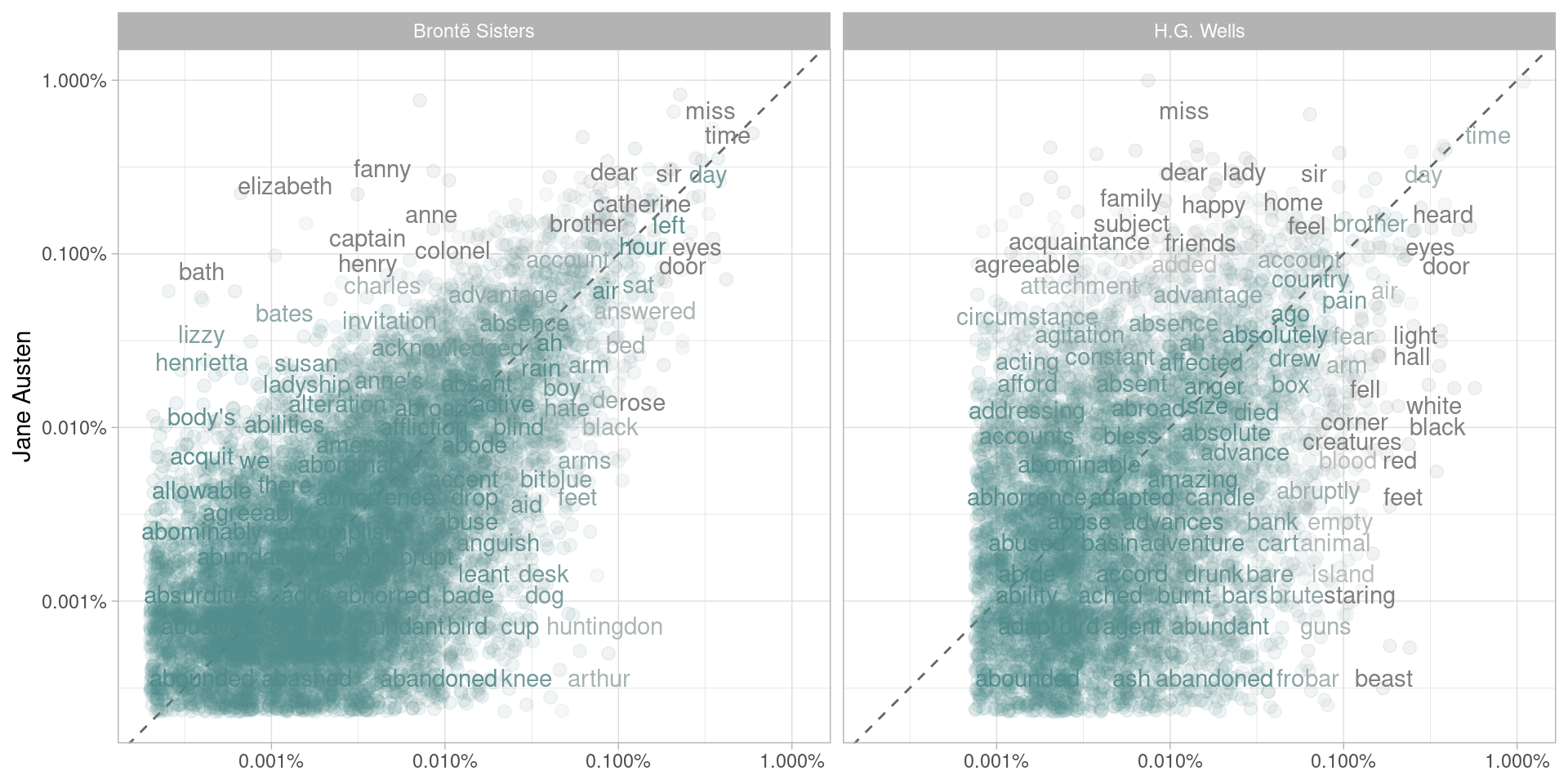
I have the code below, but my plot ends up empty.

library(scales)
ggplot(frequency, aes(x = proportion, y = `Radicals`, color = abs(`Radicals` - proportion))) +
    geom_abline(color = "gray40", lty = 2) +
    geom_jitter(alpha = 0.1, size = 2.5, width = 0.3, height = 0.3) +
    geom_text(aes(label = word), check_overlap = TRUE, vjust = 1.5) +
  scale_x_log10(labels = percent_format()) +
  scale_y_log10(labels = percent_format()) +
  scale_color_gradient(limits = c(0, 0.001), low = "darkslategray4", high = "gray75") +
  facet_wrap(~author, ncol = 2) +
  theme(legend.position="none") +
  labs(y = "Radicals", x = NULL)
Simon Lindgren
  • 2,011
  • 12
  • 32
  • 46

2 Answers2

2

Your plot ends up empty because there isn't a column 'Radicals'. if you're trying to narrow to only Radicals and then plot that you should do something like

 radical_frequecy <- subset(frequency, author == 'Radicals')

then you can do

 library(scales)
 ggplot(radical_frequency, aes(x = proportion, y = author, color = abs(`Radicals` - proportion))) +
geom_abline(color = "gray40", lty = 2) +
geom_jitter(alpha = 0.1, size = 2.5, width = 0.3, height = 0.3) +
geom_text(aes(label = word), check_overlap = TRUE, vjust = 1.5) +
   scale_x_log10(labels = percent_format()) +
   scale_y_log10(labels = percent_format()) +
   scale_color_gradient(limits = c(0, 0.001), low = "darkslategray4", high = "gray75") +
   theme(legend.position="none") +
   labs(y = "Radicals", x = NULL)

(I took out facet wrap since you've already narrowed to Radicals. You could add that back in and then do the first bit of code if you did y=author and facet_wrap(~author, ncol = 2)

basically, tl:dr your error is caused by trying to create an axis from a variable not a column

ike
  • 342
  • 3
  • 17
  • Still same problem. I try to follow the tutorial for [Figure 1.3 here](http://tidytextmining.com/tidytext.html#fig:plotcompare) – Simon Lindgren Apr 17 '17 at 14:11
  • ok, well again, it looks like you missed the core step at the top where they created the mutated data frame. I think you might go back and try those steps. – ike Apr 17 '17 at 14:16
  • 2
    then your frequency table does not reflect that. the output from the example would have a column for each author there. yours does not. look up how ggplot works for these kind of plots and you'll better be able to make these kinds of charts. there's tons of great tutorials such as [this one](http://r-statistics.co/ggplot2-Tutorial-With-R.html) – ike Apr 17 '17 at 14:49
1

If what you are wanting to do is make a plot comparing the frequency of one "author" (like, say, Conservatives) on the x-axis and one "author" (perhaps the Radicals) on the y-axis, you need to spread your dataframe (from the tidyr package) so that you can plot it that way.

library(tidyverse)
library(scales)

frequency %>%
  spread(author, proportion) %>%
  ggplot(aes(Conservatives, Radicals)) +
  geom_abline(color = "gray40", lty = 2) +
  geom_point() + 
  geom_text(aes(label = word), check_overlap = TRUE, vjust = 1.5) +
  scale_x_log10(labels = percent_format()) +
  scale_y_log10(labels = percent_format())
Julia Silge
  • 10,848
  • 2
  • 40
  • 48
  • Thanks! I was able to solve it like [this](https://github.com/simonlindgren/Tidy-Text-comparisons/blob/master/Tidy%2Btext%2Bcomparisons.ipynb). Does that seem reasonable? – Simon Lindgren Apr 17 '17 at 19:41
  • 1
    Yep, it looks like it; you might think about trying out `spread()` next time instead. – Julia Silge Apr 17 '17 at 19:53