0

I have 5 diagonal stripes here…

https://jsfiddle.net/70wk1hm2/

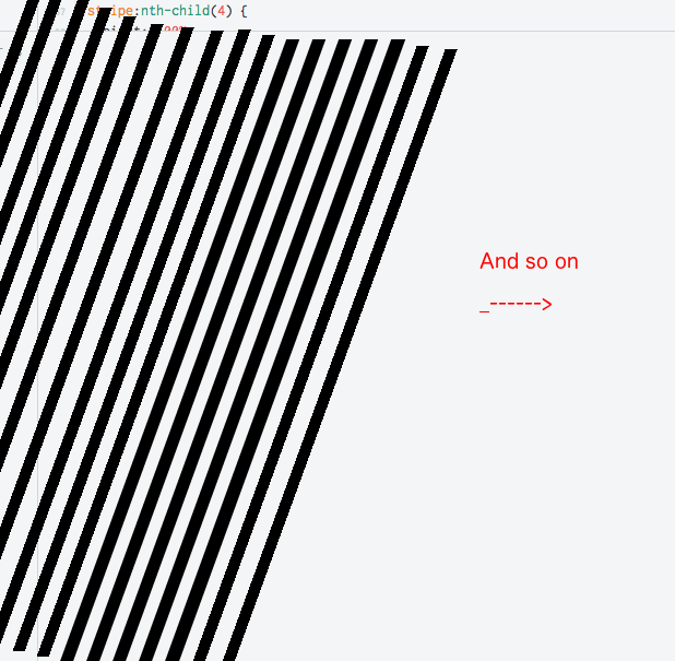
.... I have a problem with the left side (and the right -> It should be window-filling), it is empty, there should be stripes too, which come from the left (out of the nothing).And no matter what browser-windowsize. I know that I have a problem with margin-left, but I don't get the result which I would like to see.

And the spacing should be the same on both sides

HTML Code:

  <div class="stripe"></div>
  <div class="stripe"></div>
  <div class="stripe"></div>
  <div class="stripe"></div>
  <div class="stripe"></div>

CSS Code:

.stripe {
  height: 100%;
  width: 2%;
  background-color: black;
  position: fixed;
  transform: skew(-20deg);
  transform-origin: left bottom;
}

.stripe:nth-child(1) {
  height: 100%;
  width: 2%;
  margin-left: 0%;
  background-color: black;
  position: fixed;
}


.stripe:nth-child(2) {
  height: 100%;
  width: 2%;
  margin-left: 4%;
  background-color: black;
  position: fixed;
  animation-delay: 0.2s;
}

.stripe:nth-child(3) {
  height: 100%;
  width: 2%;
  margin-left: 8%;
  background-color: black;
  position: fixed;
}

.stripe:nth-child(4) {
  height: 100%;
  width: 2%;
  margin-left: 12%;
  background-color: black;
  position: fixed;
}

.stripe:nth-child(5) {
  height: 100%;
  width: 2%;
  margin-left: 16%;
  background-color: black;
  position: fixed;
}

Picture of the result i want: enter image description here

Pengyy
  • 37,383
  • 15
  • 83
  • 73

1 Answers1

0

Hope this is what you expected.

In the example below, each stripe has 2% width and 1% margin around ~> it has total 4% of viewport width. To fill 100% viewport, you needs 100 / 4 = 25 stripes. The .mask element help us hidden overflowing spaces from negative margin of .container. The results is completely symmetric by centered point.

html, body {
  height: 100%;
  margin: 0;
}

.mask {
  height: 100%;
  overflow: hidden;
}

.container {
  height: 100%;
  margin: 0 -100vh;
}

.stripe {
  float: left;
  height: 100%;
  width: 2%;
  margin: 0 1%;
  background-color: black;
  transform: skew(-20deg);
  transform-origin: center center;
}
<div class="mask">
  <div class="container">
    <div class="stripe"></div>
    <div class="stripe"></div>
    <div class="stripe"></div>
    <div class="stripe"></div>
    <div class="stripe"></div>
    <div class="stripe"></div>
    <div class="stripe"></div>
    <div class="stripe"></div>
    <div class="stripe"></div>
    <div class="stripe"></div>
    <div class="stripe"></div>
    <div class="stripe"></div>
    <div class="stripe"></div>
    <div class="stripe"></div>
    <div class="stripe"></div>
    <div class="stripe"></div>
    <div class="stripe"></div>
    <div class="stripe"></div>
    <div class="stripe"></div>
    <div class="stripe"></div>
    <div class="stripe"></div>
    <div class="stripe"></div>
    <div class="stripe"></div>
    <div class="stripe"></div>
    <div class="stripe"></div>
  </div>
</div>
VTr
  • 718
  • 3
  • 11