-2

I am trying to plot some comparative data in excel, but all the available graphs appear to be variants on basic lines (e.g. bars are just a different representation of the same logic).

The data I have is comparative scoring (on a scale of 1 to 10) of two options, as provided by a few dozen people.

        OptA  OptB
Score1    1     3
Score1    3     4
Score1    8     5
Score1    6     6

How do I get this to plot as a proper scatter graph; the axes being scores for OptA and OptB, with dots at (1,3), (3,4), (8,5) and (6.6), preferably with the name of the scorer alongside each?

The purpose is to allow visual representation of the relative scores, and any trend.

Rick
  • 397
  • 3
  • 16

1 Answers1

0

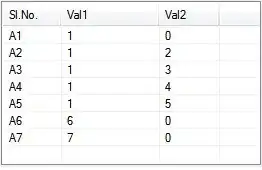
What about this one:

enter image description here

It will produce a chart like this: enter image description here

Update 1

If you want Column B to be Axis X and Column C to be Axis Y, then select only the data before clicking on the chart icon:

enter image description here

Update 2

There is a macro on Microsoft's page that can do it:

https://support.microsoft.com/en-za/help/914813/how-to-use-a-vba-macro-to-add-labels-to-data-points-in-an-xy-scatter-chart-or-in-a-bubble-chart-in-excel-2007

I'll copy the essence of it:

Sub AttachLabelsToPoints()

   'Dimension variables.
   Dim Counter As Integer, ChartName As String, xVals As String

   ' Disable screen updating while the subroutine is run.
   Application.ScreenUpdating = False

   'Store the formula for the first series in "xVals".
   xVals = ActiveChart.SeriesCollection(1).Formula

   'Extract the range for the data from xVals.
   xVals = Mid(xVals, InStr(InStr(xVals, ","), xVals, _
      Mid(Left(xVals, InStr(xVals, "!") - 1), 9)))
   xVals = Left(xVals, InStr(InStr(xVals, "!"), xVals, ",") - 1)
   Do While Left(xVals, 1) = ","
      xVals = Mid(xVals, 2)
   Loop

   'Attach a label to each data point in the chart.
   For Counter = 1 To Range(xVals).Cells.Count
     ActiveChart.SeriesCollection(1).Points(Counter).HasDataLabel = _
         True
      ActiveChart.SeriesCollection(1).Points(Counter).DataLabel.Text = _
         Range(xVals).Cells(Counter, 1).Offset(0, -1).Value
   Next Counter

End Sub

Alternatively, you may use PowerPoint's Scatter Chart that can do it without macro.

z32a7ul
  • 3,695
  • 3
  • 21
  • 45
  • Unfortunately, that is just another line/bar graph. It has column A as its X axis and the scale of values in columns B and C as its Y axis. I want column B as the X axis and column C as the Y axis; the dot then represents column A. i.e. there would be exactly 4 dots in this example, – Rick Mar 24 '17 at 09:37
  • Agreed - this gives the graph itself. But it lacks the visualisation value of being able to see who (column A) each dot represents. – Rick Mar 24 '17 at 23:44
  • Thanks. that looks promising. – Rick Mar 26 '17 at 20:23