I have a big form and the problem with alignment. I cut some fields, but the demo will show the problem.
I have two columns in the begining of the form, some rows use half of the width, some rows use full witdh. And, the problem with the last one. As you can see textareas is not aligned with the others inputs:
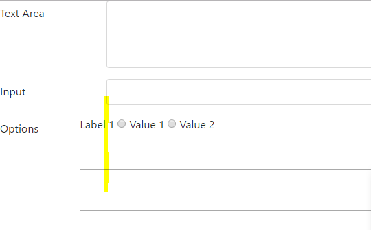
How can I fix it?
PS. I use Bootstrap 4, but, I think this question is related to Bootsrap 3 too.
.full-width {
  width: 100%;
}
<script src="https://ajax.googleapis.com/ajax/libs/jquery/2.1.1/jquery.min.js"></script>
<script src="https://npmcdn.com/tether@1.2.4/dist/js/tether.min.js"></script>
<link href="https://maxcdn.bootstrapcdn.com/bootstrap/4.0.0-alpha.6/css/bootstrap.min.css" rel="stylesheet"/>
<script src="https://maxcdn.bootstrapcdn.com/bootstrap/4.0.0-alpha.6/js/bootstrap.min.js" integrity="sha384-vBWWzlZJ8ea9aCX4pEW3rVHjgjt7zpkNpZk+02D9phzyeVkE+jo0ieGizqPLForn" crossorigin="anonymous"></script>
<form novalidate>
<div class="row">
<div class="col-md-8">
<div class="form-group row">
<label for="field1" class="col-md-2 col-form-label">Text Area</label>
<div class="col-md-10">
<textarea id="field1" class="form-control"
cols="30" rows="4"></textarea>
</div>
</div>
</div>
<div class="col-md-4">
<div class="form-group row">
<div class="col-md-12">
<div class="form-check">
<label class="form-check-label">
<input class="form-check-input" type="checkbox"> Checkbox 1
</label>
</div>
<div class="form-check">
<label class="form-check-label">
<input class="form-check-input" type="checkbox"> Checkbox 2
</label>
</div>
<div class="form-check">
<label class="form-check-label">
<input class="form-check-input" type="checkbox"> Checkbox 3
</label>
</div>
</div>
</div>
</div>
</div>
<div class="row">
<div class="col-md-8">
<div class="form-group row">
<label for="field2" class="col-md-2 col-form-label">Input</label>
<div class="col-md-10">
<input id="field2" class="form-control"/>
</div>
</div>
</div>
</div>
<div class="row">
<div class="col-md-12">
<div class="form-group row">
<label class="col-md-1 col-form-label">Options</label>
<div class="col-md-11">
<div class="row">
<div class="col-md-6">
<span>Label 1</span>
<input type="radio" name="group1" value="Value 1"> Value 1
<input type="radio" name="group1" value="Value 1"> Value 2
</div>
<div class="col-md-6">
<span>Label 2</span>
<input type="radio" name="group2" value="Value 1"> Value 1
<input type="radio" name="group2" value="Value 2"> Value 2
</div>
</div>
<div class="row">
<div class="col-md-12">
<div class="row">
<div class="col-md-11">
<textarea class="full-width"></textarea>
</div>
<div class="col-md-1">
<span">Icon</span>
</div>
</div>
<div class="row">
<div class="col-md-11">
<textarea class="full-width"></textarea>
</div>
<div class="col-md-1">
<span">Icon</span>
</div>
</div>
</div>
</div>
</div>
</div>
</div>
<div>
</form>