2

I have a series of files output from another code that contains pre-binned data which I would like to plot up using matplotlib.

A simple example of the contents from one of these files would be:

hist_file=[  0.00000000e+00,   1.52915100e+24,   0.00000000e+00,
             0.00000000e+00,   0.00000000e+00,   0.00000000e+00,
             0.00000000e+00,   0.00000000e+00,   0.00000000e+00,
             0.00000000e+00,   2.03886800e+24,   0.00000000e+00,
             0.00000000e+00,   0.00000000e+00,   0.00000000e+00,
             0.00000000e+00,   0.00000000e+00,   0.00000000e+00,
             0.00000000e+00,   0.00000000e+00,   0.00000000e+00,
             0.00000000e+00,   0.00000000e+00,   0.00000000e+00,
             0.00000000e+00,   0.00000000e+00,   0.00000000e+00,
             0.00000000e+00,   0.00000000e+00,   0.00000000e+00,
             0.00000000e+00,   0.00000000e+00,   0.00000000e+00,
             0.00000000e+00,   0.00000000e+00,   0.00000000e+00,
             0.00000000e+00,   0.00000000e+00,   0.00000000e+00,
             0.00000000e+00,   5.09717100e+23,   0.00000000e+00,
             1.00000000e+00]

Where hist_file[0] is a reference to the corresponding dump time in the simulation of the data, hist_file[-2] is the lower bound of the entire data and hist_file[-1] the upper bound. (so in this set of data, the dump is at 0, the lower bound on the data set is 0, and the upper bound is 1). hist_file[1:-2] is the binned data I am attempting to visualise.

Using bar I can plot the data (see code chunk below):

import matplotlib.pyplot as plt

hist_data=hist_file[1:-2]
plt.bar(range(0,len(hist_data)), hist_data)

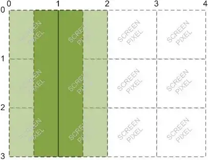
However, the xticks do not correspond to the actual bin values of the data (the interval [0,1]). This is shown in the following figure

See figure 1.

What I thought would work would be something as follows:

import numpy as np
hist_interval=np.linspace(hist_file[-2], hist_file[-1],len(hist_data))
plt.bar(hist_interval, hist_data)

But this produces a bar plot like the following which is clearly not right.

so

Furthermore I am aware that while I have len(hist_data) bins, the bin edges would be len(hist_data)+1 which I have been entirely unable to resolve due to their different sizes. Similarly I've tried using plt.set_xaxisticks and not made any headway either.

So all in all any help would be great thanks :D

Matthew
  • 33
  • 1
  • 5

1 Answers1

1

I'm not entirely sure where exactly you have problems, but the following would be an example of how you could plot your data.

import matplotlib.pyplot as plt
import numpy as np; np.random.seed(13)

xmin = 0 # minimum value (left edge of first bin)
xmax = 1 # maximum value (right edge of last bin)
N = 4    # number of values (bins)
# data
data = np.random.rand(N)
# coordinates of left bin edge:
x = np.arange(0,N)*(xmax-xmin)/float(N)
# bar width
width=(xmax-xmin)/float(N)

plt.bar(x, data, width=width, align="edge", edgecolor="k")
#set x ticks to bin edges
plt.xticks(list(x)+[xmax])
plt.show()

enter image description here

And here is the same example with xmax = 100 and 15 bars:

import matplotlib.pyplot as plt
import numpy as np; np.random.seed(13)

xmin = 0 # minimum value (left edge of first bin)
xmax = 100 # maximum value (right edge of last bin)
N = 15    # number of values (bins)
# data
data = np.random.rand(N)
# coordinates of left bin edge:
x = np.arange(0,N)*(xmax-xmin)/float(N)
# bar width
width=(xmax-xmin)/float(N)

plt.bar(x, data, width=width, align="edge", edgecolor="k")
#set x ticks to bin edges
plt.xticks((list(x)+[xmax])[::3], rotation =45)
plt.show()

enter image description here

ImportanceOfBeingErnest
  • 321,279
  • 53
  • 665
  • 712
  • Hi, thanks for the answer (and sorting out the figures in the original post). So I tried your example and it also did not work, but if I placed it into a new notebook it worked first time, similar for then using my data. I'm not sure why the original notebook was having trouble as nothing weird had gone on in there but thank you for the working solution. – Matthew Mar 10 '17 at 12:17
  • If this answers your question consider [accepting](https://meta.stackexchange.com/questions/5234/how-does-accepting-an-answer-work) it. If not, feel free to detail your additional problem. – ImportanceOfBeingErnest Mar 10 '17 at 12:42
  • Hi sorry, but trying after trying a different set of data it seems this only behaves well for the [0,1] interval. If for example the right edge of the last bin was 100, the resulting figure is a series of overlapping bars at the left hand side. – Matthew Mar 10 '17 at 12:51
  • I edited the answer to include `N=100`. There is essentially no difference. If you experience problems, I cannot help you without knowing the code you are using. – ImportanceOfBeingErnest Mar 10 '17 at 12:57
  • Sorry perhaps I was unclear, I meant with `xmax=100` and `N=4` in your example. – Matthew Mar 10 '17 at 13:01
  • Oh ja, you're right. I forgot to multiply the coordinates by the difference between the min and max values. Corrected the answer. – ImportanceOfBeingErnest Mar 10 '17 at 13:06
  • Brilliant, my head is not screwed on today at all to have noticed that. All sorted :) – Matthew Mar 10 '17 at 13:09