0

The answer to this question is probably more than obvious, but I just cannot get my head around (or rather, I think I know a solution, but it appears to complicated to me), so I thought I should ask for help.

My data looks like this:

MyItem Measurement First Last
Item1  10          267.4 263.2
Item2  15          263.2 254.8
Item3  3           250.5 250.5
Item4  20          266.9 253.2
Item5  16          260.0 250.0

My measurement for the first item is valid for the time 267.5 to 263.2 (arbitrary time units; could be seconds, years, ...). The measurement for the second item is valid from 263.2 to 254.8 and so on.

I would like to create a plot in R, where the x-axis represents time and the y-axis represents our measurements. Time should be divided in intervals of length 1. If the interval of our measurements overlaps with the time interval of the x-axis, a data point should appear in our plot (in the middle of the time interval on the x-axis). To give an example: Let's assume that our x-axis starts at 269 and ends at 249. Our first time interval on the x-axis goes from 269 to 268. None of our measurements falls into this time interval, therefore no data point is plotted. Our second time interval on the x-axis goes from 268 to 267. A measurement for Item1 has been recorded for this time interval. Therefore a data point is plotted in our time interval 268-267, with y=10 (our measurement) and x=267.5 (midpoint of our time interval 268-267). Our third time interval goes from 267 to 266. Two of our measurements fall into this time interval, namely Item1 and Item4. Therefore, two data points should be plotted, with the coordinates y=10, x=266.5 (Item1) and y=20, x=266.5 (Item4). We proceed like this for the rest of our data.

Unfortunately I haven't found a smart function/package to do this in R - usually you can only supply one value for the y-axis (which makes sense, as otherwise the mapping of your x-value becomes ambiguous) - but I'm sure there must be something. I thought that by using seq() I could create dummy values for every single time step (e.g., dummy values for Item1 would be 267.5, 266.5, 265.5, 264.5, 263.5 - all of them associated with y=10) and add those values to my data. But this appears to me as a very complicated solution, far from being elegant.

I'm sure there must be an easy and elegant way of doing this, but I can't come up with it. I don't even know, what I should look for - I thought you would see this issue come up in time series analyses, but that does not appear to be the case. What I do NOT want to do, is to take the mean time between the begin and the end of the time interval (e.g., for Item1 267.5+263.2/2 = 265.35).

If possible I would like to plot the scatter plot with ggplot2 (but I take any solution) and then fit a line through my plotted data points.

Thanks in advance for any help!
user6475
  • 31
  • 1
  • 11
  • I think you may get more help on a programming site as this is not really a question about statistics itself. –  Mar 06 '17 at 17:02
  • Hmmm, thank you! If that's the case, I should probably move the topic to Stackoverflow: Is that possible or do I have to recreate the posting there? – user6475 Mar 06 '17 at 17:09
  • I am not an expert on the protocols for migration the only thing I would suggest is that if you do it yourself you must delete it here as cross-posting annoys people. –  Mar 06 '17 at 17:13
  • Ok, I've flagged migration to Stackoverflow (unfortunately I cannot do it myself). – user6475 Mar 06 '17 at 17:28

2 Answers2

0

I'm at loss for a solution that does not involve transforming your data to "long" data. But I also don't think it is particularly inelegant as a tactic - but maybe we disagree on that point. Here's a quick, short solution using lapply() and rbind to generate a long version of your data:

# Convert data.frame to list, split on MyItem
dl <- split(df, df$MyItem)

# For each item, create a data frame with the measurements and a sequence of the intervals
lapply_output <- lapply(dl, function(item){
    out_df <- data.frame('MyItem' = item$MyItem,
                         'Measurement' = item$Measurement,
                         'Interval' = seq(floor(item$First), floor(item$Last))+ 0.5)
    return(out_df)
})
# Take the list of data frames and bind them together
long_data <- do.call(rbind, lapply_output)

# Plot using ggplot
p <- ggplot(long_data, aes(Interval, MyItem)) + geom_point()

Perhaps someone else has a quicker solution using one of the many packages made for reformatting data frames.

Jammeth_Q
  • 128
  • 7
  • Thank you very much for your help! This does, indeed, work: While I did have something similar in mind, it is definitely more elegant than my solution. Nevertheless, I'll leave the question open for now, as I still think that there must an even more simple approach to the problem. You would think other people already had to deal with such an issue. – user6475 Mar 06 '17 at 22:17
  • @user6475 Glad you found it elegant! Yes hopefully someone will come up with something more novel and we'll both learn from it. – Jammeth_Q Mar 06 '17 at 23:06
0

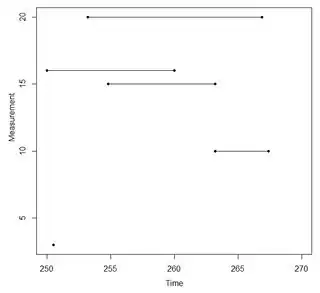
This is not especially novel, but it is a simple way to capture all three of your variables (First, Last, Measurement) with Time on the x-axis and Measurement on the y.

plot(df$First, df$Measurement, pch=20, xlim=c(250,270),
    xlab="Time", ylab="Measurement")
points(df$Last, df$Measurement, pch=20)
segments(df$First, df$Measurement, df$Last, df$Measurement)

Line plot

G5W
  • 36,531
  • 10
  • 47
  • 80
  • Thank you very much! Yes, indeed, this works as well and the representation is a nice out-of-the-box way of thinking. I'm sure I wouldn't have come up with this, thanks a lot! If I want to fit a line through my plotted data points (which also takes account of the range), I guess I would still have to use an approach that is similar to the one @Jammeth_Q proposed. – user6475 Mar 07 '17 at 10:41
  • So far I found both answers very useful: @Jammeth_Q's answer does exactly what I asked and also allows for curvefitting, but is less simple than your answer (but definitely more elegant than my approach). Your answer, on the other hand, plots the data differently from what I had in mind (but in a very clever way), does not allow curve-fitting in its current state (as far as I can tell), but is indeed very simple to implement. – user6475 Mar 07 '17 at 10:42
  • I'm still going to keep the question open, to see whether there's an alternative that combines the simplicity of your approach with the flexibility of @Jammeth_Q's answer (potentially without having to rely on seq() or segments()). Thank you very much! – user6475 Mar 07 '17 at 10:42