0

enter image description here

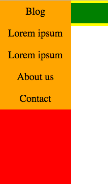
I have a sidebar navigation with a width of 10%. But at a certain width (smaller) the side bar looks like this:

enter image description here

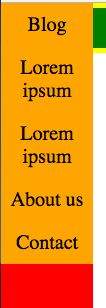
"Lorem ipsum" is under eachother and that's not what i want. I want that the height of the side bar navigation (the orange part) stays the same and that the text will disappear in the div. How do I do this?

HTML:

<div id="sideMenu">
        <ul>
            <li> Blog </li>
            <li> Lorem ipsum </li>
            <li> Lorem ipsum </li>
            <li> About us </li>
            <li> Contact </li>
        </ul>
    </div>

CSS:

#sideMenu {
    background-color: red;
    width: 10%;
    transition: 0.5s;
    position: fixed;
    top: 0;
    height: 100%;
}

#sideMenu ul li {
    background-color: orange;
    font-size: 20px;
    padding: 10px 0px;
    text-align: center;
}
Soccerlife
  • 671
  • 3
  • 9
  • 20

1 Answers1

1

You can accomplish what you're trying to do by making the following changes to your code:

#sideMenu {
  overflow: hidden;
}

#sideMenu ul li {
  white-space: nowrap;
}

#sideMenu {
  background-color: red;
  width: 10%;
  transition: 0.5s;
  position: fixed;
  top: 0;
  height: 100%;
  overflow: hidden;
}

#sideMenu ul li {
  background-color: orange;
  font-size: 20px;
  padding: 10px 0px;
  text-align: center;
  white-space: nowrap;
}

ul {
  margin: 0;
  padding: 0;
}

li {
  list-style-type: none;
}
<div id="sideMenu">
  <ul>
    <li> Blog </li>
    <li> Lorem ipsum </li>
    <li> Lorem ipsum </li>
    <li> About us </li>
    <li> Contact </li>
  </ul>
</div>
Jeff Miller
  • 2,405
  • 1
  • 26
  • 41