I tried to make it with border but gradient makes it impossible. Maybe I can make four divs and make it like that?
I tried to make it with border but gradient makes it impossible. Maybe I can make four divs and make it like that?
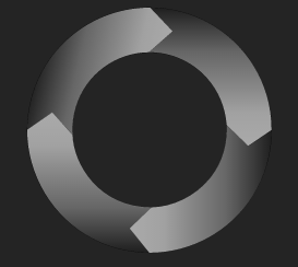
CSS might not be the best way to create such shapes. You should use SVG instead.
We can use SVG's path element to create a pointing arrow like shape and fill it with gradient created with linearGradient.
Only one attribute d is used to define shapes in path element. This attribute itself contains a number of short commands and few parameters that are necessary for those commands to work.
Here is a detailed information about SVG paths:
body {
  text-align: center;
  background: #333;
  margin: 20px;
}
<svg width="400" height="400" viewBox="0 0 400 400" xmlns="http://www.w3.org/2000/svg">
<defs>
<linearGradient id="gradient">
<stop offset="0" stop-color="#212121"></stop>
<stop offset="1" stop-color="#a7a7a7"></stop>
</linearGradient>
<path id="arrow" x="0" y="0" d="M0,200
A200,200 0, 0, 1, 200,0
L225,25
L200,50
A150,150, 0, 0, 0 50,200
L25,175" fill="url(#gradient)" />
</defs>
<use xlink:href="#arrow" transform="translate(0,400) rotate(270)"></use>
<use xlink:href="#arrow" transform="translate(400,400) rotate(180)"></use>
<use xlink:href="#arrow" transform="translate(400,0) rotate(90)"></use>
<use xlink:href="#arrow"></use>
</svg>