2

I am new with CSS and need some help, please. Although it seems to be simple to solve, I am already working in this problem for about 4 hours. I found many similar questions on internet, but each case is particulary different from mine, and the "solutions" can't solve my problem (already tried most of them).

Here is the basic structure of my html page:

<!DOCTYPE HTML PUBLIC "-//W3C//DTD XHTML 1.0 Transitional//EN"
"http://www.w3.org/TR/xhtml1/DTD/xhtml1-transitional.dtd">
<html >
<head>
    <title>Test</title>
</head>
<body>

    <div id="main">

        <div id="head">
            <div id="head_content">
                HEARDER
            </div>
        </div>

        <div id="body">

            <div id="menu">
                MENU
            </div>

            <div id="page">
                PAGE CONTENT
            </div>

        </div>

        <div id="foot">
            <div id="foot_content">
                FOOTER
            </div>
        </div>

    </div>

</body>
</html>

And here is the CSS I am trying to implement:

html {
    height: 100%;
}

body {
    margin:0;
    padding:0;
    width:100%;
    height: 100%;
    min-height: 100%;
    background: #DEDEDE;
}

#main {
    width: 100%;
    min-height:100%;
    position:relative;
}

#head {
    width: 100%;
    height: 58px;
    border-bottom: 1px solid #115293;
    background-color: #1976D2;
}

#head #head_content {
    width: 1000px;
    padding: 6px;
    color: #FFFFFF;
    margin: 0 auto;
    text-align: center;
}

#body {
    width: 1000px;
//    height: 100%;
//    min-height: 100%;
    margin: 0 auto;
//    padding-bottom: 50px;
    border-left: 1px solid #BFBFBF;
    border-right: 1px solid #BFBFBF;
}

#body #menu {
    float: left;
    width: 220px;
//    height: 100%;
//    min-height: 100%;
    background-color: #94C9FF;
}

#body #page {
    overflow: hidden;
//    height: 100%;
//    min-height: 100%;
    padding: 10px;
    color: #5C5C5C;
    border-left: 1px solid #BFBFBF;
    background-color: #FFFFFF;
}

#foot {
    position:absolute;
    bottom: 0;
    left: 0;
    width: 100%;
    height: 58px;
    color: #FFFFFF;
    border-top: 1px solid #115293;
    background-color: #1976D2;
}

#foot #foot_content {
    position: relative;
    width: 1000px;
    padding: 6px;
    margin: 0 auto;
    text-align: center;
}

Obs: Commented lines are SOME of the solutions I already tried.

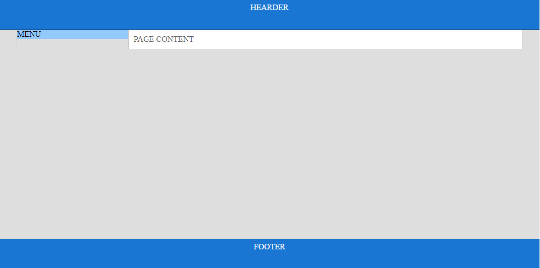
Here is what I got so far:

enter image description here

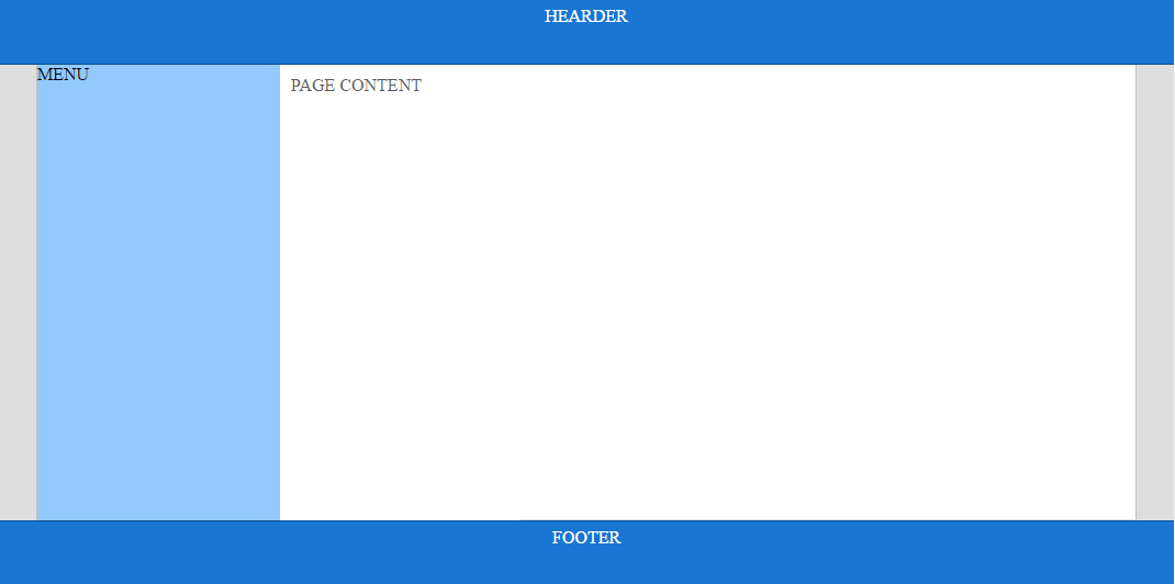
And finally here is what I really need:

enter image description here

Guybrush
  • 1,575
  • 2
  • 27
  • 51
  • u are just missing height property for #main. add that in and add height back in body, #page #menu with value set to 100%. https://jsfiddle.net/9pao4qs1/ – JungJoo Feb 12 '17 at 05:38
  • @JungJoo, doing this way the page goes before the foot div... I'd like the foot div be in the last bottom of the page. Do you know how to fix? Thank you! – Guybrush Feb 12 '17 at 15:35
  • @JungJoo, I used in the wrapper (#body div) this parameter height: calc(100% - Npx) and could solve the problem. But now I have another problem, when the content is bigger then the screen, it does not increase height automatically... https://jsfiddle.net/9pao4qs1/2/ – Guybrush Feb 12 '17 at 17:29
  • oh i missed that. I just added clear: left to footer and changed it to float. https://jsfiddle.net/f11w1ryp/ – JungJoo Feb 14 '17 at 03:47

3 Answers3

2

The reason you were having trouble getting the #body div to be the full height of the remaining space is because each of the wrapping elements needed height:100% not just one of them. That means #main, #body, #page and #menu.

html {
    height: 100%;
}

body {
    margin:0;
    padding:0;
    width:100%;
    height: 100%;
    min-height: 100%;
    background: #DEDEDE;
}

#main {
    width: 100%;
    min-height:100%;
    position:relative;
  height:100%;
}

#head {
    width: 100%;
    height: 58px;
    border-bottom: 1px solid #115293;
    background-color: #1976D2;
}

#head #head_content {
    width: 1000px;
    padding: 6px;
    color: #FFFFFF;
    margin: 0 auto;
    text-align: center;
}

#body {
  height:100%;
    width: 1000px;
    margin: 0 auto;
    border-left: 1px solid #BFBFBF;
    border-right: 1px solid #BFBFBF;
}

#body #menu {
    float: left;
    width: 220px;
    background-color: #94C9FF;
  height:100%;
}

#body #page {
    overflow: hidden;
    padding: 10px;
    color: #5C5C5C;
    border-left: 1px solid #BFBFBF;
    background-color: #FFFFFF;
  height:100%;
}

#foot {
    position:absolute;
    bottom: 0;
    left: 0;
    width: 100%;
    height: 58px;
    color: #FFFFFF;
    border-top: 1px solid #115293;
    background-color: #1976D2;
}

#foot #foot_content {
    position: relative;
    width: 1000px;
    padding: 6px;
    margin: 0 auto;
    text-align: center;
}
<html >
<head>
    <title>Test</title>
</head>
<body>

    <div id="main">

        <div id="head">
            <div id="head_content">
                HEARDER
            </div>
        </div>

        <div id="body">

            <div id="menu">
                MENU
            </div>

            <div id="page">
                PAGE CONTENT
            </div>

        </div>

        <div id="foot">
            <div id="foot_content">
                FOOTER
            </div>
        </div>

    </div>

</body>
</html>
Dylan Stark
  • 2,325
  • 17
  • 24
  • Hi Dylan! Strange, I added a comment here "yesterday" (4 am), but it disappeared... Well, I already tried the 100% height as you did, but the problem is that I need the foot div in the last bottom of the page, and when we add this 100% height, there is a part of the page before the foot div. Do you know how to fix? Thanks! – Guybrush Feb 12 '17 at 15:29
  • I used in the wrapper (#body div) this parameter height: calc(100% - Npx) and could solve the "over height" problem. But now I have another problem, when the content is bigger then the screen, it does not increase height automatically... https://jsfiddle.net/9pao4qs1/2/ ... Please, do you know how to solve? Thanks! – Guybrush Feb 12 '17 at 17:31
  • Well, another step donne but still have problems... Now the code works with dynamic content (flexible height), the footer always stays in the end of page (screen). But the content vertical borders do not follow the height... Please, have a look https://jsfiddle.net/r56oqg41/ – Guybrush Feb 12 '17 at 19:50
  • Hi @Guybrush, might be able to help but please post as a new question to stack overflow. – Dylan Stark Feb 12 '17 at 20:25
  • Yes, I am thinking about this... Thanks! – Guybrush Feb 12 '17 at 20:33
  • Dylan, here it is. Thank you! http://stackoverflow.com/questions/42193035/css-dynamic-content-height-without-vertical-border – Guybrush Feb 12 '17 at 20:47
0

You can do this in the following way--

Just use the height unit as vh(viewport height) relative to viewport. Add rest of your css to get desired width effect.

checkout the snippet

#main {
  background-color:blue;
  height: 10vh;
  }
#body {
  background-color:grey;
  height:80vh;
  }
#foot {
  background-color:blue;
  height: 10vh;
  }
<!DOCTYPE HTML PUBLIC "-//W3C//DTD XHTML 1.0 Transitional//EN"
"http://www.w3.org/TR/xhtml1/DTD/xhtml1-transitional.dtd">
<html >
<head>
    <title>Test</title>
</head>
<body>

    <div id="main">

        <div id="head">
            <div id="head_content">
                HEARDER
            </div>
        </div>

        <div id="body">

            <div id="menu">
                MENU
            </div>

            <div id="page">
                PAGE CONTENT
            </div>

        </div>

        <div id="foot">
            <div id="foot_content">
                FOOTER
            </div>
        </div>

    </div>

</body>
</html>

You can find compatibility here---

vh compatibility

EDIT

As fallback for vh unit I think you can use javascript . Through javascript you can get the window size. Then specify the height of the footer as percentage of the window height.

This question can be good starting point

Community
  • 1
  • 1
neophyte
  • 6,540
  • 2
  • 28
  • 43
  • Hi neophyte! Hummm... never heard about this solution before. Do you know about compatibility? Tomorrow I will make a reasearch and tests, and let you know. Here is 4am now. Thank you! – Guybrush Feb 12 '17 at 06:01
  • added browser compatibility in the answer. – neophyte Feb 12 '17 at 06:23
  • Well, it's a relative new CSS parameter, the compatibility is limited, I will prefer other approach for now... maybe in a year or two this approach would be the best way to solve the problem. Thank you! – Guybrush Feb 12 '17 at 15:31
  • after your comment I tried for some fallback approach. Added it in the answer. – neophyte Feb 12 '17 at 15:43
  • Sorry, I prefer not to use javascript, only CSS... Thanks! – Guybrush Feb 12 '17 at 19:46
0

you can add the following to css based on the size of content you require the content to be, just change the pixels based on the content you want:-

div#page {
    width: 100%;
    height: 600px;
}

I hope it will help

  • Hi! I do not want to have a fixed height... the foot div must be in the last bottom of the screen... Thanks! – Guybrush Feb 12 '17 at 15:32