Our team is creating a Service Portal page within ServiceNow and is running into formatting issues with flexboxes. We have a container with a row with three columns and each column will contain a widget. Currently, it looks like this:

We want all three widgets to be the same height and width. You can see that the Maps and Youtube widgets are the same exact size but the Open task widget on the left will not expand to fill the space. Here's how I defined the classes:
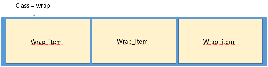
.wrap {
  display: flex;
  flex-wrap: wrap;
  width: 100%;
  height: 100%;
}

.wrap_item {
  background-color: yellow;
  border: black 1px solid;
  padding: 10px;
  display: flex;
  flex-direction:column;
}
It looks like the wrap and wrap_items are working correctly since the yellow portions extend the entire space, but for some reason I cannot get the Open Task widget itself to fill the entire space.
The Map and Youtube widgets are enclosed in bootstrap responsive tags: <div class="content embed-responsive embed-responsive-16by9">
The Open Tasks widget's code looks like this:
<div id="something" class="{{::c.options.class_name}} wrapper label-{{::c.options.color}}" ng-if="c.options.table">
<a ng-href="?id={{::c.options.sp_page_dv}}&table={{::c.options.table}}&filter={{::c.options.filter}}">
<h1><i class="fa fa-{{::c.options.glyph}}" aria-hidden="true" ></i> {{c.data.count}}</h1>
<h3>{{::c.options.title}}</h3>
</a>
</div>
.wrap_item #something {
background-color: $white;
text-align: center;
}
I've tried everything with defining height =100% for the div, body, html, but nothing works. Any ideas on how to rectify this?
Thanks!
@Michael_B, this is what it looks like (i added in some text below)
