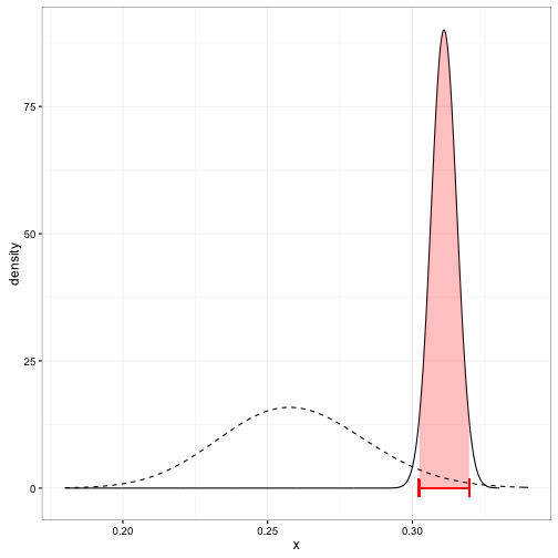
I'm looking to create a plot that looks similar to this one on David Robinson's variance explained blog:

I think I have it down except for the fill that goes between the credible intervals and under the posterior curve. If anyone knows how to do this it would be great to get some advice.
Here's some sample code:
library(ebbr)
library(ggplot2)
library(dplyr)

sample<- data.frame(id=factor(1:10), yes=c(20, 33, 44, 51, 50, 50, 66, 41, 91, 59),
                total=rep(100, 10))

sample<-
  sample %>%
  mutate(rate=yes/total)

pri<-
  sample %>%
  ebb_fit_prior(yes, total)

sam.pri<- augment(pri, data=sample)

post<- function(ID){
  a<-
    sam.pri %>%
    filter(id==ID)

  ggplot(data=a, aes(x=rate))+
    stat_function(geom="line", col="black",  size=1.1, fun=function(x)
      dbeta(x, a$.alpha1, a$.beta1))+
    stat_function(geom="line", lty=2, size=1.1,
                  fun=function(x) dbeta(x, pri$parameters$alpha,     pri$parameters$beta))+
    geom_segment(aes(x=a$.low, y=0, xend=a$.low, yend=.5), col="red", size=1.05)+
    geom_segment(aes(x = a$.high, y=0, xend=a$.high, yend=.5), col="red", size=1.05)+
    geom_segment(aes(x=a$.low, y=.25, xend=a$.high, yend=.25), col="red", size=1.05)+
xlim(0,1)
}

post("10")
