2

I have multiple histograms generated from various samples that need to be combined in the end. What I have found is that I am not getting good results at the combination stage because different plots have different max values, but if I normalize them to somewhat similar values I get a good result.

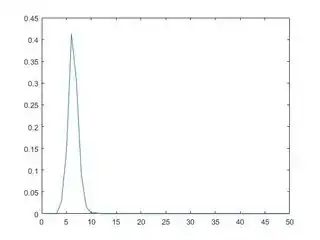
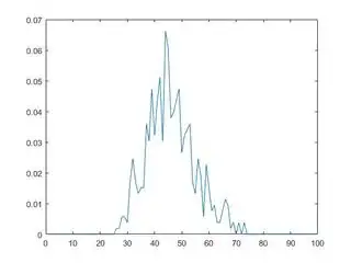
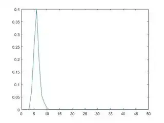
For example the below three plots:

enter image description here enter image description here enter image description here

Now as can be seen one of the plots peak at around 0.067 while the other two at around 0.4. I cannot combine them in this state, but after looking at the plots visually I know that if I multiply the first plot 0.6 I get this:

enter image description here

Now they are at same level and can be displayed together.

I am doing this visually for every result. Would it be possible to automate this? As its not always like this, sometimes the first and second inputs(plot) are low but the third one is peaked and I would have to divide the third plot by a certain value, which I know after visually looking at the plots.
NoDataDumpNoContribution
  • 10,591
  • 9
  • 64
  • 104
StuckInPhDNoMore
  • 2,507
  • 4
  • 41
  • 73
  • 1
    "Normalize" histograms by divide or multiply can sometimes run out some properties of the histogram, such as area/power of the histogram, or relations between parts. If all you want is to place them on the same graph, maybe `plotyy` will help here? – Adiel Jan 11 '17 at 12:54

1 Answers1

3

Matlabs function histogram has some normalization types built in. You can either normalize the number of counts, or the sum of the histogram area (see also), ... but you cannot yet normalize for a maximum value which is what you want probably.

I recommend to compute the histograms without plotting using histcounts, then normalizing them to a common maximum like 1 for example and then plotting them all together or separate in bar plots.

Example:

% generate example data
a = randn(100, 1) + 5;
b = randn(100, 1) * 4 + 8;
nbins = 0:20;

% compute histograms
[na, edges] = histcounts(a, nbins);
centers = mean([edges(1:end-1);edges(2:end)]);
nb = histcounts(b, nbins);

% normalize histograms to maximum equals 1
na = na / max(na);
nb = nb / max(nb);

% plot as bar plots with specified colors (or however you want to plot them)
figure;
bar_handle = bar(centers', [na',nb']);
bar_handle(1).FaceColor = 'r';
bar_handle(2).FaceColor = 'g';
title('histogram normalized to max');

and it looks like

enter image description here

Community
  • 1
  • 1
NoDataDumpNoContribution
  • 10,591
  • 9
  • 64
  • 104