I have an existing ruby on rails webapp and I have used Bootstrap 3 to make it fully responsive and for other styling requirements. Now some of my webpages contain data tables. Since my webapp is fully responsive, so when I open my webapp in mobile devices, the data tables get fit into the small screen and a horizontal scrollbar comes at bottom. But I don't need this feature. I need that the whole table will be visible with smaller fonts and without horizontal scrollbar.
Is there any way to achieve this using media queries and any other tricks?
Please help me to figure out this.
Thanks in advance!!!
My data table is as follows:
<table class="table table-striped table-hover" id="indentdatesort">
<thead>
<tr>
<th>Indent No.</th>
<th>Warehouse</th>
<th>Item</th>
<th>Make/Catno</th>
<th>UOM</th>
<th>Qty</th>
<th>Qty P</th>
<th>Sh Cl</th>
<th>Date</th>
<th>SortDate</th>
<th>Rqt Dt</th>
<th>Sort Rqt Dt</th>
<th>Cost Centre</th>
<th>Remarks</th>
<th>By</th>
<th>Entry</th>
<th></th>
</tr>
</thead>
<tbody>
<tr>
<td>INDMSF/16-17/00002</td>
<td>Furnace</td>
<td>Cotton Hand Gloves</td>
<td></td>
<td>pair</td>
<td>12.0</td>
<td>0.0</td>
<td></td>
<td>25/06/16</td>
<td>06/25/16</td>
<td>25/06/16</td>
<td>06/25/16</td>
<td>Kiln . Kiln 1 . Girth Gear</td>
<td></td>
<td>Ashfaque</td>
<td>Ayush Jhunjhunwala</td>
<td><input class="btn btn-default btn-xs" name="154" type="submit" value=">" /></td>
</tr>
<tr>
<td>INDMSF/16-17/00003</td>
<td>Furnace</td>
<td>Bearing 22317 EW33J</td>
<td></td>
<td>no</td>
<td>2.0</td>
<td>2.0</td>
<td></td>
<td>31/08/16</td>
<td>08/31/16</td>
<td>31/08/16</td>
<td>08/31/16</td>
<td></td>
<td></td>
<td>Ashfaque</td>
<td>Ayush Jhunjhunwala</td>
<td><input class="btn btn-default btn-xs" name="155" type="submit" value=">" /></td>
</tr>
</tbody>
</table>
My actual view is:

My mobile view is:-
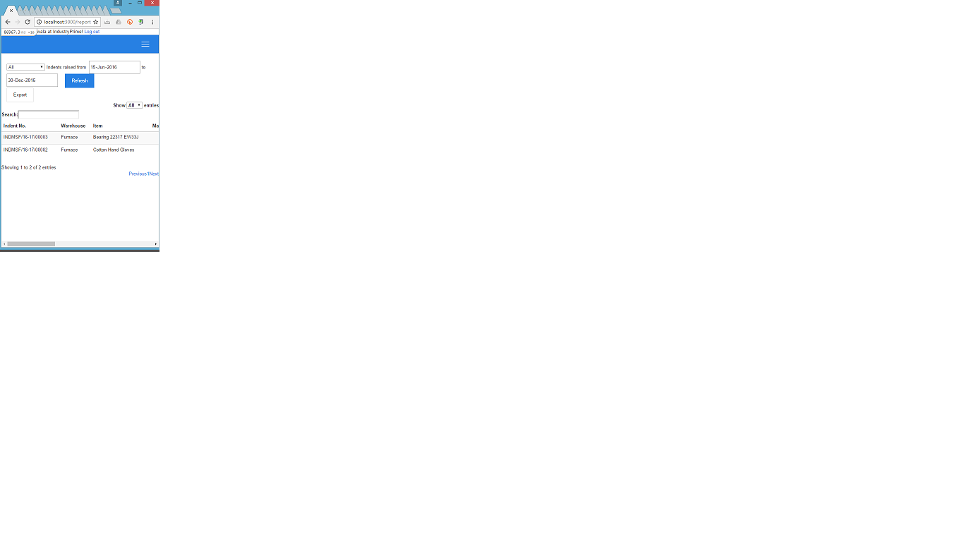
See, in the mobile view, a horizontal scrollbar is appearing. I do not need this scrollbar and I want to see the all table columns to be fitted in the small screen, may be with small fonts.