0

I have a data set that looks like this:

dens1    dens2    dens3    conc
0.339    0.354    0.432    123
0.287    0.234    0.324    143
0.236    0.453    0.123    153
0.182    0.235    0.324    143
0.18     0.245    0.213    153

I am interested in plotting the average dens vs conc and using the three dens columns to put standard error bars on each point. Plotting the average dens vs conc is simple in JMP, but I am not sure how to plot the error bars.
Chillie
  • 1,030
  • 10
  • 28
Ozzy
  • 1
  • 1

1 Answers1

0

This seems to be a less than straightforward thing to do in JMP, regardless of the way the data are organized.

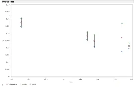
One way to approximate it is to use formula columns to calculate new columns with the mean density and the std error of the mean for density (sd/sqrt(3)). Then, using those columns, create new columns for upper bar (mean + se) and lower bar values (mean - se). Use an overlay plot to plot the mean, upper and lower bar values as Ys and conc as the X. You can add lines to connect the points by selecting "Needle" under "Y Options".

I jittered the repeated values of the conc variable; +1 and -1 seemed to work.

Unfortunately, it all looks a bit "non-standard," as you can see. I'm not wild about it, but it uses a standard JMP plot and doesn't need extensive JMP Scripting Language (JSL) to accomplish.

Overlay Plot with SE

Edward Carney
  • 1,372
  • 9
  • 7