9

As a student, I'm actually making my own portfolio.
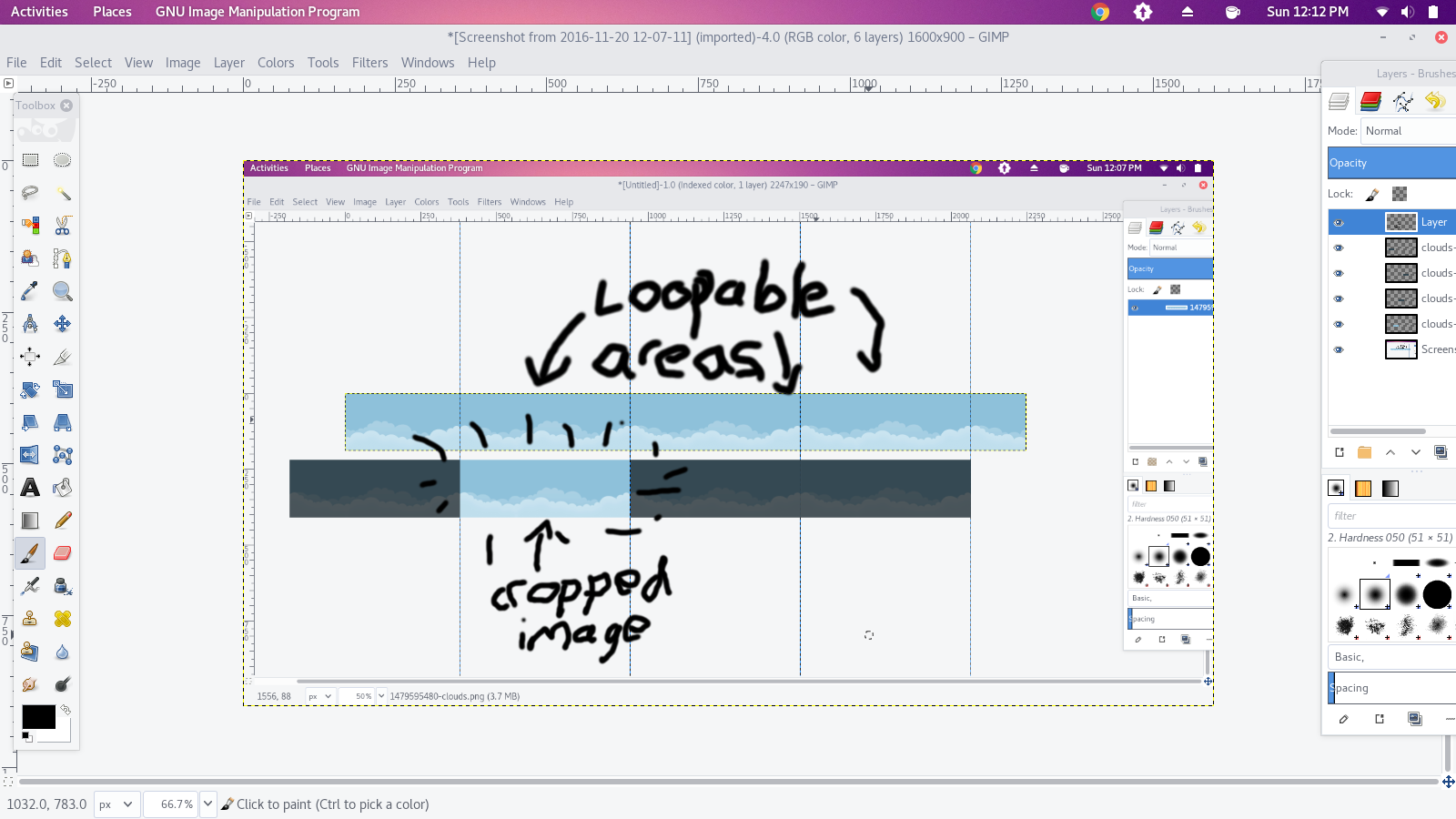
For the header, I tried to create a sky effect, with an image scrolling horizontally. I used CSS and keyframes, the problem I have is that when the image come to the end, it "resets" and doesn't continue to scroll smoothly.
Is there any way to make it continue "indefinitely" ? (I changed the duration to 5s just to not make you wait the 40s :p)

@keyframes animatedBackground {
  from { background-position: 0 0; }
  to { background-position: 100% 0; }
}
#header-top {
  height: 190px;
  background-image: url('http://image.noelshack.com/fichiers/2016/46/1479595480-clouds.png');
  background-repeat: repeat-x;
  animation: animatedBackground 5s linear infinite;
  line-height: 400px;

}
<div id="header-top">
</div>
CoolCoder
  • 786
  • 7
  • 20
ShiroHaru __
  • 103
  • 1
  • 1
  • 5
  • 3
    The usual practice for such thing is to make the image end in the very same way it starts so the animation naturally feels like it loops. It should match entirely the whole viewport to make it a seamless transition. – Juan Ferreras Nov 19 '16 at 23:08
  • as @JuanFerreras mention this is how all the animation works it start right from the beginning and they make the end same as the beginning `Gif` as example – Mohammad Al Baghdadi Nov 20 '16 at 03:20

1 Answers1

20

I just cropped your image so the end lines up with the start. Then, I modified the animatedBackground keyframes to end at the opposite end of the image.

Explanation Image

Cropped image: Cropped Clouds

How it works

@keyframes animatedBackground {
  from {
    left: 0px;
  }
  90% {
    left: -562px;
  }
  100%{left: 0px;}
}
#header-top {
  height: 190px;
  width: 562px;
  overflow-x: auto;
  overflow-y: hidden;
}
* {
  margin: 0;
  padding: 0;
  font-family:sans-serif;
}
.inner-cont {
  width: 1126px;
  position: relative;
  animation: animatedBackground 4s linear infinite;
}
img{
  border-right:1px solid black;
  box-sizing:border-box;
}
<div id="header-top">
  <div class='inner-cont'>
    <img src="https://archive.org/download/clouds-tiled/clouds-tiled.png" /><img src="https://archive.org/download/clouds-tiled/clouds-tiled.png" />
  </div>
</div>
<h3>^ How it actually works(almost) ^</h3>
<h4>The spinback doesn't actually get animated, but it happens <br/>(The line separates the looped images from each other)</h4>

Final result

@keyframes animatedBackground {
  from { background-position: 0px 0; }
  to { background-position: -562px 0; }
}
#header-top {
  height: 190px;
  width:100%;
  background-image: url('https://archive.org/download/clouds-tiled/clouds-tiled.png');
  background-repeat: repeat-x;
  animation: animatedBackground 2s linear infinite;
  line-height: 400px;

}
<div id="header-top">
    </div>
Pranav Nutalapati
  • 684
  • 1
  • 7
  • 22
  • Excellent, thank you! To add to your solution because it took me a while to figure some CSS and where the image gets cut. Lets say, there are 5 images side-by-side. The first image gets cut into half. The last image gets cut into half. Your image is 562px wide. My image is 2000px wide. Inside the @keyframes, your 'to {background-position: -562px 0;) is at the width of your one image, running from right-to-left. I needed from left-to-right, so I solved it as 'to {background-position: 2000px 0;}. Just putting it out there, perhaps someone stumbles across similar scenario as mine. – Mugé Jul 22 '21 at 16:04