0

i am stuck with this. I am working with the responsiveness of my custom site. I am using bootstrap. Why does my <div class="col-xs-4"> goes down in a view of 737x width. Here is the screenshot : Screenshot

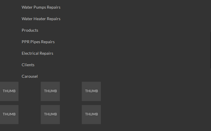
i want the boxes of image to be in the right side of the text. my image are inside of the <div class="col-xs-4"> Here is the jsfiddle:https://jsfiddle.net/DTcHh/26370/

here is my structure:

<div class="container-fluid">
<div class="row">
<div class="col-md-4">
</div>
<div class="col-md-8">
  <div class="row row-left">
    <div class="col-xs-4 col-box2">

    </div>
    <div class="col-xs-4 col-box2">

    </div>
    <div class="col-xs-4 col-box2">

    </div>
    <div class="col-xs-4 col-box2">

    </div>
  </div>
  <div class="row row-left">
    <div class="col-xs-4 col-box2">

    </div>
    <div class="col-xs-4 col-box2">

    </div>
    <div class="col-xs-4 col-box2">

    </div>
    <div class="col-xs-4 col-box2">

    </div>
  </div>
</div>
</div>
</div>

my css:

.col-box2 img {
    width: 80%;
    height: auto;
}
.col-box2 {
   display:inline-block;
   float:none;
   text-align:left;
   margin-right: 3.6%;
   width: 15.6%;
   margin-bottom: 2%;
}
.row-left {
    margin-right: 0;
    text-align: left;
}
Jc John
  • 1,799
  • 2
  • 34
  • 69

2 Answers2

1

See if this helps you:
https://jsfiddle.net/panchroma/DTcHh/26371/

On line 3 and line 5 of your HTML you had

<div class="col-md-4">

and

<div class="col-md-8">

but when they collapse it also affects their children, in this case your col-xs-4 elements

You'll see I've changed lines 3 and 5 of your HTML to

<div class="col-xs-4">

and

<div class="col-xs-8">

and all is good.

David Taiaroa
  • 25,157
  • 7
  • 62
  • 50
  • hello sir.. what a brillant answer.. thank you sir. you really helped me – Jc John Oct 19 '16 at 04:40
  • Thanks, I'm pleased this helped @JcJohn . Often when troubleshooting layout type issues for myself I'll use this exact technique of applying a colour to the background of a div or element. It will often help narrow down the cause. Good luck with your work! – David Taiaroa Oct 19 '16 at 13:49
0

You can use col-xs property with col-md just like

Col-xs property work below 767px but if we use col-xs property then content will look shrink and you have to manage content css according to view.

If we use col-md property then content will look with 100% width in mobile device.