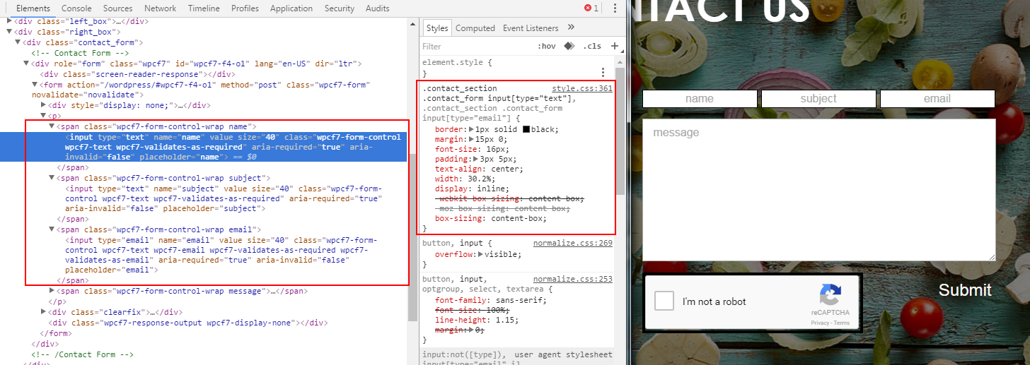
Here's the screenshot:
And here's the code:
.contact_section .contact_form input[type="text"], .contact_section .contact_form input[type="email"]{
    border: 1px solid black;
    margin: 15px 0;
    font-size: 16px;
    padding: 3px 5px;
    text-align: center;
    width: 30.2%;

    display: inline;

    -webkit-box-sizing: content-box;
    -moz-box-sizing: content-box;
    box-sizing: content-box;
}

.contact_section .right_box{
    float: right;
    width: 500px;
}

.contact_form .wpcf7-form-control-wrap:nth-of-type(2){
    margin: 0 5px;
}

@media screen and (max-width: 510px) {
    .contact_section .contact_form input[type="text"], .contact_section .contact_form input[type="email"]{
        margin: 5px auto;
        display: block;
        width: 100%;
        -webkit-box-sizing: border-box;
        -moz-box-sizing: border-box;
        box-sizing: border-box;
    }

    .contact_form .wpcf7-form-control-wrap:nth-of-type(2) {
        margin: 0;
    }
}
The problem is that, at normal window size, it looks perfect as shown in the screenshot. But if resize the window(to less than 510px) and back to the full size window, the email textbox goes to the next line!
Here's the screenshot:
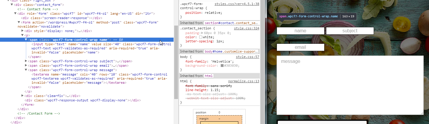
What I noticed is that, the parent <span> element now doesn't have a width! I have been trying to figure out why its happening, for many hours now. But still no success! :(
Btw, am using ContactForm7 for the contact form.
EDIT
SOLVED! I set the span elements to inline-block as well as set the 30.2% width to them instead of the textboxes. And some margin adjustments fixed the issue! Thank you