0

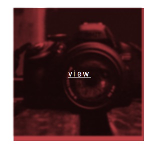
So I use a mix-blend-mode: multiply; effect to create a multiply layer on top of my image when hover on. The problem is the layer goes outside of the image border as in the picture below. I tried to set width and height to the .imgcon and .imgcon > img (see code below) and the layer fits in but then it messes up the responsive web function when viewed on different screen resolution. So I tried put width and height to 100% to keep the responsive function, but the layer still goes out of the image border.

As you can see, the multiply layer bleeds out of the image

Heres my code:

.imgwrapper {
  position: relative;
}


.imgcon + div {
 position: absolute;
  left: 42%;
  top: 44%;
  color: white;
  text-decoration: underline;
  opacity:0;
  display: block;
  pointer-events: none;
  font-size: 18px;
  
  letter-spacing: 4px;

}

.imgcon {
 position: relative;
 background: rgba(209, 19, 15, 0);
  transition: ease 0s;
  -webkit-transition: ease 0s;
  -moz-transition: ease 0s;
  -ms-transition: ease 0s;
  -o-transition: ease 0s;
   mix-blend-mode: multiply;
}
.imgcon > img {
 transition: ease 0s;
  -webkit-transition: ease 0s;
  -moz-transition: ease 0s;
  -ms-transition: ease 0s;
  -o-transition: ease 0s;
}
.imgcon:hover {
  background: #b41f24;
    background: rgba(180, 31, 36, 0.85);


}
.imgcon:hover > img {
  z-index: -1;
  -webkit-filter: grayscale(100%) blur(1.5px) contrast(100%);
  filter: grayscale(100%) blur(1.5px) contrast(100%) ;
  mix-blend-mode: multiply;

}

.imgcon:hover + div {
  display: block;
  opacity: 1;
  z-index: 1;
}
<a href="works.html?option=emkoinvite" class="permalink">
     <div class="desktop-3 mobile-half columns">
      <div class="item first-row">
       <h3>EmKO invitation</h3>
       <span class="category">Identity, print</span>

       <div class="imgwrapper">
       <div class="imgcon">
       <img src="http://i.imgur.com/XmhcxJS.png" /></div>
       <div id="view">view</div></div>
      </div><!-- // .item -->
     </div><!-- // .desktop-3 -->
    </a>
Phuong
  • 71
  • 2
  • 12

3 Answers3

2

Here's your solution. For an explanation, any block element is by default going to be 100% the width of its parent. If you want the element to remain the widths of its container, you need to use a different display attribute; inline-block seemed to make the most sense here.

The added space at the bottom is something that many elements have, I call it the descender space. Certain letters like "g" and j" dip below the text line. The parts that dip are called descenders. Many elements leave a little room for descenders. To get rid of this space, you can set line-height to 0.

The width and centered text stuff was just an easier way for me to center the text properly.

Let me know if you have any other issues!

.imgwrapper {
  position: relative;
}


.imgcon + div {
 position: absolute;
  text-align: center;
  top: 42%;
  width: 256px;
  color: white;
  text-decoration: underline;
  opacity:0;
  display: block;
  pointer-events: none;
  font-size: 18px;
  
  letter-spacing: 4px;

}

.imgcon {
 position: relative;
 display: inline-block;
 line-height: 0;
 background: rgba(209, 19, 15, 0);
  transition: ease 0s;
  -webkit-transition: ease 0s;
  -moz-transition: ease 0s;
  -ms-transition: ease 0s;
  -o-transition: ease 0s;
   mix-blend-mode: multiply;
}
.imgcon > img {
 transition: ease 0s;
  -webkit-transition: ease 0s;
  -moz-transition: ease 0s;
  -ms-transition: ease 0s;
  -o-transition: ease 0s;
}
.imgcon:hover {
  background: #b41f24;
    background: rgba(180, 31, 36, 0.85);


}
.imgcon:hover > img {
  z-index: -1;
  -webkit-filter: grayscale(100%) blur(1.5px) contrast(100%);
  filter: grayscale(100%) blur(1.5px) contrast(100%) ;
  mix-blend-mode: multiply;

}

.imgcon:hover + div {
  display: block;
  opacity: 1;
  z-index: 1;
}
<a href="works.html?option=emkoinvite" class="permalink">
     <div class="desktop-3 mobile-half columns">
      <div class="item first-row">
       <h3>EmKO invitation</h3>
       <span class="category">Identity, print</span>

       <div class="imgwrapper">
       <div class="imgcon">
       <img src="http://i.imgur.com/XmhcxJS.png" /></div>
       <div id="view">view</div></div>
      </div><!-- // .item -->
     </div><!-- // .desktop-3 -->
    </a>
CourtDemone
  • 5,772
  • 6
  • 23
  • 25
1

All you're missing is a display: inline-block; on the image's parent:

.imgwrapper {
  position: relative;
}
.imgcon + div {
 position: absolute;
  left: 42%;
  top: 44%;
  color: white;
  text-decoration: underline;
  opacity:0;
  display: block;
  pointer-events: none;
  font-size: 18px;
  letter-spacing: 4px;
}
.imgcon {
 display: inline-block;
 position: relative;
 background: rgba(209, 19, 15, 0);
  transition: ease 0s;
  -webkit-transition: ease 0s;
  -moz-transition: ease 0s;
  -ms-transition: ease 0s;
  -o-transition: ease 0s;
   mix-blend-mode: multiply;
}
.imgcon > img {
 transition: ease 0s;
  -webkit-transition: ease 0s;
  -moz-transition: ease 0s;
  -ms-transition: ease 0s;
  -o-transition: ease 0s;
}
.imgcon:hover {
  background: #b41f24;
  background: rgba(180, 31, 36, 0.85);
}
.imgcon:hover > img {
  z-index: -1;
  -webkit-filter: grayscale(100%) blur(1.5px) contrast(100%);
  filter: grayscale(100%) blur(1.5px) contrast(100%) ;
  mix-blend-mode: multiply;
}
.imgcon:hover + div {
  display: block;
  opacity: 1;
  z-index: 1;
}
<a href="works.html?option=emkoinvite" class="permalink">
     <div class="desktop-3 mobile-half columns">
      <div class="item first-row">
       <h3>EmKO invitation</h3>
       <span class="category">Identity, print</span>
       <div class="imgwrapper">
       <div class="imgcon">
       <img src="http://i.imgur.com/XmhcxJS.png" /></div>
       <div id="view">view</div></div>
      </div><!-- // .item -->
     </div><!-- // .desktop-3 -->
    </a>

That's because that parent is a div, and as such it is a block element and takes all available width. Changing it's display to inline-block makes it wrap to the dimensions of it's children.

Nick Ribal
  • 1,959
  • 19
  • 26
  • Thank you, but the layer still bleeds out for about 2 pixels at the bottom of the image. Any idea why? – Phuong Oct 18 '16 at 06:21
1
.imgwrapper {
    position: relative;
    display: inline-block;
}

.imgcon > img{display:block}
parag parmar
  • 148
  • 6